In February 2025, OpenAI shipped the first rebrand in its history. The work was done in-house, by design leads Veit Moeller and Shannon Jager, with the Berlin foundry ABC Dinamo drawing the type and Rotterdam's Studio Dumbar handling motion. At the center of it sits a typeface, OpenAI Sans.
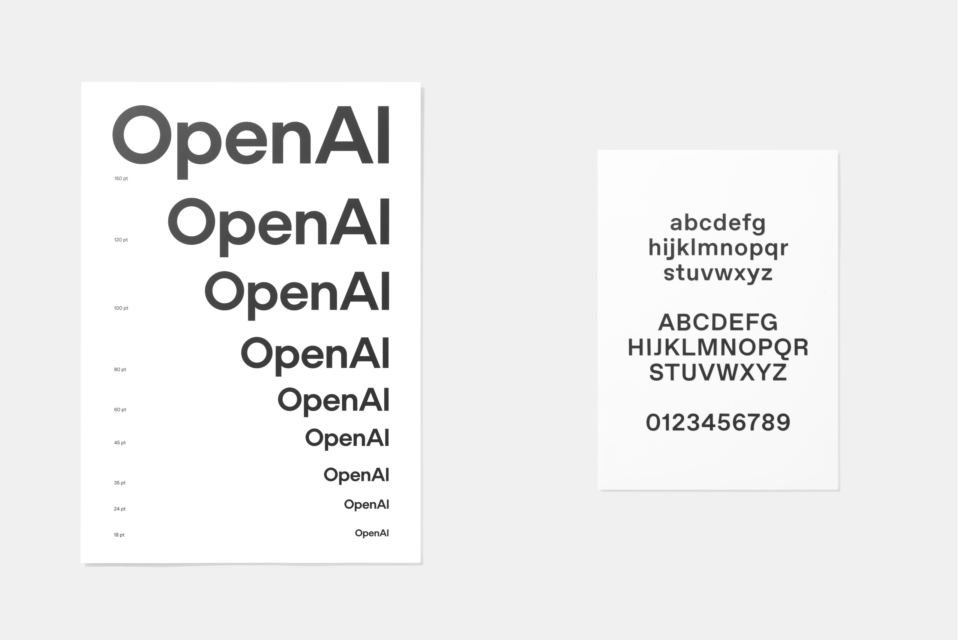
Look closely at its capital O. The outside is a flawless circle. The inside is not. The counter, the hole in the middle, is drawn slightly off, a dent built in on purpose so the letter reads as made by a person, not machine-stamped. That small flaw carries the rebrand's whole argument.
The team named four values for the work:
- Simplify
- Space
- Imperfection
- Vivid
The brief was to feel "more organic and more human" while keeping the "authority, technological sophistication and research-focused" character the company had already built. The palette went to greys and blues, chosen to read as horizons, sky, and open space, with a few sharp primaries on top.
"More organic and more human."
OpenAI's stated goal for the rebrand
The blossom, OpenAI's flower-like mark, survived the overhaul. It kept its shape but lost its wobble: the strokes were evened out and the geometry tidied, answering a long-running complaint that the old version looked lopsided.
Anthropic, and a slash that does the talking
Anthropic got there two years earlier, and quieter. Its identity came out of Geist, a Portland studio, over a collaboration that ran about two and a half years, from the company's stealth period through Claude's launch. There is no icon. No abstract bloom, no orbiting dot. The logo is the company's name and one piece of punctuation.
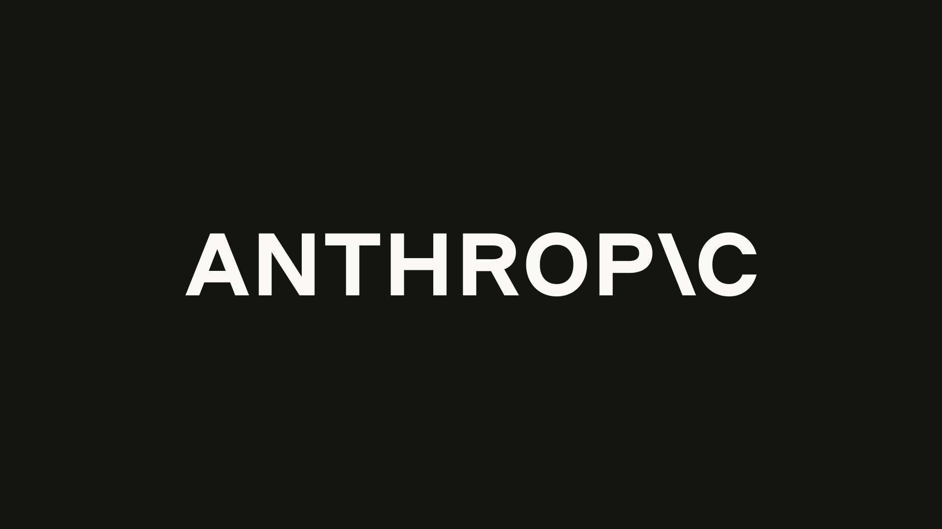
Read it and you get ANTHROP, a slash, then C. The slash has taken the place of the I. Geist calls it "a reference to the code that underlays AI, and a nod to the future ahead." One mark, set into a letter you would otherwise skim past, carrying the whole idea.
"A reference to the code that underlays AI, and a nod to the future ahead."
Geist, on the Anthropic slash
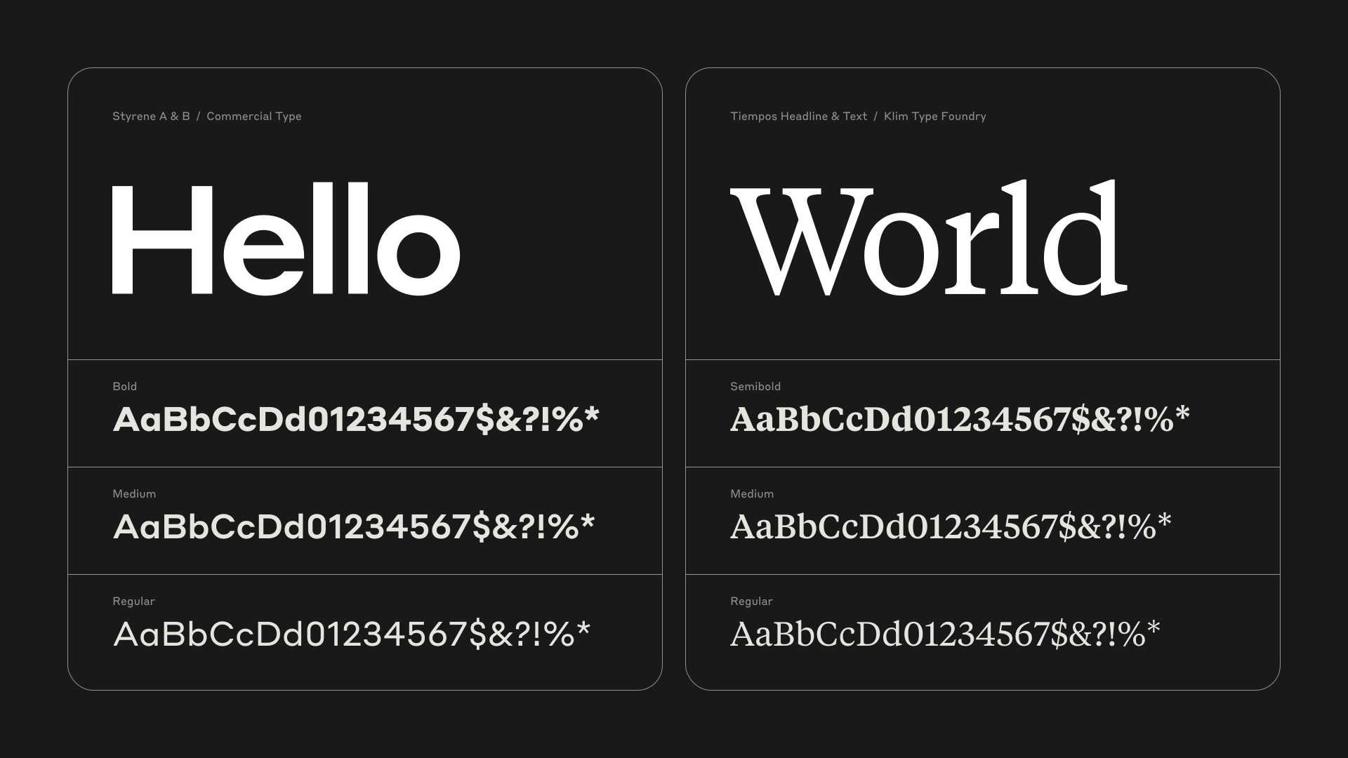
The type around it is deliberate too. The brief, in Geist's words, was to capture "at once the company's human-centered mission, and a sense of the technical craft with which they do their work," while dodging the usual tech-brand clichés. The earliest system paired two off-the-shelf families with real pedigree: Styrene, a sans by Berton Hasebe at Commercial Type, for headlines, and Tiempos, a serif from the Klim Type Foundry, for body. Geist called the mix technically refined and a little quirky. A full custom family came later, three subfamilies of serif, sans, and mono, the serif and sans drawn by Chester Jenkins.
The color is the argument
What most people register first, before any of this, is the color. Claude does not look like the rest of the category. Where the field defaults to a cool, faintly clinical blue-grey, Anthropic went warm.
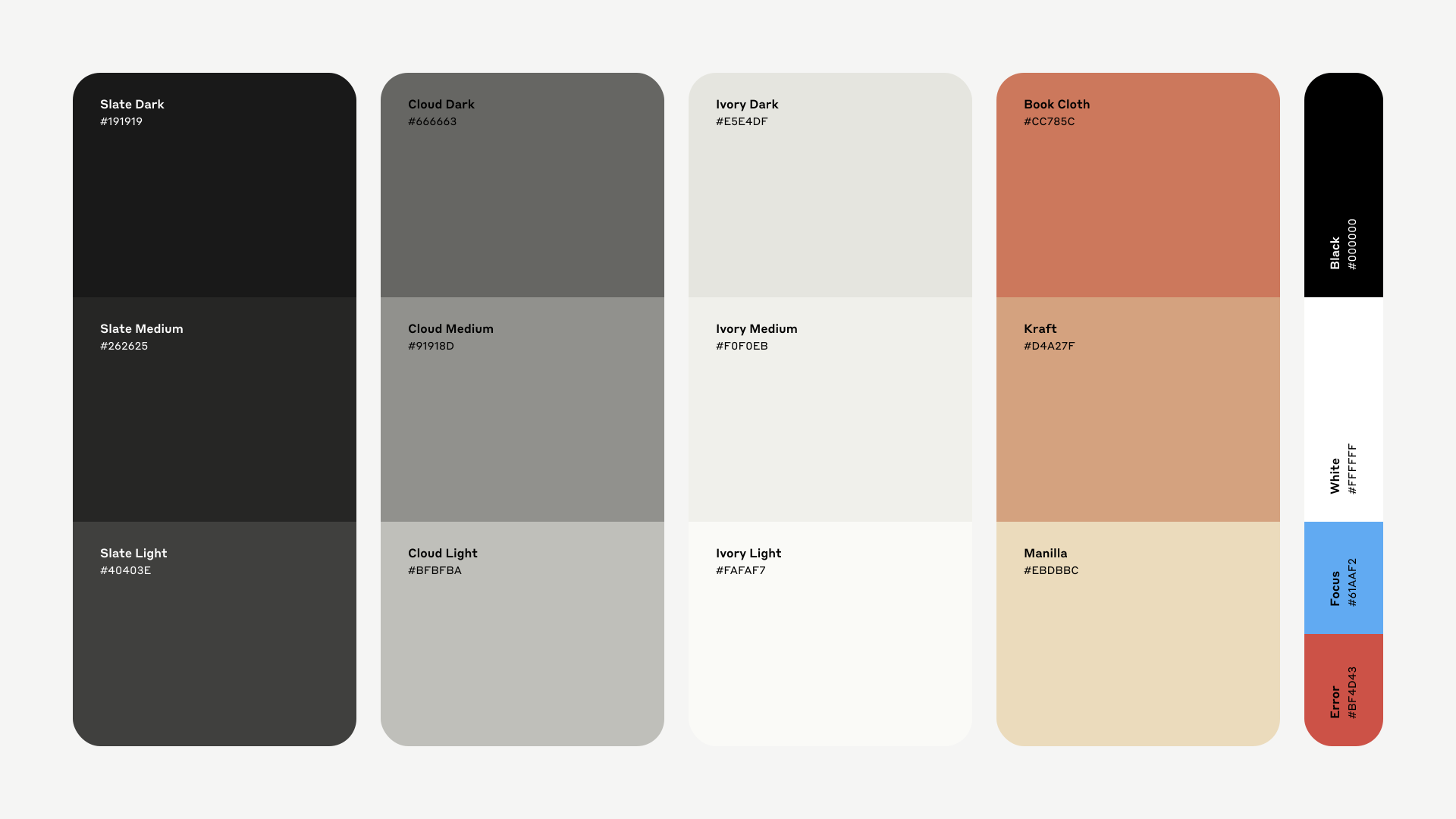
The brand palette names its colors instead of numbering them. The warm tone is Book Cloth, #CC785C, a soft terracotta. The off-white behind it is Ivory, running from #FAFAF7 to #F0F0EB. The greys are Slate and Cloud. Even the secondary warms carry names off a bookbinder's shelf: Kraft, Manilla.
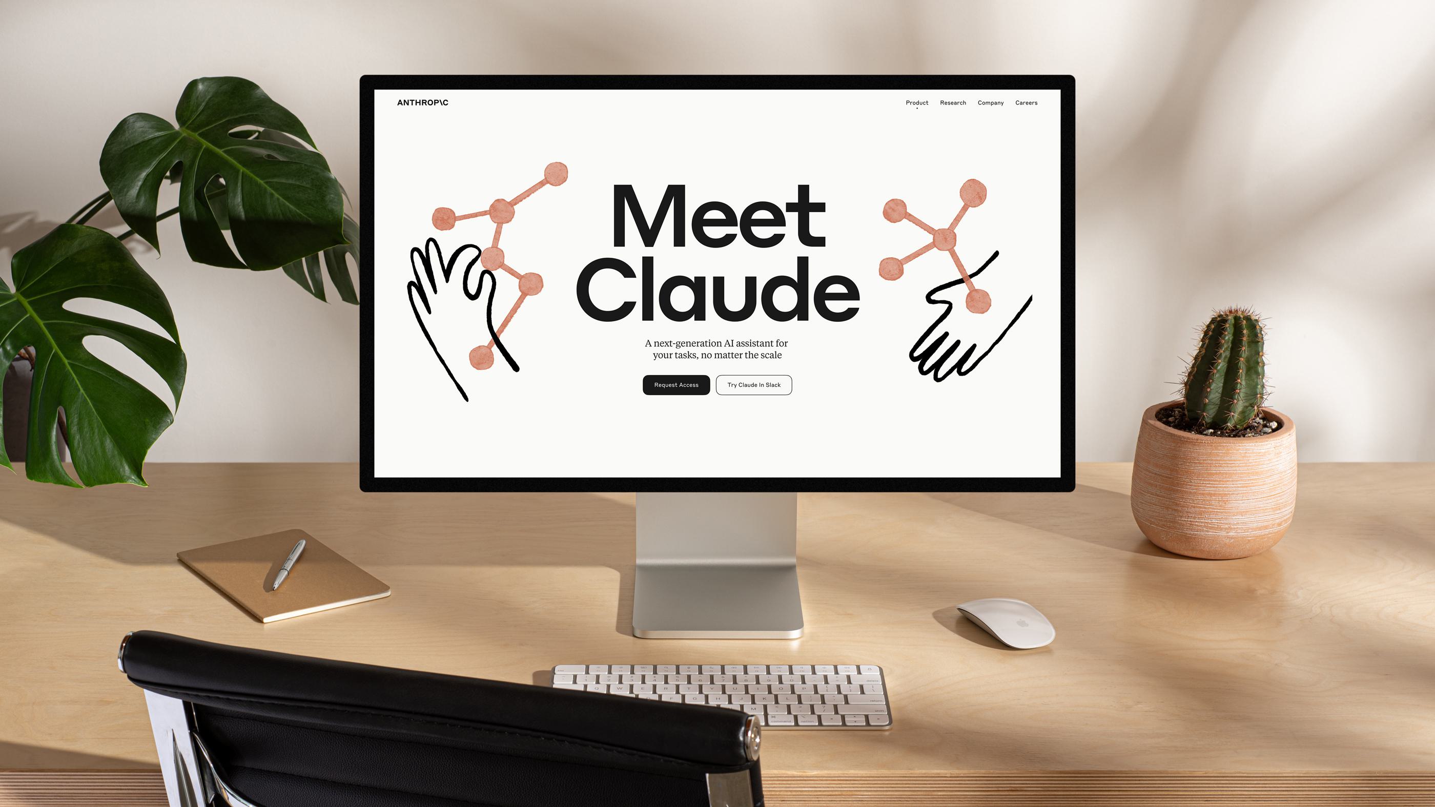
In use, that palette makes the product look like something you would text, not something you would boot up. Geist's launch page set "Meet Claude" in heavy type over a beige field, with coral constellation graphics and hand-drawn line art. In the shipped product the warmth stuck: a beige background, brown interactive gradients, a hand-drawn multi-point star in brown-orange, and headers in the transitional serif Galaxie Copernicus over Tiempos. The earth tone sets Claude apart from the intimidating, futuristic look most AI products reach for.
A name, and a spec sheet
The naming runs on the same instinct. Anthropic gave its assistant a human first name, Claude, widely read as a nod to Claude Shannon, whose 1948 paper founded information theory. The company has never formally confirmed it. OpenAI named its products for what they do. GPT is Generative Pre-trained Transformer. ChatGPT bolts a conversation onto that. The "o" in GPT-4o stands for omni: text, image, and audio in one model.
The words behind the marks
The language each company chooses tracks its design. Anthropic's own site calls it "an AI safety and research company" building "reliable, interpretable, and steerable AI systems," under the headline "Making AI systems you can rely on." It describes its purpose, as a Public Benefit Corporation, as "the responsible development and maintenance of advanced AI for the long-term benefit of humanity," and talks about starting "a race to the top on safety." Its three design principles for Claude are helpful, honest, and harmless. It built Constitutional AI, training models against an explicit written set of principles, some drawn from the UN Universal Declaration of Human Rights.
OpenAI's public language leans the other way. Its mission is "to ensure that artificial general intelligence benefits all of humanity," and the words around it run toward frontier capability and AGI more than safety method. OpenAI publishes a Preparedness Framework and runs a standing safety program; Anthropic's three H's and Constitutional AI are stated principles, not independently audited behavior. Both are describing themselves, and a company describing itself is doing marketing, whichever direction it leans.
One fact about that mission is worth setting down plainly. OpenAI has revised its formal mission statement six times in nine years. The 2025 version dropped the word "safely" that earlier ones carried, in lines like "build general-purpose artificial intelligence that safely benefits humanity." Those edits landed amid the company's for-profit restructuring, and the wording is drawn from its Form 990 filings. Read it as one data point.
Everyone is drifting warm
Here the tidy reading gets complicated. OpenAI's whole rebrand is itself a move toward warmth: a sans that "blends geometric precision and functionality with a rounded, approachable character," a palette of skies, a flaw worked into a letter. That tracks the broader 2024-to-2025 logo current, softer gradients and slightly irregular shapes built to feel human, and the design press now argues AI branding is growing out of its first phase of sparkles and minimalism toward identities with more texture. The fonts are converging faster than the manifestos.
The rest of the field
The other labs sort along the axis these two set. A quick tour:
- Google DeepMind aimed its 2023 identity at contemporary, friendly, and approachable, with custom DM Sans, Serif, and Mono.
- Mistral broke from the category's blues into yellow, gold, and orange, and stamped a modular pixel M that doubles as a cat.
- Perplexity went the opposite way: a deliberately recessive "invisible brand" meant to feel like a Scandinavian subway, "just a vessel for facts," with a custom asterisk pointing at its citations.
- xAI's Grok took the coldest line, near-monochrome black and white with sharp angles, a power tool rather than a companion.
The badge everyone shares
And then there is the four-pointed sparkle, which undercuts every claim of distinctiveness at once. It has become the near-universal shorthand for "AI feature," stamped across Gemini, Adobe Firefly, Zoom's AI Companion, Canva's Magic Media, and ChatGPT. Google traces it to a 2016 Docs feature, standardized in a 2023 redesign. By 2024 the company counted nearly 100 distinct sparkle icons of its own, and its design team warned that the ubiquity was wearing the symbol out.
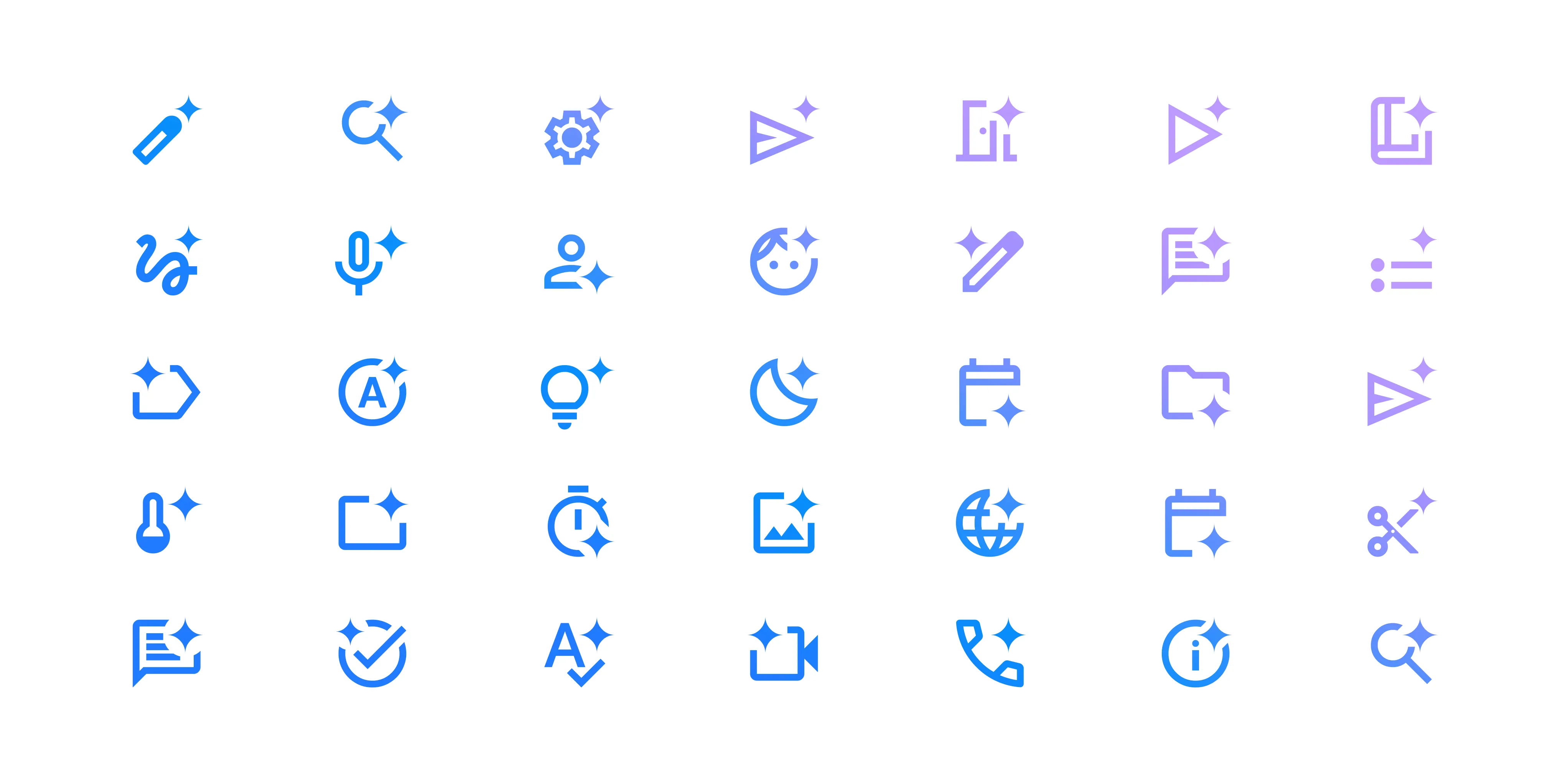
It may not even communicate. As of September 2024, a Nielsen Norman Group study found only about 17% of people read the sparkle as "AI," while 73% took it for a favorite or save button. The mark meant to signal intelligence mostly signals "bookmark."
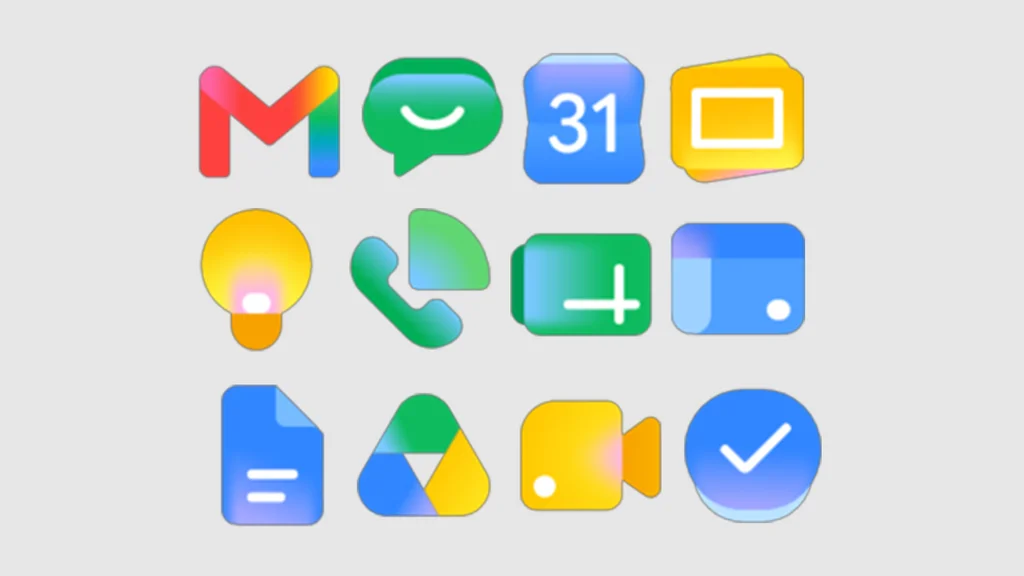
The gradient is the second shared badge. A soft multi-stop blend, equal parts sunrise and oil slick, now reads as "we are an AI company too." It is worn by Apple Intelligence, Meta AI, and Microsoft Copilot, and was applied wholesale to Google's Workspace icons. Designers admit the irony: brands reach for the same effect to stand apart, and arrive at the same place.
That is the field OpenAI and Anthropic opted out of. Most of the industry reached for the sparkle and the gradient, two ready-made costumes; these two paid for custom type instead and aimed it in opposite directions, one at authority with a flaw worked in, one at a serif-warm assistant with a human name. Whether the language behind the type stays as honest as the type itself is the part still worth watching.
Sources
- Wallpaper*, OpenAI has undergone its first ever rebrand, giving fresh life to ChatGPT interactions
- Creative Bloq, OpenAI's bold new rebrand is surprisingly human
- Geist, Anthropic
- Gooova Studio, Anthropic Designed Its Own Type Family
- Dear Designer, My Styrene Soul: A Short Affair with Claude.ai
- Type.Today, Styrene in use: Anthropic
- TechTarget, What Is ChatGPT? Everything You Need to Know
- Wikipedia, GPT-4o
- Anthropic, Company
- Anthropic, Shape how AI meets the world
- Anthropic, Constitutional AI: Harmlessness from AI Feedback
- Fortune, OpenAI has changed its mission statement 6 times in 9 years
- OpenAI, Safety & responsibility
- Kreafolk, The Most Updated Logo Design Trends in 2025
- Design Week, AI branding is growing up, with expressive brand worlds taking the wheel
- Someform Studio, DeepMind Branding
- DesignYourWay, The Mistral AI Logo History, Colors, Font, And Meaning
- Mistral AI, Frontier AI LLMs, assistants, agents, services
- Smith & Diction, Branding perplexity.ai. Creating an invisible brand.
- Sologo AI, Elon Musk's Grok Logo Evolution: From Minimalist Design to Saturn-Inspired Monogram
- Slate, Why the sparkly star became the symbol for artificial intelligence, and why that's a problem
- Google Design, Rise of the AI Sparkle Icon
- Fast Company Middle East, Google's Workspace icons just got the 'AI gradient' treatment