Squint at four startup websites and try to tell them apart. Daryl Ginn ran that test at the start of 2023 and could not do it. The look he was describing, a dark background with a blurred gradient glowing behind the product shot, has only spread since. The same thing happened to designer portfolios. Open ten and you will meet the same moves: the full-bleed name in heavy type, the grid of project cards, the hover that fades and lifts, the contact line at the bottom.
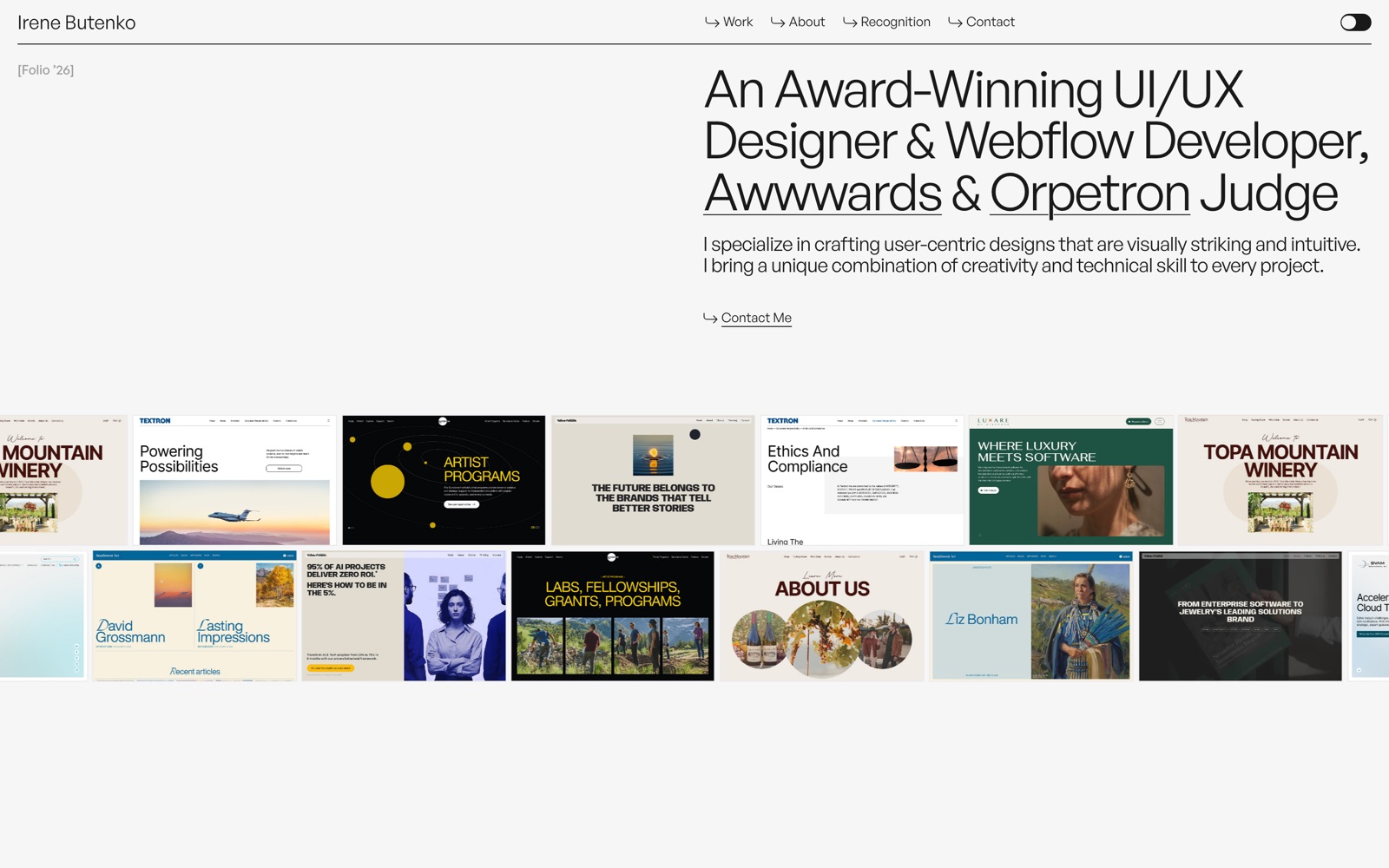
Some of this is just tooling. Framer crossed a $2 billion valuation in August 2025 on more than half a million monthly active users, and 40 percent of Y Combinator's most recent batch built their main site on it. When that many sites start from one builder and the same short shelf of templates, they end up looking alike.
Why everything rhymes
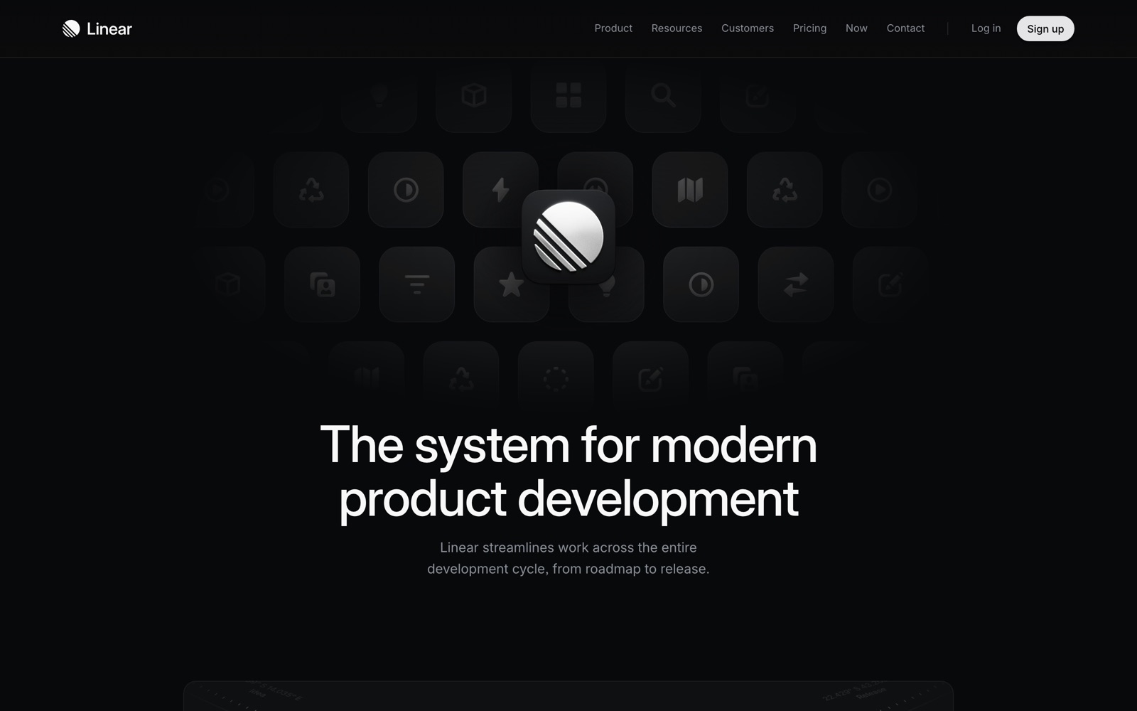
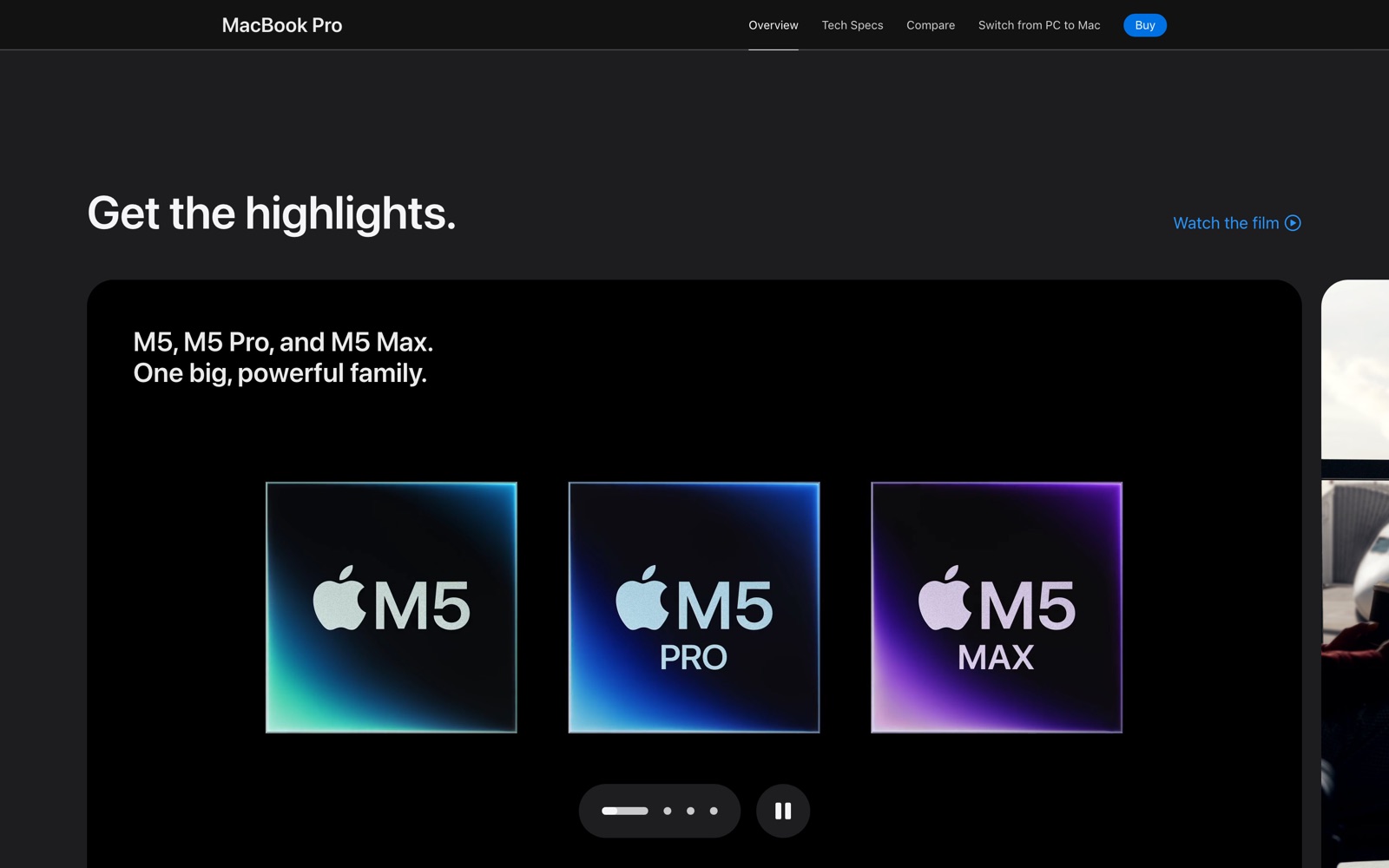
The references are shared too. Ginn traced the dark-glass look back through Linear to Stripe, which set the previous template around 2020 with its diagonal gradients and duotone icons. The bento grid, the wall of unevenly sized cards, came off Apple's product pages. Vercel gave everyone the faint dotted background and the monospace label. A designer building a portfolio in 2026 is drawing from the same small pool of admired sites as every other designer, because those are the sites that circulate.
This is older and better documented than the current panic lets on. A 2021 study out of Indiana University measured it. By analyzing screenshots of representative sites from 2003 to 2019, the researchers found page layouts had grown more than 30 percent more similar since 2007. Their explanation was not that designers got lazy. It was plumbing. The rise of shared libraries, frameworks, and CMS templates, they wrote, makes it easy to spin up a site with a predefined look, and the use of a few specific libraries turned out to predict how alike two layouts would be. The tools carry the convergence whether you mean to or not.
You can name the current looks fast. The dark Linear glass. The bento grid. The monospace-and-timestamps engineer aesthetic. Oversized display type used as the whole layout. That one rides a real shift: variable fonts ran on about 39 percent of desktop pages in 2025, up from a third the year before, though almost nobody animates them, around 0.3 percent of pages. Then the counter-move, the neobrutalist or text-first site, which Nielsen Norman defines as high contrast, thick borders, and deliberately unpolished, a reaction against the sleek minimal default. The counter-move converges too: a site stripped to black text on white with a monospace nav now looks like the other sites stripped the same way.
The look stopped being worth anything
Because it stopped being scarce. AI made it free. Nielsen Norman put it flatly in its State of UX 2026 report: as the tools improve, "anyone will be able to make a decent-looking UI (at least from a distance)." If a polished interface is what a portfolio sells, it is now selling something AI produces on demand.
So the weight slides off the surface and onto everything the surface used to stand in for. NN/g's own list of what stays hard gives it away: "curated taste, research-informed contextual understanding, critical thinking, and careful judgment." Elizabeth Goodspeed, writing in It's Nice That in early 2024, made the point earlier. "It's simply not enough to be able to draw or design anymore. Now you need to have taste," she wrote, and "AI itself can't generate good taste for you." Taste is accumulated judgment, which is the part a model cannot hand over.
For the portfolio, the case study now carries the weight the visuals used to. UXfolio asked 74 recruiters in early 2026 what they actually read, and the answer was the thinking. "I'd rather see one project explained really well than five explained quickly," one said. They spend three to five minutes on a portfolio and use it to find the reasoning: how you framed the problem, what you ruled out, what you would change next time. The screenshots are evidence for the argument the case study makes.
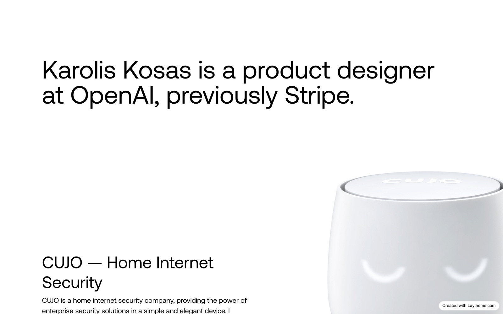
That is why the stripped-down senior portfolio reads as confident rather than unfinished. Karolis Kosas, a product designer at OpenAI, opens his site on a single line of plain text. Rauno Freiberg, who works with Vercel, runs a mostly monospace, mostly-text page that trusts you to care about the work and not the wrapper. The restraint is the signal: someone who no longer needs the site to perform, because the work and the names behind it already do.
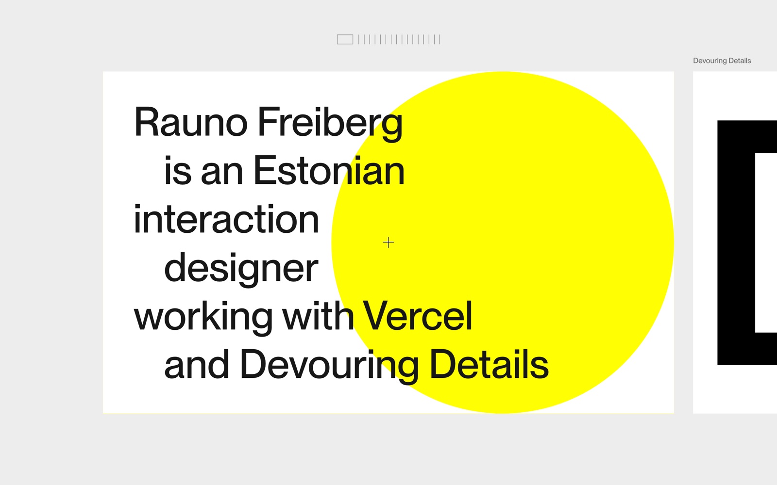
Which is the part nobody has settled. "Taste" is already hardening into the next template. Every other portfolio now claims it, the text-first layout is becoming its own monoculture, and a thing everyone signals stops signaling anything. If the glossy look stopped differentiating the moment AI could produce it, there is no obvious reason curated restraint will not go the same way once the field agrees that is what taste looks like.
Sources
- Rectangle (Daryl Ginn), The Linear effect
- TechCrunch, No-code website builder Framer reaches $2B valuation
- Goree, Doosti, Crandall & Su, CHI 2021, Investigating the Homogenization of Web Design: A Mixed-Methods Approach
- Nielsen Norman Group, State of UX 2026: Design Deeper to Differentiate
- It's Nice That, Elizabeth Goodspeed on the importance of taste, and how to acquire it
- HTTP Archive, Fonts (Web Almanac 2025)
- UXfolio, UX Portfolio Playbook: What Recruiters Actually Look For in 2026
- Nielsen Norman Group, Neobrutalism: Definition and Best Practices