In 1994 David Carson ran an entire magazine interview in Zapf Dingbats. Not a pull quote or a sidebar: the whole piece, set in a font that holds no letters at all, only little symbols, stars, scissors, pointing hands. Carson was art-directing Ray Gun, he found the interview dull, and he decided the layout could say so. Years later he said of it, "I admit that was one you could not actually read."
Carson's defense became a line designers still quote, don't mistake legibility for communication. The claim fits a poster or a magazine spread, where a reader chooses to linger over the page. It fits the interfaces and documents where most design now lives far less well.
Heller's test: function, not reflex
When does breaking a rule actually work, and when is it self-indulgent? The most cited answer is thirty years old. In 1993 Steven Heller wrote "Cult of the Ugly" for Eye, setting a distinction that has held up.
Ugliness as a tool, a weapon, even as a code is not a problem when it is a result of form following function. But ugliness as its own virtue, or as a knee-jerk reaction to the status quo, diminishes all design.
Steven Heller, "Cult of the Ugly", 1993
The distinction turns on function. A broken rule that serves a purpose reads as a deliberate choice; the same break with no purpose behind it reads as affectation. Heller also described what tends to follow. An original breaks a rule for a reason, and imitators copy the look and not the reason, "misusing their signature designs and typography as style without substance." The break settles into a convention, drained of the purpose that first justified it.
The plainest breaks are often the strongest
One of the clearest examples barely looks like a design decision at all. Berkshire Hathaway's website is a wall of blue underlined links on white: no images, no navigation bar, no type system, a page largely unchanged since the 1990s.
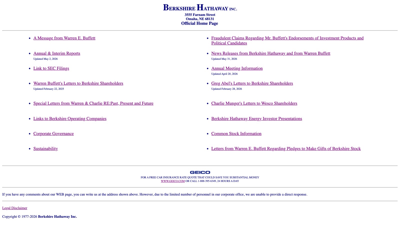
By every current convention the page is broken, and for its users it works. They are shareholders who came for Buffett's letters and the annual report; the site delivers both in one click, loads on any connection, and reads fine on any device, screen reader included. The bareness reads as deliberate, a company signaling it will not spend shareholder money dressing up a website. Craigslist made a similar bet and outlasted a decade of better-funded competitors. For this audience and this task, the convention that a site must look designed was the wrong rule to follow.
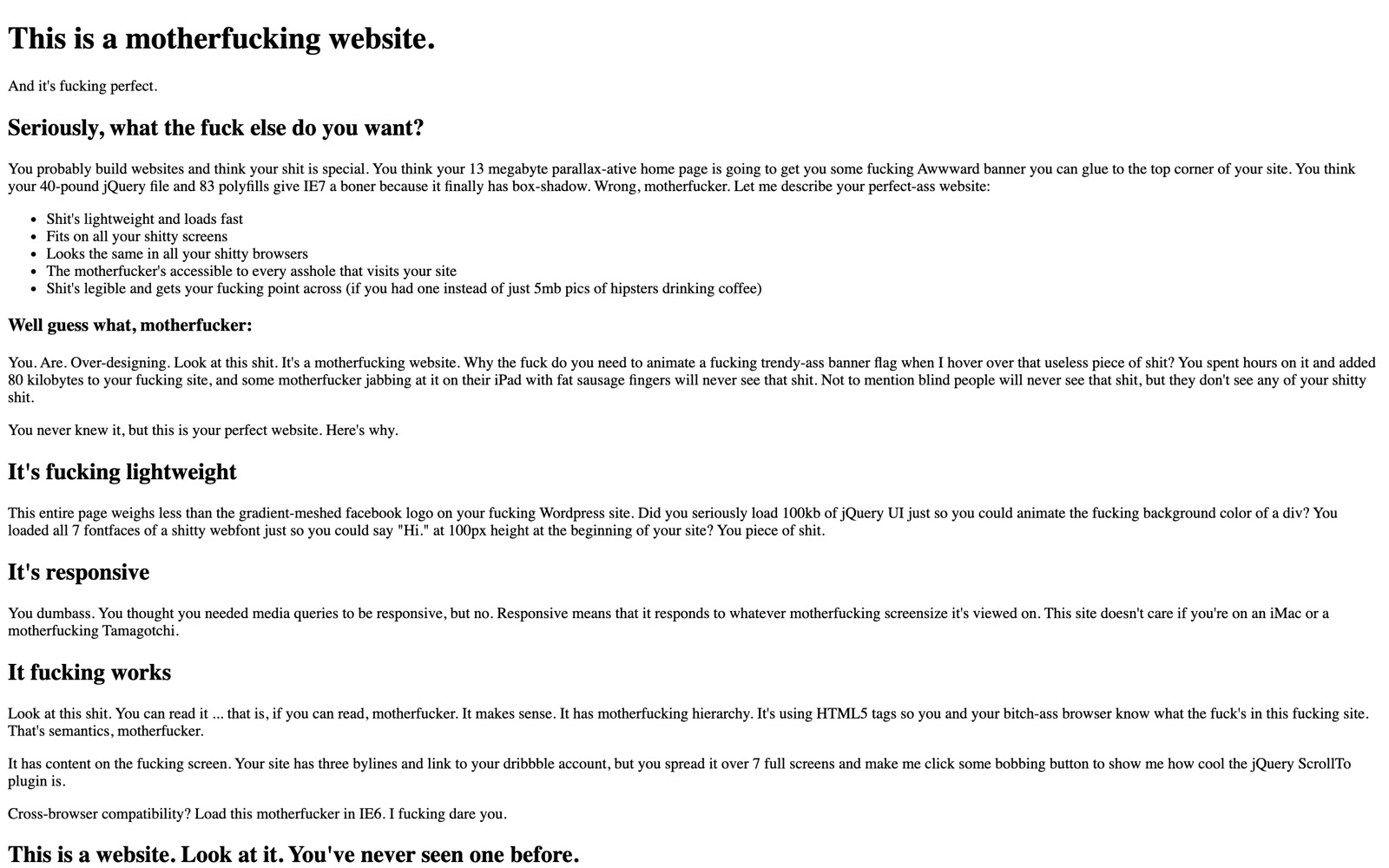
A widely shared site, motherfuckingwebsite.com, makes the same case as a demonstration. It is a single page of unstyled black-on-white HTML, written to mock heavy, bloated design, and its argument is that default HTML loads fast and reflows to any screen before a designer adds anything. Each layer added on top, a parallax hero, a font loader, a scroll effect, is a chance to lose one of those properties.
The other route is total commitment
Plainness is one route. Maximalism is the other, and it can work when it commits fully. Cameron's World is a collage assembled from thousands of salvaged GeoCities pages: spinning GIFs, starfields, under-construction signs, the amateur vocabulary of the 1990s web, all at once.
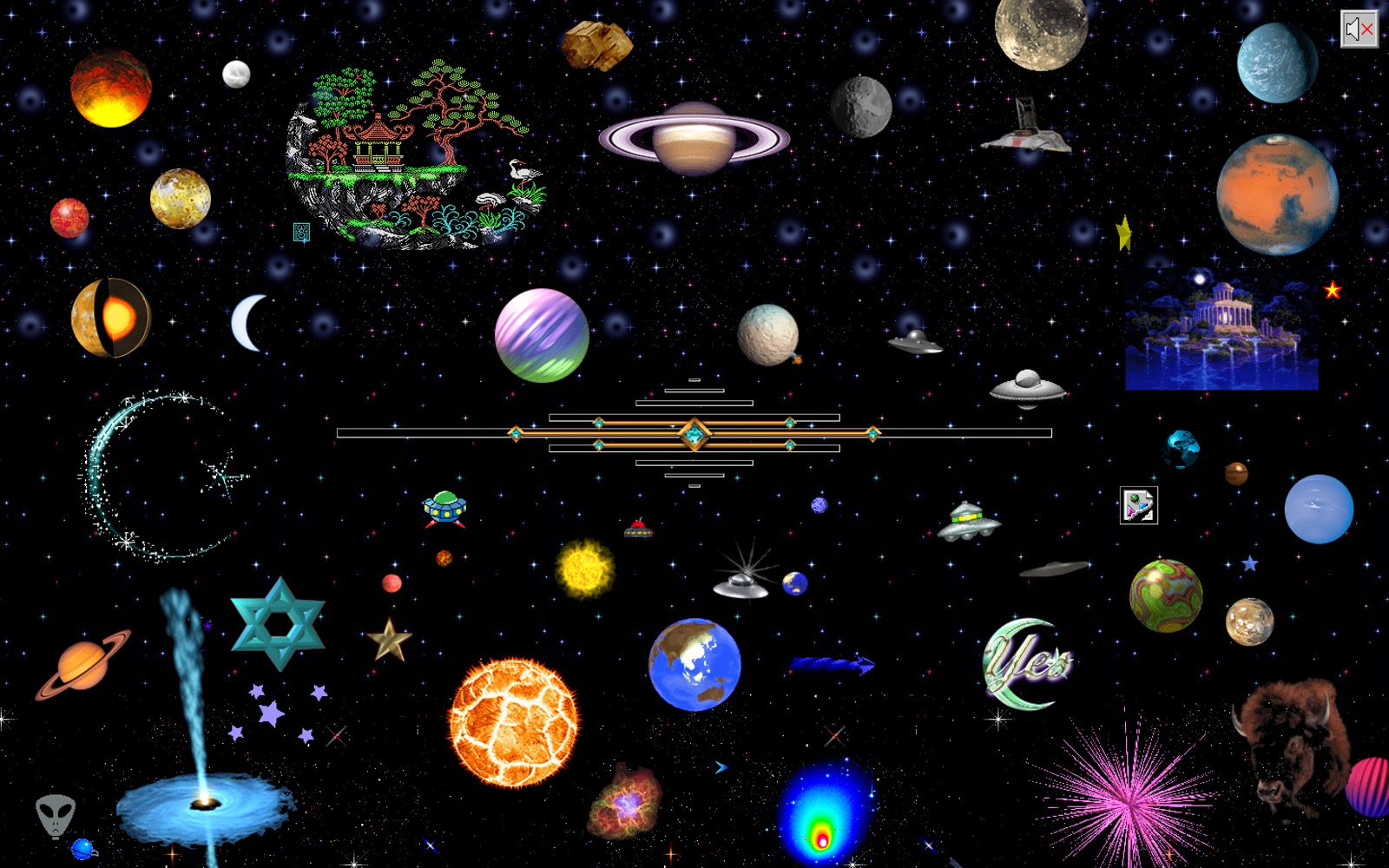
It ignores every rule about restraint and consistency. The difference from an actual GeoCities page is curation: someone chose and placed every fragment.
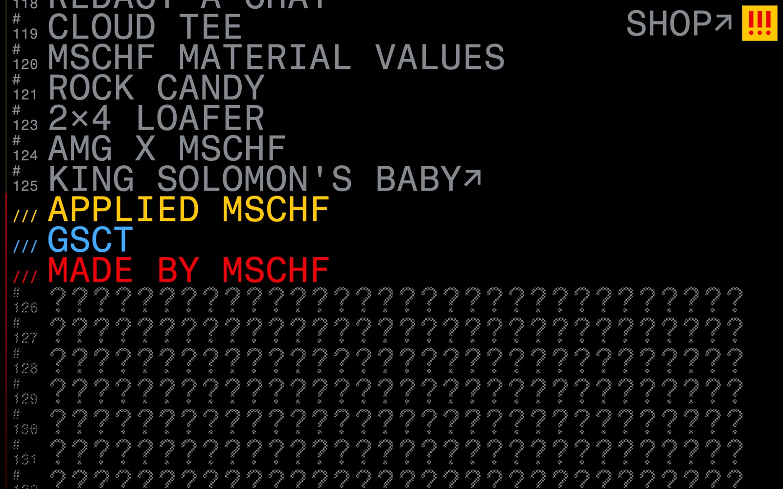
A commercial operation runs on the same idea. MSCHF, the Brooklyn collective behind the Satan Shoes and the Big Red Boots, sells its work from a bare numbered list, counted off in "drops", with no store design and no brand system. The absence of design is the brand: a single editorial sensibility runs the operation, so the bareness reads as deliberate rather than unfinished.
Gumroad shows the test applied to a current style. Its neobrutalism, thick black outlines, flat pastel fills, hard offset shadows, is a deliberate break from the soft, rounded look most software adopted. Nielsen Norman Group, which judges interfaces on usability rather than fashion, finds it defensible: the raw aesthetic fits a platform built around independent creators, and beneath the loud surface the layout keeps function ahead of decoration.
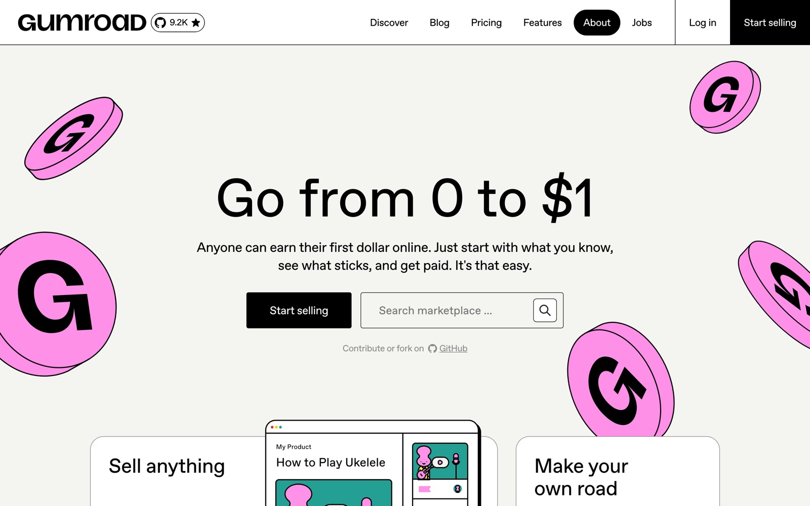
The style has since been copied widely, the thick borders and hard shadows applied to products with none of Gumroad's reasoning behind them. That is the pattern Heller described: the look detaches from the purpose and spreads on its own.
The approach has also worked in conservative contexts. When Richard Turley redesigned Bloomberg Businessweek from 2011, he brought crude type and clip art to a finance magazine, and ran deliberately ugly covers. The Society of Publication Designers named it Magazine of the Year for 2012, and the art director George Lois called the run "the best consistent set of covers in 40 years." A business weekly is an unlikely home for ugliness on purpose.
When the look outlives the reason
The reverse case is the showpiece built around scroll effects and heavy animation. Nielsen Norman Group studied scroll-jacking, the technique of overriding how the scroll wheel behaves to produce a cinematic effect, and found that "the majority of our study participants were at least mildly disoriented," with the worst results on pages that changed scroll speed while also asking the reader to read. The broken rule here is that a control should behave the way the user expects, and the break serves the effect rather than the reader.
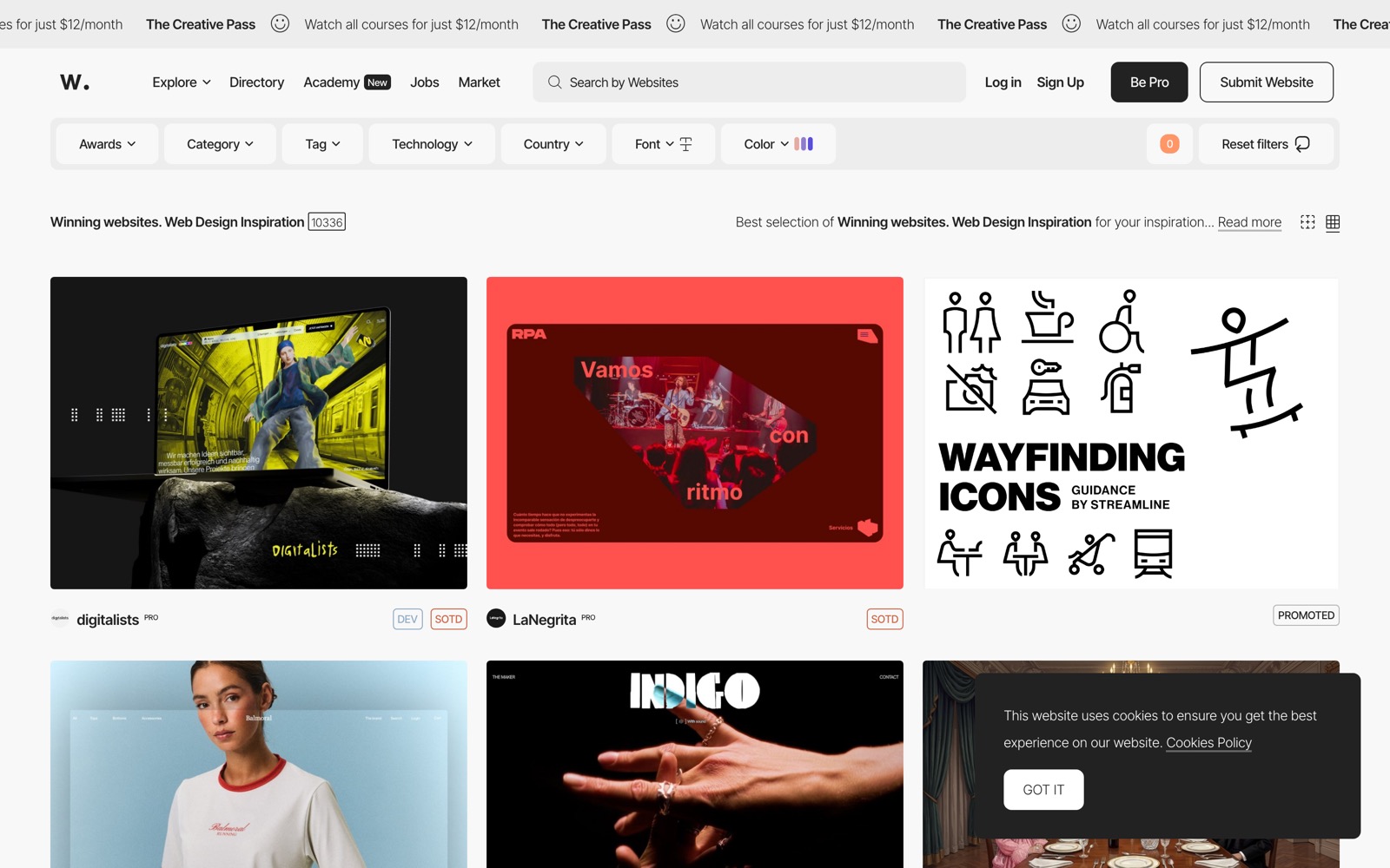
The incentives behind these sites show up in how they are judged. Awwwards, a widely followed site-of-the-day gallery, publishes its scoring: design 40 percent, usability 30, creativity 20, content 10. Usability counts for less than a third of the total, below design and creativity combined, so a site tuned for the award is tuned for visual impact ahead of use.
Antidesign follows the same path from idea to mannerism. Kate Moran of Nielsen Norman Group writes that antidesign's goals "feel like the antithesis of UX design," since the style treats difficulty as a feature rather than a cost. The same group notes that neobrutalism, used without balance, can overwhelm users and harm accessibility, and advises against pairings such as yellow on cyan that fail readability tests.
A smaller example is the custom cursor, which hides the system pointer and replaces it with a graphic that often lags behind the input. The accessibility writer Eric Bailey argues that "Choices that don't prioritize usability mean you are practicing decoration, not design." Overriding the cursor also discards the size and contrast settings some users rely on to find the pointer. The trade is an accessibility affordance for a visual effect.
The exception: accessibility
One class of rule sits apart from taste. Whether a grid or a palette works is a judgment people can disagree about; whether someone can use a page at all is measurable, and the field treats it as a baseline rather than a style choice. The Web Content Accessibility Guidelines set body-text contrast at a minimum ratio of 4.5 to 1, the level at which readers with moderately low vision can still read the text. Motion tied to scrolling can trigger vestibular disorders, with reactions the specification describes as "nausea, migraine headaches, and potentially needing bed rest to recover." When a break violates these, the cost is not aesthetic but functional: some people can no longer use the page, whatever the designer intended.
The cases that work share one trait: a reason for the break that the design itself makes legible. That distinction is hard to hold at scale, because a look copies easily and a reason does not. Web brutalism drew serious attention around 2016 and had hardened into a common template within a few years, and neobrutalism appears to be following the same path. Whether the next worthwhile break avoids that arc is an open question.
Sources
- Adam Banks, An interview with David Carson (MacUser, 2008)
- davidcarsondesign.com, David Carson, reviews and press
- Steven Heller, Eye no. 9 (1993), Cult of the Ugly
- Wikipedia, MSCHF
- Wikipedia, Richard Turley (graphic designer)
- Nielsen Norman Group, Neobrutalism: Definition and Best Practices
- Nielsen Norman Group, Scrolljacking 101
- Awwwards, Evaluation System
- Nielsen Norman Group, Brutalism and Antidesign
- Eric Bailey, Don't use custom CSS mouse cursors
- W3C Web Accessibility Initiative, Understanding SC 1.4.3: Contrast (Minimum)
- W3C Web Accessibility Initiative, Understanding SC 2.3.3: Animation from Interactions