Accordion
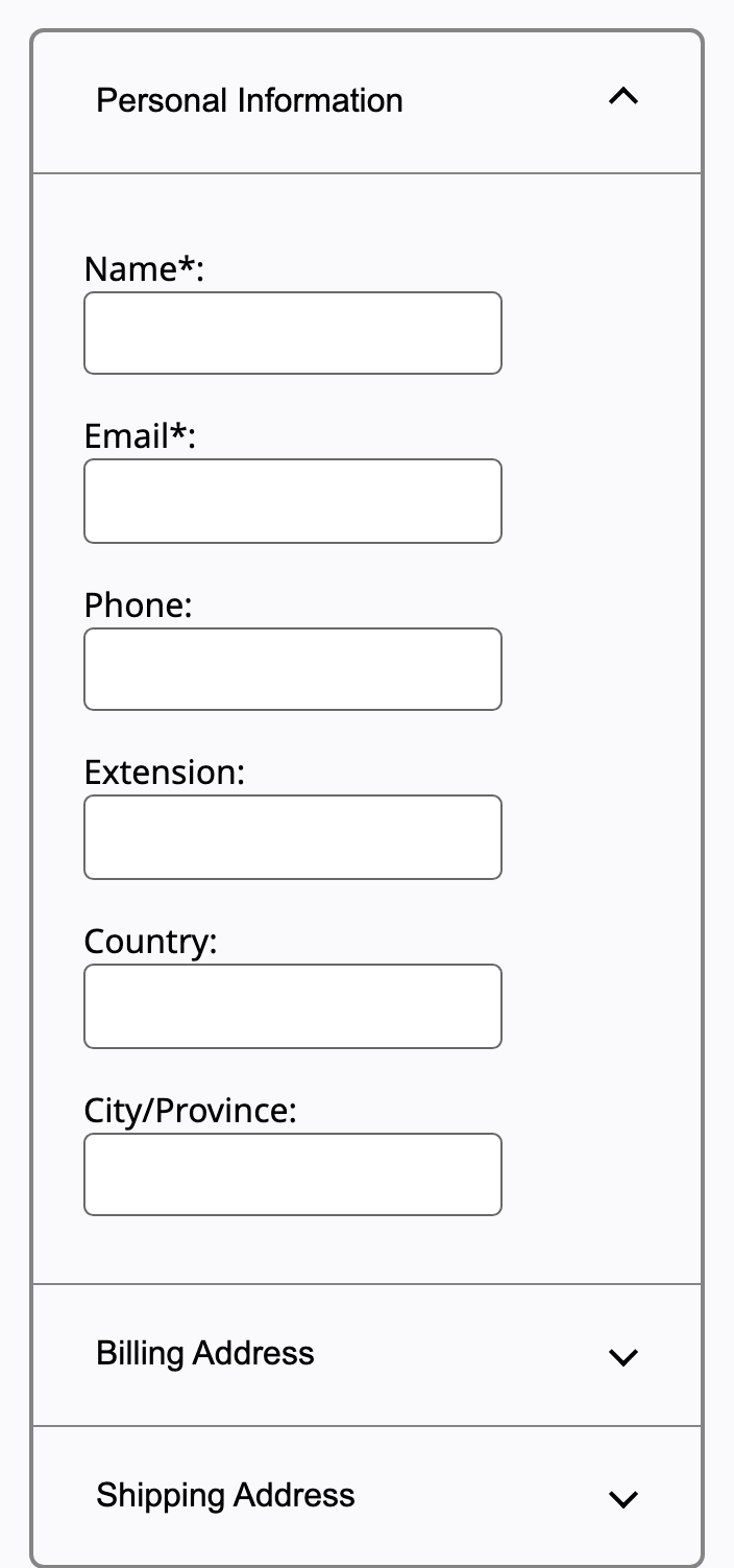
A vertical stack of headers that each expand and collapse a panel of content, revealing sections only as they are needed.
Behavior
Keyboard
- Enter / Space
- With focus on a header, toggle its panel. In a single-open accordion, opening one collapses the other.
- Tab / Shift+Tab
- Move to the next / previous focusable element. All focusable elements in the accordion are in the normal page tab sequence.
- Down / Up Arrow
- Optional: move focus between accordion headers, wrapping at the ends.
- Home / End
- Optional: move focus to the first / last header.
Parts
Accordion header
A label that also serves as the control for showing (and often hiding) its section. The title sits in an element with role=button, so it is operable and announced as a control.
Heading wrapper
Each header button is wrapped in a heading element with an aria-level appropriate to the page, so the headers form part of the document outline and screen-reader users can navigate by heading.
Accordion panel
The collapsible region of content tied to a header. It can take role=region with aria-labelledby pointing at its header, which helps when panels contain headings or nested accordions.
Expand/collapse icon
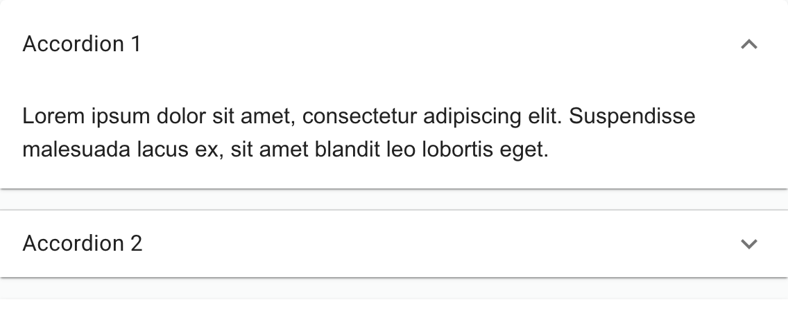
A chevron or triangle that signals expandability and rotates to indicate open versus closed. It accompanies the label and must not be the only cue that a section is toggleable.
States
Expanded versus collapsed
When a panel is visible its header button has aria-expanded=true; when hidden, aria-expanded=false. The chevron rotates to match. This state pairing is the heart of the widget: the visual and the programmatic state must always agree.
Single-open versus multi-open
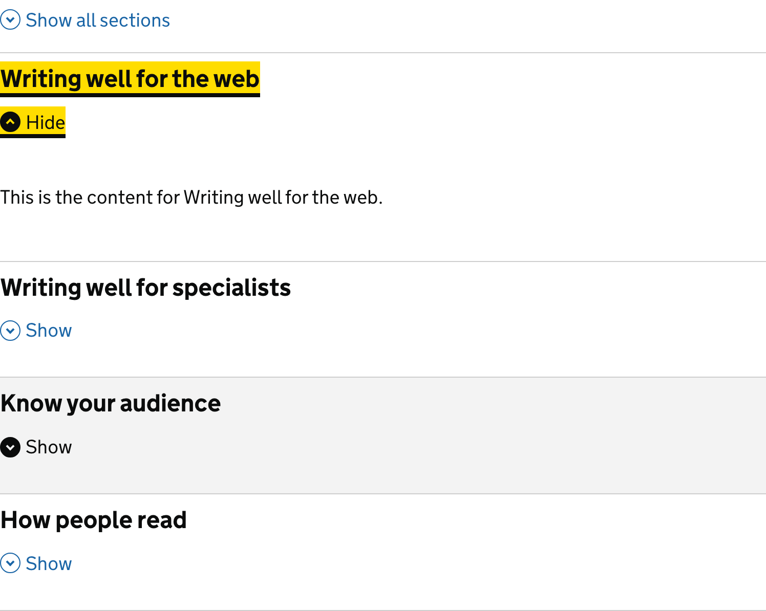
In a single-open accordion, expanding a collapsed header collapses the one already open. In a multi-open accordion any combination can be open, often with open-all and close-all controls. Choose based on whether users compare sections or read them one at a time.
Animation and reduced motion
Open and close are usually animated by transitioning height and opacity. Under prefers-reduced-motion: reduce, cut or replace the slide (for example a quick fade) so the movement does not affect users sensitive to motion.
The find-on-page caveat
Content in a collapsed panel hidden with display:none cannot be found by the browser's find-in-page, and text fragments cannot link into it. The modern fix is hidden=until-found with the beforematch event, which lets the browser search hidden text and reveal the matching section.
References
Use it
Figma
An accordion item with expand/collapse variants
- Build one item: a vertical Auto Layout frame with a header row (label plus chevron, space-between) and a panel frame below it.
- Make it a component and add a State variant: Collapsed, Expanded.
- In Collapsed, remove the panel from the layout flow and point the chevron at rest; in Expanded, show the panel and rotate the chevron.
- Wire the on-click variant change with Smart Animate so the chevron rotation and panel height animate, mirroring aria-expanded flipping.
Expose the chevron as an instance swap so you can switch icon styles without rebuilding the variants.
An accordion group with an open policy
- Stack several item instances in a vertical Auto Layout frame: this is the grouped, labelled set.
- For multi-open, leave each item independent so any combination can be Expanded.
- For single-open, prototype selecting one item's Expanded variant resetting the others to Collapsed.
- Add an optional open-all and close-all row to match the GOV.UK pattern and ease the find-on-page caveat.
Keep header height and padding as shared variables so the stack stays even whether one or many panels are open.
Accessibility
An accordion is a set of headers, each a button wrapped in a heading, whose aria-expanded reports panel visibility and whose aria-controls points at the panel. All focusable elements are part of the normal page tab sequence; arrow-key navigation between headers is an optional enhancement, not a requirement, which is the opposite of the tablist's roving model.
- Put the button in a true heading with the correct level so the headers contribute a meaningful document outline; do not put the heading role on a div.
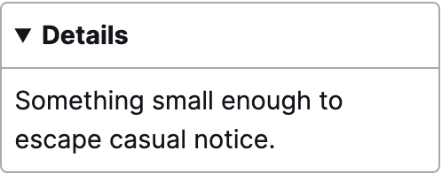
- Native <details> and <summary> are the no-JS baseline, but a real accordion needs grouping and has some assistive-tech quirks, so test it.
- Keep all headers in the tab order with a visible focus indicator.
- Honor prefers-reduced-motion by reducing or replacing the open-close animation.
- Account for find-in-page: collapsed panel text is unsearchable, so prefer hidden=until-found or offer open-all and close-all.
- The chevron must not be the only affordance; make it clear the headings are buttons.
Research notes & sources
WAI-ARIA Accordion: heading-wrapped buttons with aria-expanded and aria-controls
- Accordion Pattern (ARIA Authoring Practices Guide)W3C WAI
- Accordion Example (ARIA Authoring Practices Guide)W3C WAI
- Disclosure (Show/Hide) PatternW3C WAI
- <details>: The Details disclosure elementMDN Web Docs
- Disclosure Widgets
- Accordions for Complex Website Content on DesktopsNielsen Norman Group
- Accordion componentGOV.UK Design System
- Making collapsed content accessible with hidden=until-foundChrome for Developers (Google)
- prefers-reduced-motionMDN Web Docs
- React Accordion componentMUI (Material UI)