Alert / Banner
A prominent, persistent message in the page that reports a status, a warning, or an error, and stays until the situation is resolved or the user clears it.
Scheduled maintenance Sunday, 2 to 4 AM UTC
Plan upgraded to Team
Your card expires this month
Enter a valid work email
Each intent carries an icon and a heading, not color alone. The banner and the error are dismissible; both stay cleared until you restore them.
Behavior
Keyboard
- Tab
- Reaches the dismiss button and any action link in the alert in normal DOM order. role=alert does not move focus to the alert itself; the user keeps their place and the message is announced.
- Enter / Space
- Activates the focused dismiss button or action. The dismiss control must be a real button, not a click handler on a non-focusable icon.
Parts
Container and intent color
The bounded block, typically a tinted fill with a left border or a colored edge keyed to the intent. The color is one of the cues, never the only one: a color-blind user must still read the intent from the icon and the words, per WCAG 1.4.1.
Intent icon
A glyph that names the severity: an i in a circle for info, a check for success, a triangle for warning, an X or circle-slash for error. It is decorative when the text already says the intent (mark it aria-hidden), and it is the redundant cue that keeps the alert legible without color.
Message (and optional heading)
The text itself, the part that does the work. A short message can stand alone; a longer one takes a one-line heading that states the status and a body that says what happened and, for an error, how to fix it. Keep it human and specific, not a code.
Action (optional)
A link or button that resolves the condition, such as Retry, Update payment, or View details. Because an alert persists, an action inside it is reachable, the opposite of the auto-dismissing toast where an embedded action is the classic failure.
Dismiss button (optional)
A close control for alerts the user is allowed to clear. It must be a real focusable button, reachable by keyboard. Errors and validation messages usually omit it and persist until resolved; informational banners may carry one, and once dismissed should stay dismissed.
States
Four intents, four treatments
Info, success, warning, and error each get a distinct color, icon, and tone. Polaris and Carbon both formalize this set. Reserve the high-severity styling (critical red, the assertive announcement) for genuine high severity; if everything is an alert, nothing reads as one, and the page earns banner-blindness.
Dismiss, and stay dismissed
A dismissible alert closes on its button and does not come back on the next render or visit. Persist the dismissed state. An informational banner that reappears every page load trains the user to ignore the banner region entirely, which is how real warnings get missed.
Dynamic injection through a live region
When an alert appears in response to an action (a failed save, a completed import), it must be announced. Put the live-region container in the DOM at page load, then inject the message: assertive (role=alert) for urgent, polite (role=status) otherwise. Creating the live region at the moment the message arrives usually fails to announce.
No auto-dismiss for anything that matters
An alert that carries an error, a required action, or information the user must see does not time out. This is the toast trap in reverse: the value of an alert is that it waits. Carbon's inline notifications and Material's banners both stay on screen until the user dismisses or resolves them.
Responsive and stackable
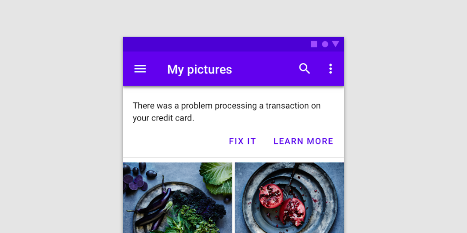
Inline, an alert reflows like any block of content: text wraps, the icon stays pinned, the action drops below the message on narrow screens. A pinned banner pushes the content down rather than overlapping it. Show one banner at a time; combine multiple messages into a single banner rather than stacking several.
References


Use it
Figma
An alert component with intent variants
- Build an Alert component set with an Intent property: Info, Success, Warning, Error.
- Make each variant an Auto Layout row: an intent icon, the message text (with an optional heading slot), an optional action, and an optional dismiss button, with consistent padding.
- Drive the icon, the tint, and the edge color from a variable per intent, so the severity is always carried by icon plus color plus text, never color alone.
- Check the text contrast against each tinted fill; tinted backgrounds often drop body text below 4.5:1.
Keep the icon a separate layer bound to the Intent variant, so switching the intent swaps the glyph and the color together and the two never drift apart.
Inline error plus an error summary
- Make a field with an error state: the input outlined in the error color, with an inline message below naming the problem and the fix.
- Add an error summary block at the top of the form listing each error as a link, captioned that focus moves here on submit.
- Repeat language from each field's label in its message, so the summary entry and the field read as the same error.
- Annotate that the live build adds role=alert to the summary on submit and prefixes the page title with Error, which Figma cannot represent.
Show the inline message and the summary entry side by side so reviewers see they are complementary, not a choice between one or the other.
Document alert versus toast versus dialog
- Put three labeled examples in a row: a persistent inline alert, a corner toast, and a modal alertdialog.
- Caption the alert as in-context and persistent: stays until resolved, used for errors and status.
- Caption the toast as transient and non-blocking: a few seconds, low-stakes confirmation, nothing essential inside.
- Caption the dialog as blocking: traps focus and requires a response, for the rare message that must be acknowledged.
Add the one-line rule: persistent and in-context is an alert, transient is a toast, must-acknowledge is a dialog. Keep it in the library so the decision is made once.
Accessibility
An alert is a message, not a widget you operate, so its accessibility turns on two things. First, intent must survive the loss of color: every severity carries an icon and states its status in words (WCAG 1.4.1). Second, announcement depends on timing. Content present at page load needs no live role and is read in normal order. A message injected dynamically needs a live region whose container already exists in the DOM: role=alert (assertive) for urgent messages, role=status (polite) for routine ones (WCAG 4.1.3). role=alert never moves focus and should not require the user to dismiss it; if a message must be acknowledged, it is an alertdialog, not an alert. Any dismiss button or action must be a real, keyboard-reachable control.
- Meet WCAG 1.4.1 Use of Color: never signal intent by color alone; pair the color with an icon and with words that state the status.
- Meet WCAG 4.1.3 Status Messages: announce dynamically added alerts via a live region or role without moving focus.
- Give the container and text enough contrast against the tinted fill; tinted backgrounds often push text below 4.5:1 if you are not careful.
- For form errors, mirror the field-level messages in an error summary at the top of the form and link each entry to its field; move focus to the summary on submit.
- Reserve assertive (role=alert) for genuinely urgent messages; frequent interruptions hurt users with cognitive and visual disabilities.
Research notes & sources
No dedicated widget role. A dynamically injected urgent message uses role=alert (assertive); a polite one uses role=status; content present on load needs no live role
- Alert Pattern (ARIA Authoring Practices Guide)W3C WAI
- Alert Example (ARIA Authoring Practices Guide)W3C WAI
- ARIA: alert roleMDN Web Docs
- Understanding SC 4.1.3: Status Messages (Level AA)W3C WAI (WCAG 2.1)
- Understanding SC 1.4.1: Use of Color (Level A)W3C WAI (WCAG 2.1)
- Error-Message GuidelinesNielsen Norman Group
- Indicators, Validations, and Notifications: Pick the Correct Communication OptionNielsen Norman Group
- BannersMaterial Design (Google)
- Notification component usageIBM Carbon Design System
- BannerShopify Polaris
- Notification bannerGOV.UK Design System
- Error summaryGOV.UK Design System