Badge
A small marker that shows status, a count, or a category at a glance, overlaid on an element or sitting inline beside it.
Count change is announced via a role=status live region.
128 caps to a fixed-size 99+ so the marker never grows.
Each intent color is backed by a glyph and a word, never color alone.
Behavior
Keyboard
- (none)
- A badge is a read-only marker and is not focusable or operable in its own right. When the badge sits on an interactive host such as an icon button or a tab, that host carries the focus and keyboard behavior; the badge contributes only its accessible name.
Parts
Marker
The visible badge itself: a small filled dot, a number, or a short text label. Its fill encodes intent (neutral, success, warning, critical) and its shape, a circle for counts and dots or a pill for labels, distinguishes it from surrounding text.
Host element
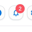
For a notification badge, the element the badge is attached to, such as an icon button, an avatar, or a tab. The badge is anchored over the host's corner and reports something about it. A status-label badge has no host; it stands inline as its own element.
Count or label content
What the badge says: nothing (a presence dot), a number (an unread count, capped with overflow), or a short word (a status or category). Numbers cap at a maximum and overflow to a form like 99+ so the marker does not grow without bound.
Accessible name
The text that makes the marker mean something to assistive tech: visually-hidden text such as "3 unread notifications", or an aria-label on the host. A purely decorative dot that repeats a meaning already in text is instead marked aria-hidden so it is not announced twice.
States
Count overflow
A numeric badge caps at a maximum and shows the cap with a plus when exceeded, so the marker stays a fixed small size. MUI's Badge defaults the cap to 99, rendering 99+ above it; Material implementations commonly cap at 999, rendering 999+. Choose a cap that fits the host and never let the raw number set the badge's width.
Empty / zero count
When the count is zero there is usually nothing to report, so the badge hides itself; MUI hides the badge automatically when the content is zero. Override that only when zero is itself meaningful in context (a deliberate showZero), in which case the zero is a real, announced status, not a leftover marker.
Positioning and anchoring
A notification badge is anchored to a corner of its host, most often the top-right of an icon or avatar, and overlaps the host's edge slightly so it reads as belonging to it. It is pinned with absolute positioning relative to the host and should not push surrounding layout around as its content changes from a dot to a number.
Dynamic update announcement
When a count changes while the page is open, the change should be announced without stealing focus. Placing the count text in a role=status live region (implicit aria-live polite) means a screen reader reports the new value when the user is idle rather than interrupting, matching how the visual badge updates quietly.
Responsive and small-size legibility
At badge sizes the number or label is tiny, so it needs enough contrast against its fill and against the host behind it to stay readable, and a max-width or cap so it does not wrap or overflow on narrow screens. A dot variant is the fallback when there is no room for a number at all.
References

Use it
Figma
A count badge with a dot/number boolean and overflow
- Build a Badge component with a boolean Show count property: off renders a small fixed-size dot, on renders an Auto Layout pill holding the number.
- Add a Count text property and, in the number variant, set a min width and full corner radius so single and double digits both read as a tidy circle or pill.
- Author the overflow state as a separate value (99+ or 999+) you swap in, since Figma will not compute the cap; note the real cap for the developer.
- Expose the fill as a variable so the page theme or an intent token can recolor it, and keep the text high-contrast against that fill.
Use tabular figures or a fixed digit width so the badge does not jitter in size as the count ticks from 9 to 10.
Anchor a badge to a host with Auto Layout plus absolute position
- Put the host icon or avatar in an Auto Layout frame, then drop the badge instance inside that frame.
- Set the badge to Absolute position and pin it to the top-right with constraints so it stays in the corner as the host resizes.
- Nudge it to overlap the host's edge slightly so it reads as attached, and give it a thin stroke in the background color to separate it from a busy icon.
- Add a Has badge boolean on the host component so a single toggle shows or hides the marker.
Because the badge is absolutely positioned, it is taken out of the Auto Layout flow, so changing it from a dot to a number will not push the icon around.
A status-pill component set keyed by an intent variable
- Create a Badge (status) component with an Intent variant property: Neutral, Info, Success, Warning, Critical.
- Bind each intent to a color variable for fill and text so the set themes consistently and meets contrast at small size.
- Put a real text Label in every variant (Paid, Pending, Sold out) and, where color does heavy lifting, include a small leading glyph so the meaning survives without color.
- Keep the pill Auto Layout with hug contents and a full radius so labels of different lengths stay balanced.
Add a note in the component description: the visible label is the accessible name, so never ship an intent that relies on the fill color alone.
Accessibility
A badge has no dedicated ARIA widget role because it is not a widget: it is a marker. The accessibility work is making its meaning reach assistive tech without color and without surprises. A count or color-only status must carry real text, via visually-hidden content or an aria-label on the host, and a dynamic count belongs in a role=status live region so updates are announced politely. A badge that merely restates visible text is decorative and is hidden with aria-hidden. Badges are typically non-interactive, so they carry no keyboard model of their own; any focus or activation belongs to the host element they sit on.
- Never rely on color alone (WCAG 1.4.1): pair every intent color with a word, glyph, or shape that carries the same meaning.
- Announce counts as real text and keep them current; a stale or silent count is worse than none.
- Maintain sufficient contrast at small sizes, both for the badge text on its fill and for the badge against the host behind it.
- Hide decorative dots from assistive tech so they do not add noise; expose only the markers that carry real information.
- Put any interactivity on the host element, and respect reduced-motion preferences for any badge appearance or pulse.
Research notes & sources
No dedicated role. Count badges announce via real text (visually-hidden or aria-label), often inside a role=status live region; decorative dots are aria-hidden.
- BadgesMaterial Design 3 (Google)
- React Badge componentMUI (Material UI)
- BadgeShopify Polaris
- Tag, UsageIBM Carbon Design System
- Notifications, Human Interface GuidelinesApple Developer
- Indicators, Validations, and Notifications: Pick the Correct Communication OptionNielsen Norman Group
- Understanding SC 1.4.1: Use of Color (Level A)W3C WAI (WCAG 2.1)
- ARIA: status roleMDN Web Docs
- Accessible hiding and aria-hidden exampleOrange Digital Accessibility Guidelines