Bento Grid
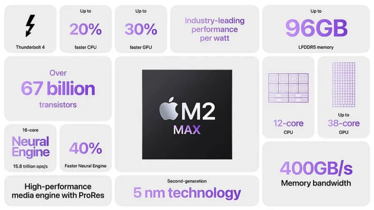
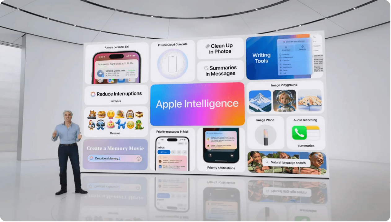
Content arranged into rounded, card-like compartments of different sizes on one shared grid, where size encodes priority.
Behavior
Keyboard
A bento grid is mostly a visual arrangement, so its accessibility hinges on one thing: keeping the reading and focus order matching the visual priority. The dense-packing tricks that make bento look effortless are exactly what scramble that order if used carelessly.
Parts
The grid
A single multi-column, multi-row grid (commonly built with CSS Grid template areas or column/row spans). Every cell snaps to it, which is what holds the composition together as one unit rather than a loose pile of boxes.
Cells (compartments)
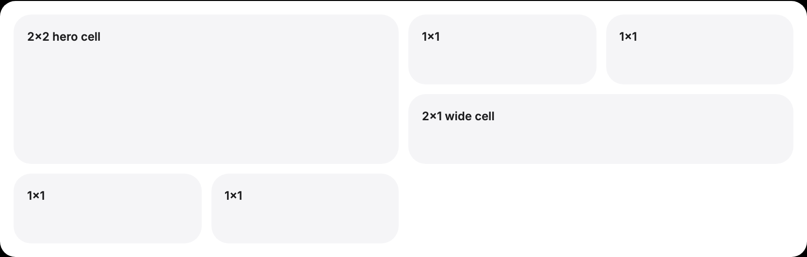
Self-contained tiles that span different track counts (1x1, 2x1, 2x2). Each holds one idea: a stat, a feature, an image, a quote. Rounded corners and a surface fill give each its boxed identity.
The hero cell
The largest compartment, carrying the headline message or primary visual. Its size is the first thing the eye lands on, so it sets the reading entry point for the whole grid.
The gutter
A single consistent gap between every cell. Uniform spacing is what makes differently sized cells still feel like one tray; uneven gaps break the bento read.
States
Responsive reflow
A bento grid reflows by merging and restacking cells, not by collapsing every cell into identical full-width boxes. Define how spans change at each breakpoint: the 2x2 hero might become 2x1, then 1x1, while small cells stack. Test that the priority order survives the collapse.
Interactive cells
When a whole cell is a link or button, the entire compartment should be the hit target, with a clear hover and focus state on the cell, not just its inner text. Keep one action per cell so the target is unambiguous.
Media cells
Cells holding an image or video should crop to fill (object-fit: cover) so the tile stays flush, and any overlaid text needs a scrim or gradient behind it to hold contrast against an unknown image.
Auto-placement caveat
grid-auto-flow: dense backfills gaps by pulling later cells forward, which visually tidies the grid but reorders cells away from source order, decoupling what you see from the DOM (and tab/read) order. Prefer explicit placement when order matters.
References
Use it
Figma
Build the tray with Auto Layout grid
- Create a frame and apply the Auto Layout grid (wrap) so children flow into rows; set a single gap value to act as your gutter.
- Make each cell a component with Auto Layout, a fixed corner radius (try 20px), and a neutral fill plus a 1px hairline stroke.
- Give wider cells a larger fixed width (or column span) so size reads as hierarchy; keep the radius and gap identical across all cells.
- Drop content into each cell as Auto Layout stacks so text and media resize cleanly.
Set one cell's fill to your accent and pull its content to white. Limit yourself to a single accent cell per frame so the hierarchy stays legible.
Make cells responsive with variants
- Build each cell component with a Size property: Large (2x2), Wide (2x1), Small (1x1).
- In a mobile frame, swap the Large hero to Wide or Small and let the wrap grid restack the rest.
- Check the visual order top-to-bottom matches the priority you want a reader (and a screen reader) to follow.
Lay out the mobile frame in true stacking order in the layers panel; that order is what a developer will translate into DOM order, which drives reading order.
Accessibility
A bento grid is mostly a visual arrangement, so its accessibility hinges on one thing: keeping the reading and focus order matching the visual priority. The dense-packing tricks that make bento look effortless are exactly what scramble that order if used carelessly.
- Keep DOM order equal to visual priority order. Source order is what keyboard and screen-reader users follow, so the hero cell should come first in the markup, not be floated into place.
- Do not rely on grid-auto-flow: dense or large grid-row/column reordering to place cells, since that visually moves cells out of source order and can violate a meaningful sequence (WCAG 2.4.3 Focus Order).
- Ensure text over image/video cells meets contrast against the busiest part of the media, not just the average; add a scrim.
- Every cell-level link/button needs a visible focus indicator on the cell itself.
- Do not let a cell's meaning depend on color alone (e.g. the one accent cell); pair it with a label or heading.
Research notes & sources
No dedicated role; a semantic region of grouped content (often headings + list/section landmarks)
- How to Use Bento Grids in Web DesignfreeCodeCamp
- Bento Grid: CSS recipe, real examples and limitsSuperdesign
- Build a bento grid layout with CSS
- Bento Grid Layouts 2026StudioMeyer
- Bento Grid: Explained with Examples and CodeBanani
- Web design trend: bento boxBootcamp (Medium)
- Apple iPhone product pageApple
- Linear marketing siteLinear
- Revolutionizing UI/UX in 2024 with the Bento UI Grid Design TrendStan Vision
- grid-auto-flowMDN Web Docs
- Understanding Success Criterion 2.4.3: Focus OrderW3C WAI (WCAG 2.1)