Button
A control that performs an action in place, as opposed to a link, which navigates away.
One primary action. Secondary, ghost, and destructive are visibly subordinate.
Publish stays focusable (aria-disabled) so this reason is reachable: add a title first.
Icon-only buttons name themselves with aria-label. The toggle uses aria-pressed.
Behavior
Keyboard
- Tab / Shift + Tab
- Moves focus to and from the button. A native <button> is in the tab order automatically; a div with role=button needs tabindex="0" to be reachable at all.
- Enter
- Activates the button. Native buttons fire on Enter for free; a custom role=button element must handle the keydown itself.
- Space
- Also activates the button. Both Enter and Space are required; this is a key difference from a link, which activates on Enter only.
Parts
Pressable container
The interactive surface itself, ideally a native <button>. It carries role=button implicitly, sits in the tab order, and activates on Enter and Space without scripting. A div or span styled as a button has none of this and must add tabindex, a keydown handler for both keys, and role=button to even approximate it.
Label
The text that names the action, and the button's accessible name when present. Lead with a strong verb and name the object: "Save changes", "Delete account", "Add to cart". Avoid vague labels like "Submit" or "Click here" that describe the mechanism rather than the outcome.
Icon
An optional glyph beside the label to aid scanning, or the entire content of an icon-only button. An icon alone carries no accessible name, so an icon-only button needs aria-label (or visually hidden text) describing the action, and a hit area that still meets the minimum target size.
Loading / busy indicator
A spinner or progress affordance shown while an async action runs, replacing or accompanying the label so the user sees the click registered. It also guards against double submission: feedback plus a temporary lock is friendlier than silence on a slow connection.
States
Default and hover
At rest the button reads as pressable through contrast, fill, or border. On pointer hover it gives immediate feedback, usually a slight darkening or shade shift, confirming it is interactive before the user commits. Hover is a pointer-only cue, so it must never be the only signal that an element is a button.
Focus (a visible ring)
When the button receives keyboard focus it must show a clearly visible focus indicator, commonly an outline or ring with sufficient contrast. This is what lets keyboard users know where they are. Use :focus-visible so the ring appears for keyboard navigation without cluttering mouse clicks, but never remove the indicator outright.
Active / pressed
On activation the button gives a brief pressed cue, a small color or depth change within roughly 100 to 150ms, so the click feels registered. For a two-state toggle button, the on/off condition is exposed with aria-pressed (true when pressed, false when not), distinct from this momentary press feedback.
Loading / busy
While an async action runs, show progress (a spinner, often with the label kept or swapped for a status word) so the user knows the click landed. This is also the humane fix for double-clicks: rather than firing the action twice, give fast feedback and lock the button briefly. GOV.UK ships a prevent-double-click option for exactly this, alongside server-side protection.
Disabled / unavailable
When an action is not yet available, a native disabled button blocks interaction, drops out of the tab order, and gives no reason. Consider keeping the control focusable with aria-disabled="true" (suppressing its action in script) so users can reach it and read an explanation of what to do to enable it. If you do disable natively, make sure the path forward is explained somewhere reachable.
References
Use it
Figma
A button component set with hierarchy and states
- Build a Button component set with two key properties: Emphasis (Primary, Secondary, Ghost, Destructive) and State (Default, Hover, Focus, Pressed, Disabled, Loading).
- Make the surface an Auto Layout frame with text plus optional icon slots, so labels of any length pad correctly without manual resizing.
- Expose the fill, text, and border as variables bound to the accent, so a primary in one theme restyles everywhere at once.
- For the Focus state, add a visible ring (an outer stroke or effect) so the prototype shows what keyboard users will see, and for Loading swap the label for a spinner.
Set a minimum height and horizontal padding that yield at least a 24px (ideally 44px) target, so the component bakes in the WCAG target size rather than relying on each designer to remember it.
Document button versus link
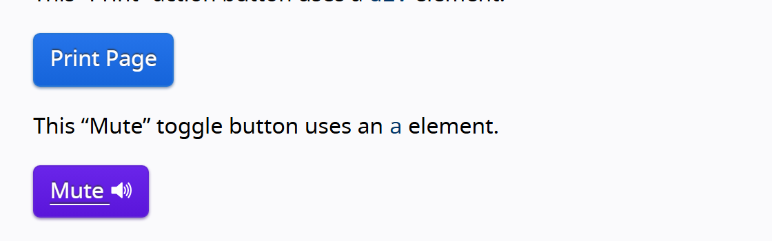
- Place two visually identical controls side by side: one a button, one a link styled as a button.
- Caption the button as performs an action in place (submit, open, toggle) and the link as navigates to a URL or resource.
- Add the keyboard note: buttons activate on Enter and Space, links on Enter only, and screen readers announce them differently.
- Finish with the one-line test: if it changes the address bar, it is a link; if it acts on this page, it is a button.
Keep this pair in the team library so the button-versus-link call is made once and reused, instead of being re-decided (and often gotten wrong) per feature.
Annotate the disabled and loading behavior
- On the Disabled variant, annotate whether it should use native disabled (removed from tab order) or aria-disabled (kept focusable with an explanation).
- Where an action is gated, write the reason it is unavailable and where the user will see that reason, rather than just greying the button out.
- On the Loading variant, note that the click must give feedback fast and that the action should be guarded against double submission.
- Add the icon-only note: any icon-only button needs an aria-label, since Figma shows the glyph but not the accessible name.
Figma can show the disabled look but not its tab-order consequence; the annotation is what stops a silently dead button from shipping.
Accessibility
Reach for the native <button> first: it is focusable, operable with Enter and Space, and announced as a button with no extra code. Give every button an accessible name (visible text, or aria-label for icon-only). Keep the focus indicator visible. Use aria-pressed for toggle buttons. Treat the native disabled attribute carefully, since it removes the control from the tab order and gives no feedback; aria-disabled keeps it reachable so the user can learn why. And remember the cardinal rule: if the control navigates, it is a link, not a button.
- Choose button vs link by function: buttons act in place, links navigate. Never swap them for visual reasons.
- Ensure a visible focus indicator for keyboard users; use :focus-visible rather than removing the outline.
- Meet the target-size guidance: at least 24 by 24 CSS pixels per WCAG 2.2 (2.5.8, AA), with 44 by 44 the enhanced target (2.5.5, AAA) and the platform norm for touch.
- Keep label text contrast at 4.5:1 or better, and do not let a disabled style drop legibility below readability.
- Write labels as verb-plus-noun ("Save changes"), not "Submit" or "Click here"; reserve a destructive (red) style for actions that are hard to undo.
Research notes & sources
Native <button> (role=button implicit); aria-pressed for toggles, aria-label for icon-only, aria-disabled to keep an unavailable action focusable
- Button Pattern (ARIA Authoring Practices Guide)W3C WAI
- <button>: The Button elementMDN Web Docs
- ARIA: button roleMDN Web Docs
- ARIA: aria-disabled attributeMDN Web Docs
- Understanding SC 2.5.8: Target Size (Minimum) (Level AA)W3C WAI (WCAG 2.2)
- Button States Communicate InteractionNielsen Norman Group
- OK-Cancel or Cancel-OK? The Trouble With ButtonsNielsen Norman Group
- Buttons (Material Design 3)Google
- Button (GOV.UK Design System)Government Digital Service
- Common actions: best practices (Shopify Polaris)Shopify
- A Web Developer's Guide to Buttons vs LinksThe A11Y Collective