Card
A self-contained box that groups an image, title, summary, and actions about a single subject into one moveable, scannable unit.
Behavior
Keyboard
- Tab
- Moves focus to the card's primary control (usually the title link), with a visible focus indicator.
- Enter
- Activates the primary link and navigates.
- Space
- Activates the primary control when it is a button.
- Tab (again)
- Moves to any genuinely separate secondary action, kept minimal, not back through redundant copies of the same destination.
Parts
Container (surface)
The bounding box that visually separates the card from its background with a border, a contrasting fill, or a drop shadow. The separation is what suggests the whole unit is a single, often clickable, surface.
Media
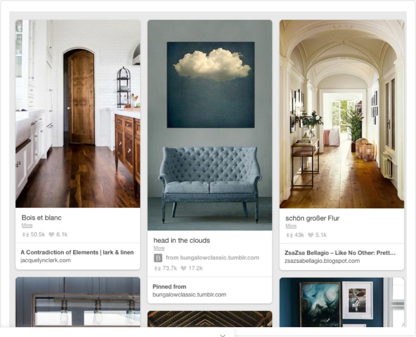
An optional thumbnail, hero image, or preview representing the subject. In feed and product cards it usually leads, giving the card its at-a-glance identity.
Title and supporting text
The headline naming the subject (typically the card's heading and its main link) followed by a short summary or metadata. This is the card's mini-hierarchy: one clear label, then brief detail.
Actions
One or more controls in a footer region: a button, a link, sometimes an overflow menu. Kept few, since a card is a summary and entry point, not a miniature web page.
States
Hover and elevation
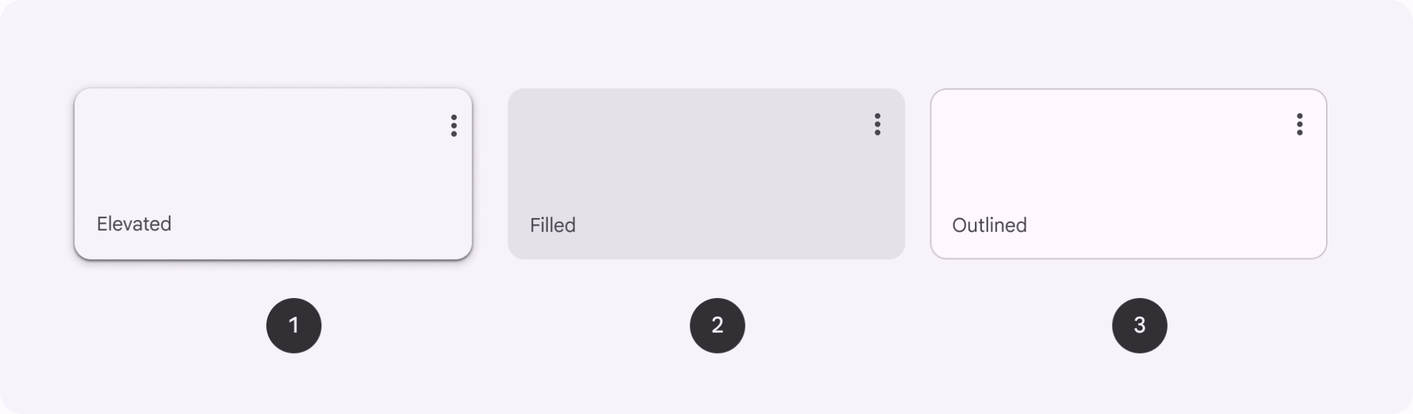
An interactive card responds to pointer hover with a visible cue. Material's elevated cards rest low and rise on interaction, reinforcing the surface metaphor. The cue should be more than a cursor change so the affordance is obvious.
Focus on the whole card
When a card is interactive, the keyboard focus state should show on the card, not just the inner link. Using focus-within lets the card adopt its hover or active styling whenever any control inside it is focused, giving keyboard users the same feedback as a mouse.
Nested interactive elements (the core trap)
A whole-card link that also contains buttons or secondary links creates ambiguous, verbose output for assistive tech, and nesting interactive elements strips semantics (a heading inside a button stops being a heading). This is the single hardest part of building a clickable card; see Accessibility for the fixes.
Loading and reflow
Before data arrives, show a skeleton that mimics the final shape (media block, title bar, text lines) to cut perceived wait and prevent layout shift. As modular blocks, cards reflow across breakpoints in a grid, so plan for variable content lengths and image sizes.
References
Use it
Figma
Build a responsive card with Auto Layout
- Make the card a vertical Auto Layout frame stacking media, title, supporting text, and an actions footer.
- Set the frame's horizontal resizing to Fill container and the text layers to Fill, so the card stretches to any column width.
- Set vertical resizing to Hug contents so each card in a grid sizes to its own content (consistent width, varying height).
- Drop the cards into a parent Auto Layout set to Wrap to get a reflowing responsive grid.
Pin the actions row to the bottom in its own horizontal Auto Layout footer so buttons align across cards of different heights.
One component, many card types, with properties
- Add a Style variant property: Elevated, Filled, Outlined, mapping to the three Material registers.
- Add boolean properties to toggle optional parts: hasMedia, hasSubhead, hasActions, hasOverflow.
- Expose the title and body as text properties and the media as an instance-swap property.
- Add a Hover variant that raises the shadow, then wire it with an interactive component to prototype the lift.
Keep the corner radius and padding as shared variables so every card type stays visually consistent across the set.
Accessibility
A card is not a native element and has no ARIA pattern of its own, so its accessibility comes entirely from real HTML semantics plus careful handling of the whole-card-clickable affordance. The central hazard is the block link: wrapping an entire card in one anchor makes screen-reader output verbose and ambiguous, and nesting multiple interactive elements compounds it.
- Expose exactly one primary interactive element to the keyboard; a card should not become a blob of links to the same place.
- If the image and title point to the same URL, give the image tabindex="-1" (with meaningful alt) so it is not a second tab stop to one destination.
- Put the heading before the content it labels in source order, so heading-shortcut users do not skip past the media to reach the label.
- A visible focus indicator is required (WCAG 2.4.7); cue linked titles with more than color when contrast against surrounding text is below 3:1.
- Keep cards from becoming miniature web pages: fewer tab stops and fewer competing actions read better for everyone.
Research notes & sources
No dedicated role; real semantics (heading, link, list). <article> only when truly self-contained
- Cards: UI-Component DefinitionNielsen Norman Group
- CardsMaterial Design 3 (Google)
- CardsInclusive Components
- Block Links, Cards, Clickable Regions, Rows, Etc.
- Accessible card UI component patternsUC Berkeley Digital Accessibility
- <article>: The Article Contents elementMDN Web Docs
- Patterns (ARIA Authoring Practices Guide)W3C WAI
- Tile: UsageCarbon Design System (IBM)
- Understanding Success Criterion 2.4.7: Focus VisibleW3C WAI (WCAG)
- React Skeleton componentMUI (Material UI)