Carousel
A set of slides shown one at a time in a single shared space, moved through with controls, dots, swipe, or auto-rotation.
Behavior
Keyboard
- Tab / Shift+Tab
- Move through the carousel's interactive controls in page order. APG places the rotation control and the previous/next buttons before the slide content so motion can be stopped first.
- Enter / Space
- Activate the focused button (previous, next, or the rotation toggle). These buttons do not move focus, so they can be pressed repeatedly.
- Left / Right Arrow
- When slide pickers are built as a tablist, arrow keys move between them following the Tabs pattern. When pickers are a group of buttons, each is reached with Tab instead.
Parts
Slide container / viewport
The fixed frame that clips the track so one slide shows at a time. It is often wrapped in a live region set to aria-live=off while rotating and aria-live=polite once stopped, with aria-atomic=false, so manual slide changes are announced but the timer does not spam assistive tech.
Slides
The individual items. Each is role=group with aria-roledescription=slide and an accessible name, falling back to a positional label like 3 of 10 when no better name exists.
Previous / Next controls
Native buttons that step one slide back or forward. They do not move focus, so they can be pressed repeatedly, and they should keep cycling rather than dead-ending on the last slide.
Slide pickers (dots / tabs)
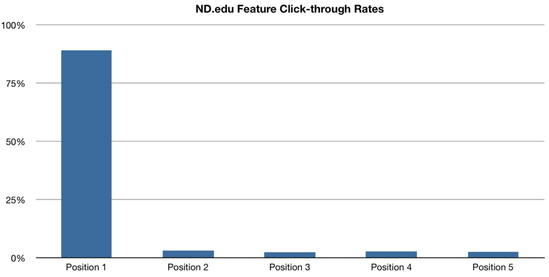
Jump-to-slide controls. APG offers two builds: a group of buttons, or a tablist where pickers use role=tab and follow the Tabs keyboard pattern. NN/g warns that bare dots are a weak cue, especially on mobile, and favors distinct, labeled controls.
Rotation play / pause control
A real button that toggles auto-rotation, with its label switching between Stop slide rotation and Start slide rotation. Required whenever the carousel moves on its own.
States
Auto-rotation, paused on hover and focus
If used, rotation starts on load, then halts when the pointer enters the carousel or keyboard focus moves into it, resuming only by explicit user action. The APG example does not auto-start rotation at all when the user prefers reduced motion.
Manual previous / next
Arrow buttons step through slides and should continue to cycle past the ends rather than disabling. Because they do not move focus, a user can click through the whole set without losing their place.
Current-slide indication
The active picker is marked, and the current slide carries its X of N label so both sighted and assistive-tech users can tell position. The previously shown slide is hidden from everyone, not just visually.
Responsive and touch swipe
On touch devices users expect to swipe between slides. Gestures should be added alongside visible arrows and indicators, never as the only way to move, since a swipe target is invisible and undiscoverable on its own.
References

Use it
Figma
A slide component set in a clipped viewport
- Build one Slide frame (image plus optional caption), make it a component, and duplicate it into the slides you need.
- Wrap the slides in a horizontal Auto Layout row (the track) with zero gap so they sit edge to edge.
- Put the track inside a viewport frame, turn on Clip content, and set the viewport width to exactly one slide for a classic carousel.
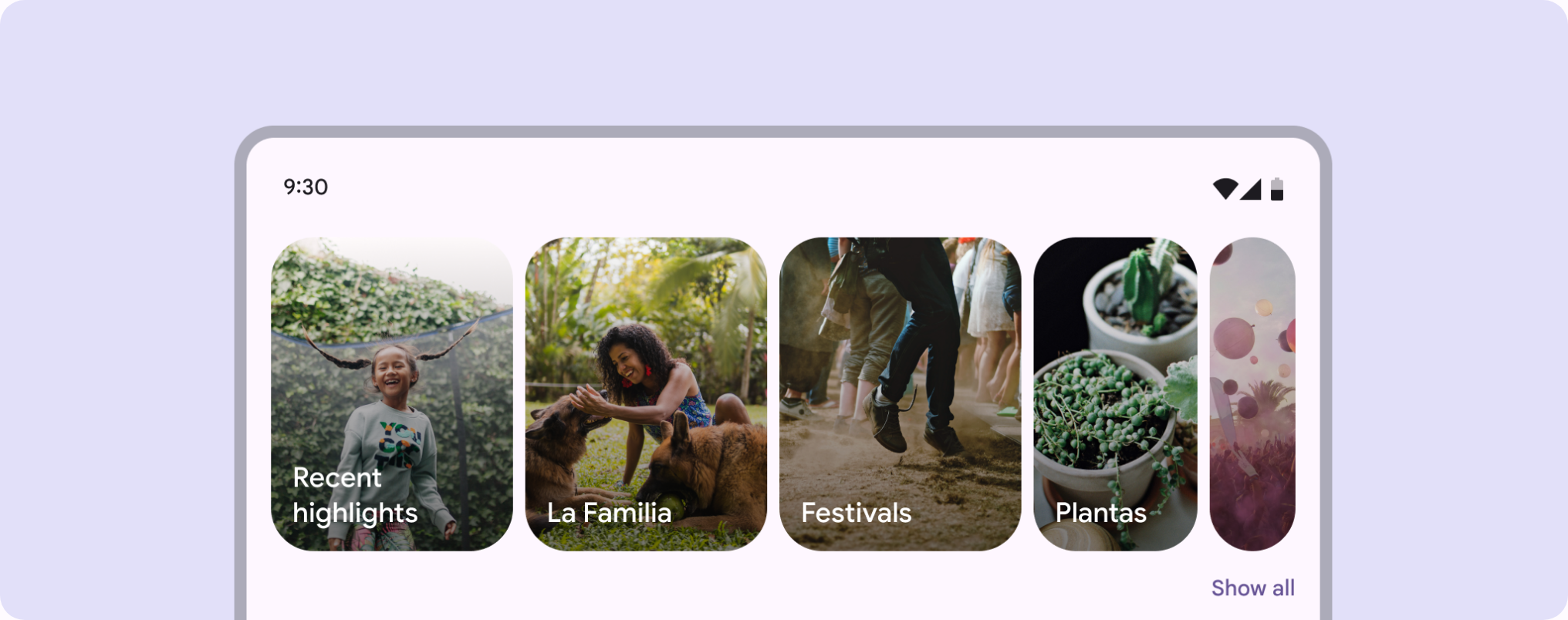
- To reveal a peek of the next slide, widen the viewport slightly or reduce the slide width so the neighbor's edge shows.
Keep every slide frame the same size so the track stays aligned and Smart Animate has matching layers to tween.
Prev/next and dot controls with state variants
- Place left and right arrow buttons over the viewport and a dot row beneath it.
- Make the dot a component with an Active and Inactive variant; set exactly one to Active per frame.
- Name each control for handoff so it maps to the ARIA names: previous, next, and go to slide X.
- Add a play/pause button if the design auto-rotates, and label its two states explicitly.
Design the prev/next buttons to cycle rather than disable at the ends, matching the recommended looping behavior.
Prototype the slide change with Smart Animate
- Duplicate the carousel frame once per slide state, advancing the track position in each.
- Wire previous, next, and each dot to the matching frame using an On click interaction.
- Set the animation to Smart Animate with an ease so the track glides between positions.
- Keep slide and control layer names identical across frames so Smart Animate matches and tweens them.
If you demo auto-rotation, use an After delay interaction, but pair it with a visible pause control so the prototype models the accessibility requirement, not just the motion.
Accessibility
A carousel is one of the hardest patterns to get right: it layers moving content, several control types, live-region timing, and keyboard semantics at once. The two anchors are the W3C APG Carousel pattern and WCAG 2.2.2 Pause, Stop, Hide. Put the rotation and prev/next controls before the slides in the tab order, pause motion on hover and focus, mark the container as a carousel and each slide as a slide, and manage the live region so the timer does not flood a screen reader.
- WCAG 2.2.2 (Level A): content that moves automatically, lasts more than five seconds, and sits alongside other content must offer a way to pause, stop, or hide it unless the motion is essential. An auto-rotating carousel triggers this squarely.
- Hide non-current slides from everyone (display:none, visibility:hidden, or the hidden attribute) rather than leaving them in the accessibility tree where a screen reader would count and read them.
- Honor prefers-reduced-motion: do not auto-start rotation, and avoid large sliding transitions, for users with vestibular or attention sensitivities.
- Never let focus jump when a slide changes; pause rotation on focus so a keyboard or screen-reader user is not chasing a moving target.
Research notes & sources
WAI-ARIA Carousel: aria-roledescription carousel/slide, group roles, live-region management, plus WCAG 2.2.2
- Carousel (Slide Show or Image Rotator) Pattern (ARIA Authoring Practices Guide)W3C WAI
- Understanding SC 2.2.2: Pause, Stop, HideW3C WAI
- Auto-Forwarding Carousels and Accordions Annoy Users and Reduce VisibilityNielsen Norman Group
- Designing Effective Carousels: Working with Content OverloadNielsen Norman Group
- Carousel Interaction Statserikrunyon.com
- A Step-By-Step Guide To Building Accessible CarouselsSmashing Magazine
- Product Page UX Best PracticesBaymard Institute
- CarouselMaterial Design 3 (Google)