Checkbox & Radio
Two sibling controls for choosing from a set: a checkbox toggles each option independently, a radio group lets exactly one option be chosen at a time.
A single on/off choice is a checkbox: it can be ticked and cleared. A lone radio could never be unchecked.
Behavior
Keyboard
- Tab / Shift+Tab (checkbox)
- Each checkbox is its own tab stop. Tab moves focus to the next checkbox or control; every checkbox in a group is individually reachable.
- Space (checkbox)
- Toggles the focused checkbox between checked and unchecked. A tri-state parent cycles its group: checking it checks all children, unchecking it clears them.
- Tab / Shift+Tab (radio group)
- Moves focus into or out of the whole group as one stop. Entering lands on the checked radio, or the first radio if none is checked; Tab again leaves the group.
- Arrow Down / Arrow Right (radio group)
- Moves focus to the next radio in the group, unchecks the previously selected one, and checks the newly focused one. Wraps from the last button to the first.
- Arrow Up / Arrow Left (radio group)
- Moves focus to the previous radio, unchecking the old and checking the new. Wraps from the first button to the last.
- Space (radio group)
- Selects (checks) the radio that currently has focus, if it is not already checked.
Parts
The control (box or circle)
The native input: a square box for a checkbox, a round button for a radio. Shape is the affordance that tells a user the rule before they read a label: square means 'pick any number', round means 'pick exactly one'. Prefer native input type=checkbox and input type=radio, which carry state, focus, and keyboard behavior for free.
Label
The text naming the option, tied to the control with a for/id pair (or by wrapping the input). The label is part of the click target: clicking the words toggles the control, which enlarges a small box into a comfortable target. Always place it to the right of the control so it is easy to find, especially for screen-magnifier users.
Group (fieldset + legend)
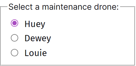
A fieldset wraps the related controls and its legend names the group. For radios the legend is the question; for checkboxes it states the set and, where helpful, how many may be chosen ('Select all that apply'). The legend is announced to screen readers as the context for every control inside, so the standalone label 'Email' becomes 'Contact method: Email'.
The shared name (radio binding)
Every radio in one group carries the same name attribute; that shared name is the mechanism that makes them exclusive and that submits a single value for the group. Each still needs a unique id and a distinct value. Checkboxes do not require a shared name to be a visual group, since each submits independently.
Hint and error text
Optional supporting copy inside the group: a hint clarifying the choice (or the selection rule), and validation text when a required group is left empty. Associate it with the group or controls via aria-describedby so it is announced, not just seen.
States
Checkbox toggle and the standalone case
Each checkbox is independent: clicking the box or its label flips that one between checked and unchecked, with no effect on its neighbors. A single standalone checkbox covers a binary opt-in (agree, subscribe) and can always be returned to off. Use positive, active labels so a tick clearly means yes.
Tri-state and the 'select all' parent
A parent checkbox can control a group of child checkboxes and reflect their combined state in three values: checked when all children are checked, unchecked when none are, and indeterminate (a dash, aria-checked=mixed) when some are. In native HTML the indeterminate look is set only in JavaScript via the element's indeterminate property; it is purely visual and does not change which boxes submit. Clicking the parent checks or unchecks all children.
Radio exclusivity and the roving-focus model
Selecting any radio in a group deselects the rest, since the group resolves to one value. Tab moves focus into the group as a single stop, landing on the checked button (or the first if none is checked). Arrow Down/Right moves to the next button, unchecking the old and checking the new; Arrow Up/Left moves the other way; both wrap around the ends. Space selects the focused button. Tab then leaves the group entirely.
Focus visibility and target size
Both controls need a clearly visible focus indicator, since the box itself is small. Extend the interactive target to include the label and surrounding padding so it meets comfortable touch sizing (Material specifies a 48 by 48 dp touch target around the visual control). The visible glyph can stay compact while the hit area is large.
Disabled and read-only states
A disabled control is dimmed, removed from the tab order, and not submitted; reserve it for choices that are currently unavailable, and explain why nearby so it does not read as a dead end. A disabled radio inside an otherwise active group is skipped by the arrow keys. Do not disable a control to communicate an error.
Responsive stacking
Selection lists read best stacked vertically, one option per line, which keeps boxes aligned for scanning and gives each row a full-width target on small screens. Horizontal rows save space for two or three short options but risk ambiguous label-to-control pairing and tighter targets; vertical is the safe default.
References


Use it
Figma
A checkbox and radio component set with all states
- Build two component sets, Checkbox and Radio, each with a Type property (the square box vs the round button) drawn as vector layers so the checked mark and the inner dot can be toggled cleanly.
- Add a State property covering Unchecked, Checked, Indeterminate (checkbox only, a dash), Focused, and Disabled, plus a boolean for the focus ring.
- Expose the box outline, the checked fill, and the mark color as variables bound to the page accent so a themed page can restyle them in one place.
- Compose a Row component that pairs the control with a label in an Auto Layout frame, with the control pinned left and generous row padding so the whole row reads as the target.
Keep the indeterminate dash as its own State value on the checkbox only; a radio has no mixed state, so do not let the property leak across the two sets.
Lay out a grouped checkbox and radio question
- Make a Group frame in vertical Auto Layout: a legend text at top stating the question, an optional hint line ('Select all that apply' for checkboxes), then the stacked control rows.
- Instance your Checkbox or Radio rows inside, one option per line, ordered logically, and add an 'Other' row with an attached text-field instance where the options cannot be comprehensive.
- For a radio group, pre-select a default option or include an explicit 'None / No preference' row, and annotate that a user cannot clear a radio set.
- Annotate the developer handoff: radios share one name and are a single Tab stop navigated by arrow keys; checkboxes are individual Tab stops toggled with Space.
Treat the legend as the real label of the group, not decoration; it is what a screen reader pairs with every option inside, so write it as the answerable question.
Prototype the tri-state 'select all' and arrow-key radio behavior
- Lay out a parent checkbox over a list of child checkboxes; with variants and interactive components, wire the parent's three states (all, none, some = indeterminate) to the children's combined state.
- Set the parent's click to check or uncheck every child at once, and a child's click to recompute the parent toward checked, unchecked, or the dash.
- For radios, use a single-select variant set so clicking one option deselects the rest, mirroring real exclusivity.
- Caption the frame that Figma cannot model the arrow-key roving selection or Space toggle, so the keyboard behavior must be specified for the build rather than shown.
Figma prototypes only model pointer clicks, so annotate the keyboard model (Space for a checkbox, arrows for a radio group) instead of implying clicking is the whole interaction.
Accessibility
Both controls are accessible out of the box when you use native input type=checkbox and input type=radio with a real, associated label and a fieldset/legend around the group. The keyboard models differ and must be respected: a checkbox is an ordinary tab stop you toggle with Space, while a radio group is a single tab stop whose selection moves with the arrow keys. Only reimplement with ARIA roles when native styling truly cannot be made to work; then you must rebuild focus, state, and keyboard handling yourself.
- Use a real label for every control; clicking the label must toggle the control, which also enlarges the target.
- Keep a visible focus indicator on the small box, and extend the clickable/touch target to roughly 44 to 48 px including the label.
- Do not pre-check checkboxes, and do not communicate an error by disabling a control; explain unavailable options in nearby text.
- Give a required group a clear question in the legend and announce any error or hint via aria-describedby.
- Maintain sufficient contrast for the box outline and the checked/selected glyph in every state, including disabled.
Research notes & sources
Native input type=checkbox and input type=radio; ARIA roles checkbox / radio / radiogroup only when reimplementing. Tri-state checkbox uses aria-checked=mixed.
- Checkbox Pattern (ARIA Authoring Practices Guide)W3C WAI
- Checkbox Example (Mixed-State)W3C WAI (APG)
- Radio Group Pattern (ARIA Authoring Practices Guide)W3C WAI
- <input type="checkbox">MDN Web Docs
- HTMLInputElement: indeterminate propertyMDN Web Docs
- <input type="radio">MDN Web Docs
- <fieldset>: The Field Set elementMDN Web Docs
- H71: Providing a description for groups of form controls using fieldset and legendW3C WAI (WCAG Techniques)
- Checkboxes vs. Radio ButtonsNielsen Norman Group
- Listboxes vs. Dropdown ListsNielsen Norman Group
- "Yes or No?" One Checkbox vs. Two Radio Buttons
- CheckboxesGOV.UK Design System
- RadiosGOV.UK Design System
- Checkbox (Material Design 3)Google
- Radio button (Material Design 3)Google