Command palette
A shortcut-summoned box for finding and running any command or destination by typing its name.
Studio / FN-214
FN-214
Checkout button overlaps footer on small screens
- Status
- In progress
- Project
- Web checkout
- Assignee
- Unassigned
Ctrl+K or ⌘K opens the palette while focus is in this window.
Empty query: recent and suggested
Nested page: Change status
No match, with a fallback
Behavior
Keyboard
- Ctrl+K / Cmd+K
- Opens the palette from anywhere in the product. Pressing it again closes it.
- Typing
- Filters the results. Standard text editing keys, including Home, End, and selection, keep working in the input.
- Down / Up
- Moves the highlight to the next or previous option, wrapping at the ends. DOM focus stays in the input.
- Enter
- Runs the highlighted command or opens the highlighted result. A command ending in an ellipsis opens a nested page instead.
- Escape
- Steps back out of a nested page. On the first page, closes the palette and returns focus to where it was opened.
- Backspace
- On an empty input inside a nested page, returns to the previous page.
- Tab
- Moves between the input and the close button. Focus never reaches the inert page behind the dialog.
Parts
Trigger and shortcut
A visible button, often shaped like a search box, plus a global chord such as Ctrl+K or Cmd+K. The button is the way in for pointer and touch users and the place to print the shortcut; aria-keyshortcuts exposes the chord to assistive technology but does not implement it.
Dialog
The modal surface over a dimmed page. Everything behind it is inert, and it needs an accessible name. A native <dialog> opened with showModal() supplies the inert page, Escape to close, and an implicit aria-modal=true.
Input (combobox)
The single text field: role=combobox, aria-controls pointing at the listbox, aria-autocomplete=list, and a real label, because a placeholder such as Type a command is not one. DOM focus never leaves it while the palette is open.
Scope indicator
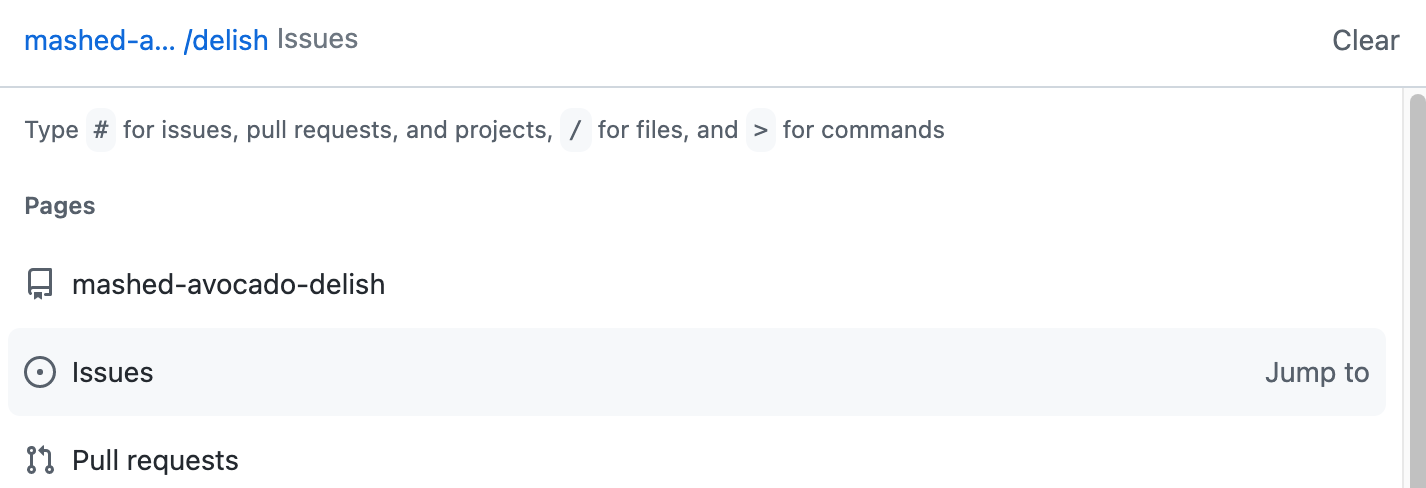
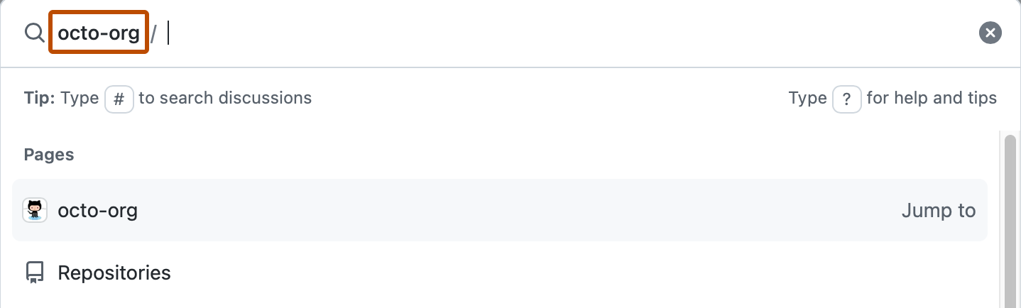
A chip or path before the input that shows where commands will run, such as the current repository or record. GitHub's palette uses the current location as the scope, Tab adds a highlighted repository to it, and Backspace removes items from it.
Result groups
Results gathered under headings such as actions, navigation, and records. In the listbox each group is role=group with an accessible name, usually its visible heading, and every group holds at least one option.
Result row
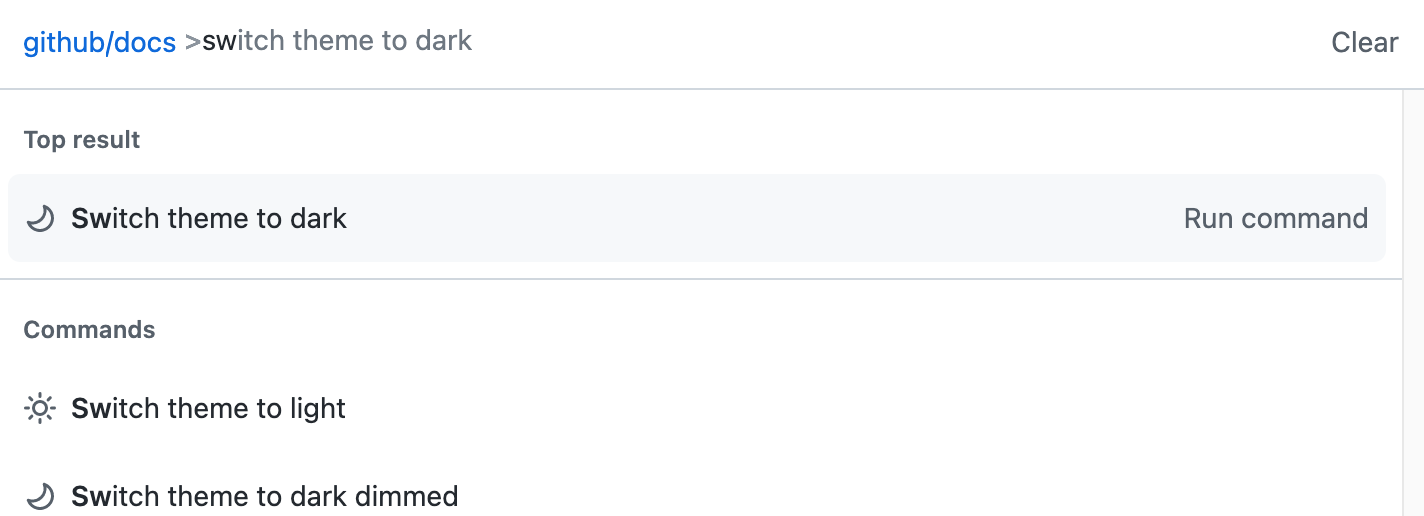
An icon, the command name with the typed characters emphasized, optional context such as Jump to or a record ID, the command's own keyboard shortcut, and a chevron when choosing it opens a nested page.
Footer hints
An optional strip of key hints (arrows to move, Enter to run, Esc to close) and mode prefixes. It teaches the keyboard model to first-time users and can be hidden on narrow screens.
States
Opening
The shortcut or the trigger opens the dialog with focus in an empty input. GitHub's palette closes with the same shortcut that opened it, as well as with Escape.
Empty query
Before anything is typed, show starting points rather than a blank list: recent items and suggestions for the current context. GitHub's palette opens on suggestions based on the current context and recently used resources.
Filtering and ranking
Each keystroke narrows the list and moves the highlight to the best match. Rank name-start and word-start matches above looser ones, and keep group order stable enough that positions can be learned.
Nested pages
Some commands need a second choice, such as a status or a project. Choosing one opens a page of options inside the palette, with the path shown as a chip. In cmdk's documented pattern, Escape goes back a page and Backspace on an empty input does the same.
Modes and prefixes
One field can search different things. VS Code runs commands, opens files, and finds symbols from the same window; GitHub switches with a leading character: > for commands, # for issues and pull requests, @ for people and repositories, / for files.
No results
Say plainly that nothing matched and offer a way forward, such as creating a record from the typed text. cmdk renders its Empty part automatically when the query matches nothing.
Running a command
Enter runs the highlighted row. Most commands close the palette, return focus to where the user was, and confirm the result in a status message; commands that open a nested page keep it open. GitHub adds Ctrl+Enter or Cmd+Enter to open a result in a new tab.
Small screens and touch
Without a keyboard there is no chord, so the visible trigger is the only door. Keep the dialog full width with a margin, rows tall enough to tap, and shortcut hints secondary.
References
Use it
Figma
A palette component with row variants
- Build a Row component with an Auto Layout frame: leading icon (instance swap), Label (text property), Hint (text property), Shortcut (boolean), and Chevron (boolean) for commands that open a page.
- Add a State property with Default and Highlighted. Highlighted gets a tint plus a 2 px leading bar, so it reads without color alone.
- Stack Group headings and Rows in a vertical Auto Layout list, then wrap header, list, and footer in a Palette frame about 560 to 640 px wide with Clip content on.
- Bind surface, text, and hairline colors to variables with Light and Dark modes so the palette follows the product theme.
Keep the Shortcut chips as their own small component so one change updates the Ctrl and ⌘ labels everywhere.
Design every state as a variant
- Create a Palette component set with a State property: Empty query, Filtered, Nested page, No results, and Loading.
- Empty query shows Recent and Suggested groups; Filtered shows groups reordered by match with the typed letters in bold.
- Nested page adds a scope chip such as FN-214 › Change status before the input and lists only that page's options.
- No results states what did not match and offers one fallback row, such as Create issue with the typed text.
Put the query in a text property so each variant can be checked with long and short queries without editing layers.
Prototype the shortcut and the arrow keys
- On the app frame, add a Key/Gamepad trigger for Ctrl+K (and ⌘K) that opens the palette as an overlay, positioned top center with a dimmed background.
- Duplicate the overlay once per highlighted row and connect Down arrow and Up arrow key triggers between them.
- Connect Enter on each highlight to its destination frame, and Escape to Close overlay.
- Annotate what the prototype fakes: real filtering on typed text, focus staying in the input, and focus returning to the trigger on close.
Name highlight frames by row (Highlight 1, Highlight 2) so reviewers can follow the arrow-key path in the prototype flow list.
Keep the command catalog as a table
- Add a table frame with columns for command name, group, aliases, shortcut, scope, and whether it opens a nested page.
- Write names verb first and lead with the word that differs (Assign to me, not Issue: assign to me).
- List aliases people might type, such as new, add, and make for Create.
- Flag any shortcut that collides with a browser, OS, or screen reader key before it ships.
Sort the table by group so it matches the palette's own order and gaps are easy to spot.
Accessibility
A command palette is a modal dialog around an editable combobox, and both halves must be complete. Open with focus in the input; keep DOM focus there while Up and Down move aria-activedescendant through a listbox of options; contain Tab inside the dialog; close on Escape; and return focus to the element that opened it. A native <dialog> opened with showModal() provides the inert page, Escape, and implicit aria-modal.
- Mark the dialog modal only when it is: the page behind must be inert and visually obscured. APG warns that aria-modal on a dialog that does not behave modally harms the assistive technology users it is meant to help.
- Make the shortcut visible on the trigger and beside each command, and expose it with aria-keyshortcuts.
- Do not claim a chord the browser, operating system, or assistive technology already uses for something else. GitHub notes that its Ctrl+K defaults may conflict with OS and browser shortcuts, lets people change them, and uses Ctrl+Alt+K or Cmd+Option+K while a Markdown editor has focus.
- A modified chord such as Ctrl+K falls outside WCAG 2.1.4, but single-character shortcuts such as a bare /, ?, or C do not: let people turn them off or remap them, or make them active only while the relevant component has focus.
- Keep option names short and lead with the word that differs. APG notes that options sharing a long common prefix slow screen reader users, who hear the repeated words before the part that matters. Category prefixes, like those in the VS Code guideline example, trade against this.
- Announce the result count and the outcome of a command in a polite status region, since the dialog closes on most commands.
- Never make the palette the only path to a feature. It accelerates people who know a command's name; menus and visible controls still have to reach everything.
- Show the highlighted row with a shape, such as an edge bar, not tint alone, and respect reduced motion for any open or resize animation.
Research notes & sources
A modal dialog (native <dialog> opened with showModal(), or role=dialog with aria-modal=true) containing an editable combobox: role=combobox on the input with aria-expanded, aria-controls, and aria-activedescendant over a listbox of grouped options
- Combobox Pattern (ARIA Authoring Practices Guide)W3C WAI
- Listbox Pattern (ARIA Authoring Practices Guide)W3C WAI
- Dialog (Modal) Pattern (ARIA Authoring Practices Guide)W3C WAI
- <dialog>: The Dialog elementMDN Web Docs
- ARIA: aria-keyshortcuts attributeMDN Web Docs
- Understanding SC 2.1.4: Character Key Shortcuts (Level A)W3C WAI (WCAG 2.1)
- GitHub Command PaletteGitHub Docs
- User Interface: Command PaletteVisual Studio Code docs (Microsoft)
- Tips and Tricks: Command PaletteVisual Studio Code docs (Microsoft)
- Command Palette (UX Guidelines)Visual Studio Code extension API docs (Microsoft)
- Command K Bars
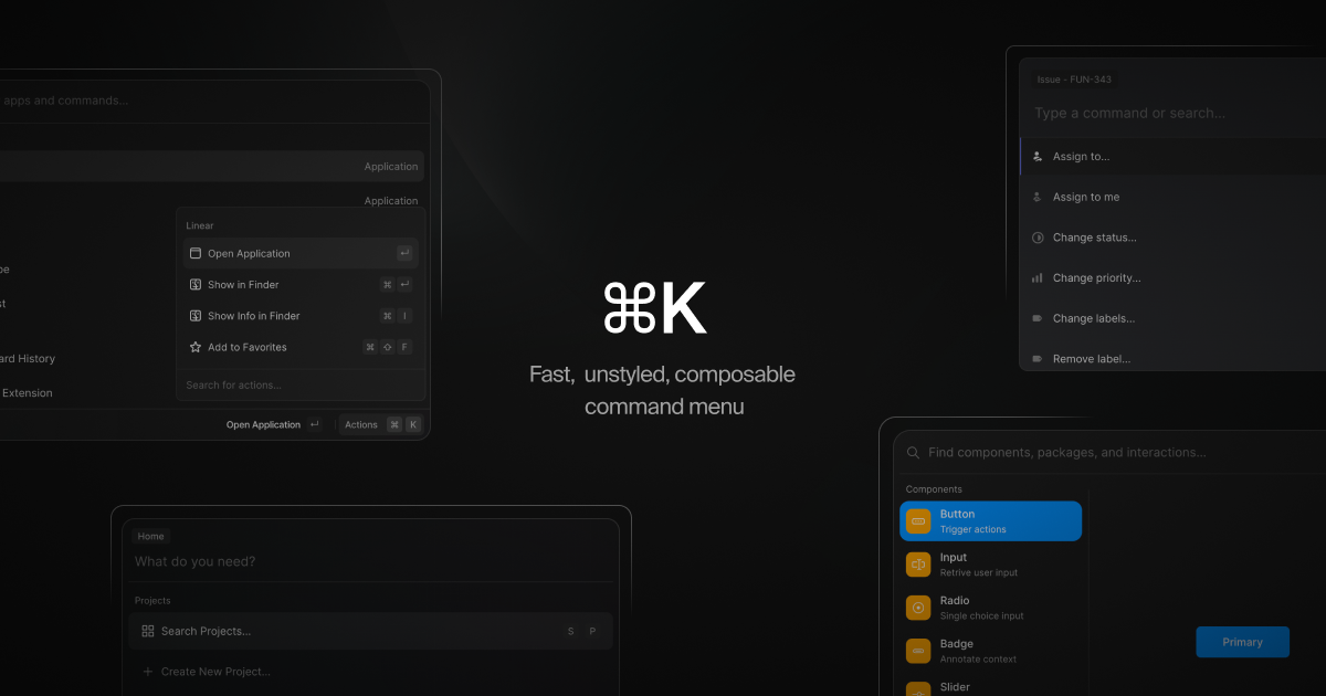
- ⌘K (cmdk): a command menu React componentGitHub