Drawer
A panel that slides in from an edge for navigation, filters, or a focused task, modal when it should block, standard when it should not.
Modal: scrim dims the page, focus is trapped, Esc / scrim / × all close.
A bottom sheet: a drawer anchored to the bottom edge for quick actions.
Behavior
Keyboard
- Enter / Space
- Activates the trigger to open the drawer.
- Tab / Shift+Tab
- Moves through the drawer's controls. In a modal drawer focus is trapped: Tab from the last focusable element wraps to the first, and Shift+Tab from the first wraps to the last.
- Escape
- Closes a modal drawer and returns focus to the trigger. A native modal <dialog> provides this automatically.
Parts
Trigger
The control that opens the drawer, commonly a menu or filter button. Keep a reference to it: when the drawer closes, focus must return to the element that opened it.
Panel / sheet
The sliding container itself, anchored to an edge. When modal it is a dialog with an accessible name; it holds the navigation, filters, details, or task, and should manage its own scrolling when content is long.
Scrim / backdrop
The dimmed layer behind a modal drawer that signals the page is paused and provides a click target to dismiss it. With a native modal <dialog> it is the ::backdrop, supplied by the browser.
Header and close control
A title that names the drawer (and its accessible name) plus an explicit close button. The close control is essential: it is the discoverable exit alongside Escape and the scrim.
States
Open and slide-in
The drawer animates in from its anchored edge when triggered. A modal drawer simultaneously raises a scrim and makes the page behind inert; a standard drawer simply pushes or overlays alongside content that stays usable.
Focus on open and close (modal)
When a modal drawer opens, focus moves inside it, to the first focusable element or a sensible target, and is trapped: Tab from the last focusable element wraps to the first. When it closes, focus returns to the trigger that opened it.
Dismissal
A modal drawer closes on Escape, on a tap of the scrim, and on its close button, and a native modal <dialog> handles Escape automatically. A standard drawer is typically toggled by its trigger or a close control rather than light-dismissed.
Edge and size
Drawers anchor to any edge: left and right for navigation and details, bottom for mobile sheets, top for utilities. The panel is bounded in the axis it slides from and usually scrolls internally when its content exceeds the viewport.
Responsive role
The same content may be a standard, always-visible side panel on desktop and a modal drawer on mobile, where space forces an overlay. The collapse is the responsive form of navigation, with the discoverability tradeoff that implies.
References
Use it
Figma
A modal drawer with a scrim
- Build the panel as a full-height Auto Layout frame pinned to the right or left edge, with a header (title and close button) and a scrolling content area.
- Place a semi-transparent scrim rectangle behind the panel, covering the page.
- Show the page content beneath the scrim so the modal relationship is clear.
- Annotate that the panel is a dialog (aria-modal=true), focus is trapped, and Escape and the scrim both dismiss it in the build.
Make the scrim its own layer beneath the panel so you can reuse the panel without the scrim for the non-modal variant.
Prototype the slide-in and dismissal
- Hide the drawer, then add an On Click from the trigger that opens it with Move In from the anchored edge.
- Set the scrim to close the drawer on click, mirroring tap-to-dismiss.
- Add Move Out on the close button for symmetry, and note reduced-motion handling.
- Annotate that Escape must also close it and focus must return to the trigger, which a prototype cannot fully show.
Use Move In and Move Out on the same edge so the drawer appears to slide from and back into the screen edge, not fade.
Standard versus modal as variants
- Make a component with a Type property: Standard and Modal.
- In Modal, include the scrim and show the page dimmed; in Standard, drop the scrim and keep the page at full contrast beside the panel.
- Keep the panel content identical across both so only modality changes.
- Annotate that Standard does not trap focus or inertize the page, while Modal does.
Drive modality with a single variant property so designers switch behavior without rebuilding the panel.
A responsive side panel that collapses
- Create a desktop frame with the panel docked beside the content as a standard sidebar.
- Create a mobile frame where the same panel is a modal drawer opened from a menu button, with a scrim.
- Show both so the responsive transformation is explicit.
- Annotate the breakpoint at which the sidebar becomes a drawer and the discoverability tradeoff of hiding navigation.
Reuse the same panel content in both frames so the desktop sidebar and mobile drawer stay genuinely the same component.
Accessibility
Treat a modal drawer as a modal dialog: role=dialog with aria-modal=true (or a native <dialog> via showModal()), an accessible name from its title, focus moved inside on open and trapped while open, focus returned to the trigger on close, and dismissal via close button, Escape, and scrim. A standard, non-modal drawer does not trap focus or inertize the page, but still needs a clear name and a reachable close.
- Make the scrim a dismiss target for modal drawers, and ensure Escape and the close button do the same.
- Keep the panel scrollable when content is long, without losing the header or close control.
- Do not bury primary navigation in a drawer on spacious screens; hidden navigation is used less than visible navigation.
- Respect reduced-motion for the slide animation, and meet contrast and target-size requirements for the close control and scrim.
- Prevent background scroll while a modal drawer is open so the inert page does not move beneath it.
Research notes & sources
A modal drawer is a dialog: role=dialog with aria-modal=true (or <dialog>.showModal()), an accessible name, focus moved in and trapped, Escape and scrim to close, focus returned to the trigger
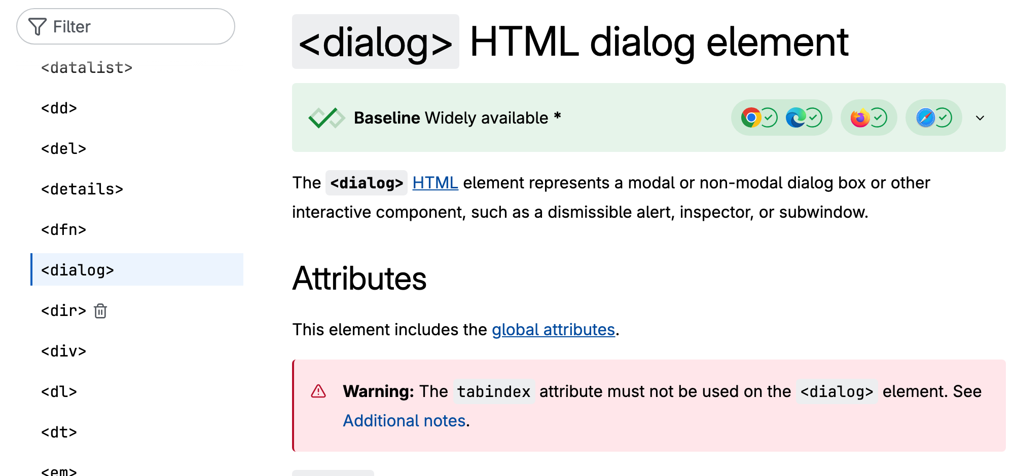
- <dialog>: The Dialog elementMDN Web Docs
- Dialog (Modal) Pattern (ARIA Authoring Practices Guide)W3C WAI
- Creating An Accessible Dialog From ScratchSmashing Magazine
- Hamburger Menus and Hidden Navigation Hurt UX MetricsNielsen Norman Group