Dropdown Menu
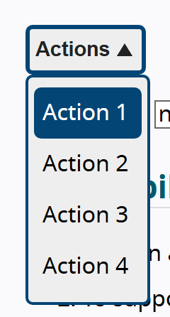
A button that reveals a short list of commands on a temporary surface, then collapses once one is chosen.
Open the menu, then use the Up/Down arrows, type-ahead, Enter, or Esc.
Current density: Comfortable. A short action menu keeps a related set of choices one click away without spending resting space.
Behavior
Keyboard
- Enter / Space
- On the trigger, open the menu and focus the first item. On an item with a submenu, open it. On a normal item, activate it and close the menu.
- Down / Up Arrow
- On the trigger (optional), open the menu and focus the first or last item. In the menu, move focus to the next or previous item, optionally wrapping at the ends.
- Home / End
- Move focus to the first or last item in the menu.
- Character keys
- Type-ahead: move focus to the next item whose label begins with the typed printable character.
- Right / Left Arrow
- On an item with a submenu, Right opens it and Left closes it. In a horizontal menubar, they move between top-level items.
- Escape
- Close the menu and return focus to the trigger from which it was opened.
- Tab / Shift+Tab
- Move focus out of the menu and close it. Tab does not move between items inside the menu.
Parts
Menu button / trigger
The persistent control that opens the menu. It carries role=button, aria-haspopup=menu, and aria-expanded reflecting open or closed state, and usually shows a caret to hint a menu will appear.
Menu / popup surface
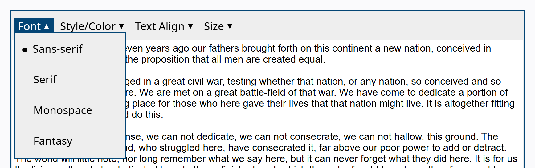
The temporary container with role=menu, labelled via aria-labelledby pointing at the trigger or via aria-label. It is a composite widget that owns focus internally and is vertical by default.
Menu item
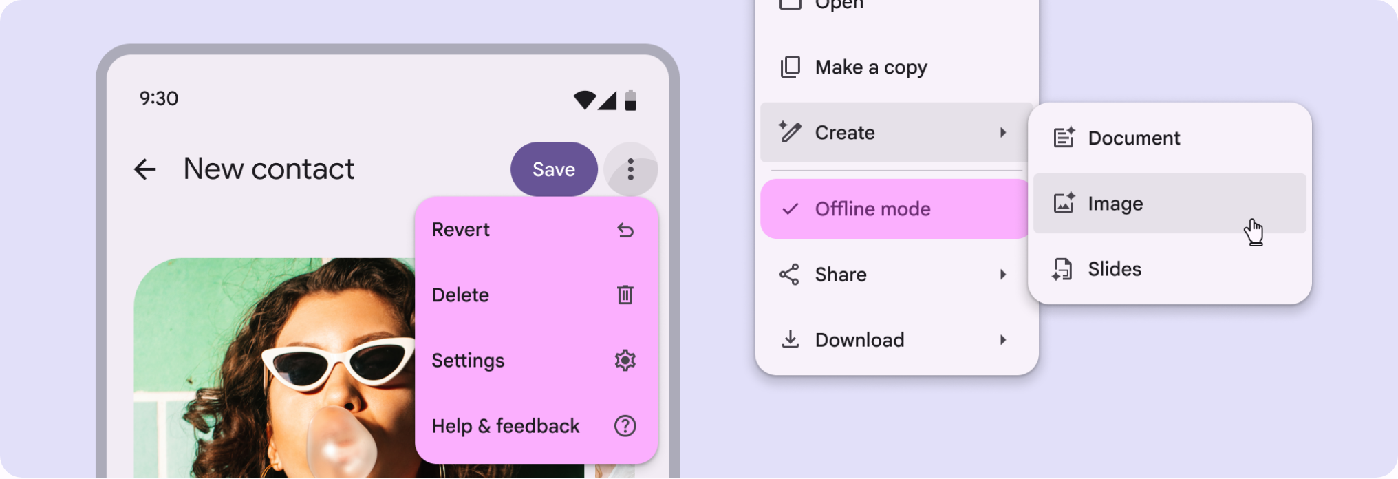
Each choice, with role=menuitem, or menuitemcheckbox and menuitemradio for toggles and exclusive sets. Every item needs an accessible name, taken from its contents by default.
Separator / group
A role=separator divides item groups (notably radio sets); separators are not focusable or interactive. Disabled items use aria-disabled=true and stay focusable but cannot be activated.
Submenu (cascading)
A parent menuitem with aria-haspopup=menu and aria-expanded opens a nested role=menu placed immediately after it in the DOM, reached with Right Arrow.
States
Open / closed
The trigger toggles the surface; aria-expanded is true while shown and false while hidden. On open, focus moves into the menu (first item via Enter, Space, or Down Arrow; last item via Up Arrow). On close, focus returns to the trigger.
Highlight and current item
Items show a focus or active highlight as the user arrows or hovers through them, with only one item current at a time, managed via a roving tabindex or aria-activedescendant.
Submenu open and type-ahead
A parent item opens its submenu on Right Arrow or Enter, moving focus to the submenu's first item; Left Arrow or Escape closes it and returns to the parent. Pressing a printable character moves focus to the next item whose label begins with that character.
Positioning and disabled items
The surface is positioned next to the trigger and should reposition to stay on screen, with a max height at least one row short of the viewport so it never fully covers the UI. Unavailable items are grayed out and kept in place for spatial consistency rather than removed.
References
Use it
Figma
A menu item as a component set with states
- Create one Menu Item component, then add a State variant property: Default, Hover, Focus, and Disabled.
- Optionally add a Type property: action, checkbox, radio, and with-submenu.
- Use Auto Layout so the item grows with its label and can hold a leading icon plus a trailing caret or shortcut.
- Give Hover and Focus visibly different treatments, matching focus to the arrow-key position in the keyboard model.
Naming Focus distinctly from Hover keeps the spec honest for handoff, since arrow-key focus and pointer hover are different states in a real menu.
Assemble the surface with Auto Layout
- Make a Menu frame with vertical Auto Layout and instance your Menu Item components into it.
- Insert a thin divider component between groups and name it Separator so it maps to role=separator.
- Set padding, corner radius, and an elevation or shadow style.
- Set a max height with Clip content so long menus scroll, mirroring the guidance to stay a row short of the viewport.
Reuse the same Menu and Menu Item components for submenus so a nested menu inherits every state automatically.
Wire the open and closed states for prototyping
- Make the trigger a component with an Expanded property: false and true (the caret rotates and the background activates on true).
- Use an interactive overlay or component property so clicking the trigger shows the Menu anchored to it.
- Set the overlay to close on click outside and on Esc.
- Add a handoff note recording aria-haspopup and aria-expanded so engineers keep the disclosure contract.
Model submenus as a nested Menu overlay positioned to the parent item's right edge, opened from the with-submenu variant, and keep nesting to one level.
Accessibility
The accessible dropdown is the WAI-ARIA menu-button pattern. Because browsers give no automatic keyboard behavior to ARIA widgets, the author must build the full keyboard model, manage focus, and return focus to the trigger on close. Use this pattern only for genuine action menus: do not apply role=menu to site navigation or to value selection, where it makes the interface less accessible, not more.
- On close, always return focus to the trigger so keyboard users are not stranded where the menu used to be.
- Do not use menu, menubar, or menuitem roles for site navigation: use a nav with a list of links, optionally a disclosure widget. Menu roles advertise desktop-style key commands that do not belong on a normal page.
- A native select and a custom combobox are not menus; repurposing a select for navigation causes an unexpected change of context.
- Keep nesting shallow: one tier of submenu is fine, two gets frustrating, and more than two is inadvisable.
Research notes & sources
WAI-ARIA Menu Button: button[aria-haspopup][aria-expanded] opens role=menu of role=menuitem, arrow-key navigation
- Menu Button Pattern (ARIA Authoring Practices Guide)W3C WAI
- Menu and Menubar Pattern (ARIA Authoring Practices Guide)W3C WAI
- Developing a Keyboard Interface (ARIA Authoring Practices Guide)W3C WAI
- Actions Menu Button Example Using element.focus()W3C WAI
- Editor Menubar ExampleW3C WAI
- ARIA: menu roleMDN Web Docs
- Dropdowns: Design GuidelinesNielsen Norman Group
- Don't Use ARIA Menu Roles for Site Navadrianroselli.com
- Menus & Menu ButtonsInclusive Components
- Action list componentShopify Polaris
- MenusMaterial Design 3 (Google)