List–Detail
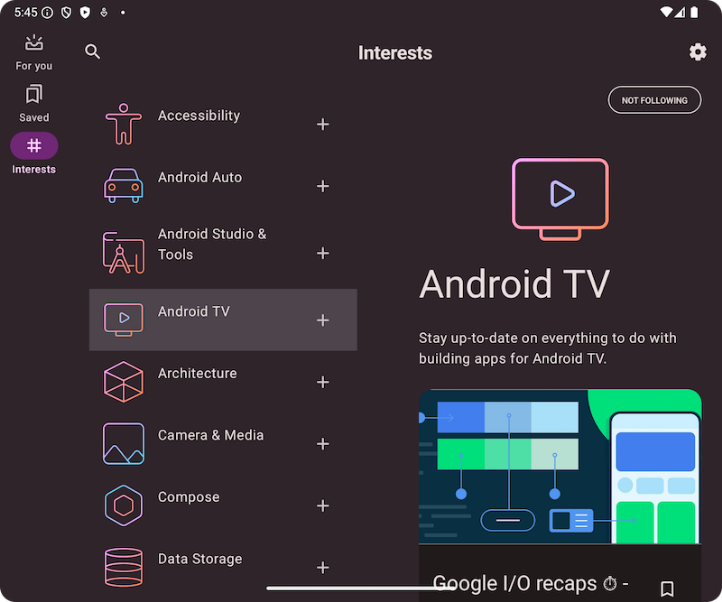
Browse a list while viewing the details of one selected item.
Studio inbox
The proof is ready
The first print of the coastal field guide is ready for review. The green ink has a softer finish on the uncoated stock, and the contour lines are holding well.
Please check the fold and the map labels before we start the full run.
Coastal field guide
Selected: The proof is ready
Behavior
Keyboard
- Tab
- Move among item buttons and detail controls.
- Enter / Space
- Open the focused item or activate Back to list.
Parts
List pane
The collection and its selected item.
Detail pane
The full content of that item.
Back control
Returns to the list when only one pane fits.
States
Selection
Choosing an item updates the detail pane and marks the current item.
Compact
Show one pane at a time; preserve selection when returning to the list.
No selection
Offer a useful prompt before an item is chosen.
References
Use it
Figma
Build the list–detail
- Build separate list and detail frames with shared item data.
- Create selected and unselected row variants.
- Prototype wide and compact views, and annotate where keyboard focus moves on selection and return.
Accessibility
Selection, focus, and the visible pane must stay in sync, especially when a pane disappears.
- Give the selected item an accessible current state.
- When selection hides the list, move focus into the detail pane; restore focus on return.
- Use links for real destinations or buttons for local updates. Do not apply listbox roles without its keyboard model.
Research notes & sources
No dedicated layout role; use a semantic list of controls and a labelled detail region.
- Reference image attribution and licensesSource and capture record
- Build a list-detail layoutAndroid Developers
- Canonical layout examplesGoogle Material Design
- Content structureW3C WAI