Modal / Dialog
A focused surface that opens above a page and blocks interaction with the content behind it.
Parts of a modal dialog
1
2
3
Delete project?
This permanently removes the project and its files.
4CancelDelete
- 1BackdropPrevents background interaction
- 2DialogContains the focused task
- 3Title and bodyIdentifies the purpose
- 4ActionsComplete or cancel
Keyboard focus and dismissal
- 01OpenTrigger activates
- 02EnterFocus moves in
- 03ContainTab cycles inside
- 04CloseEsc or action
- 05ReturnFocus returns
Use a modal for
- Destructive confirmations
- Short, focused tasks
- A response required before continuing
Keep content inline for
- Passive information
- Long or multi-step flows
- Routine marketing prompts
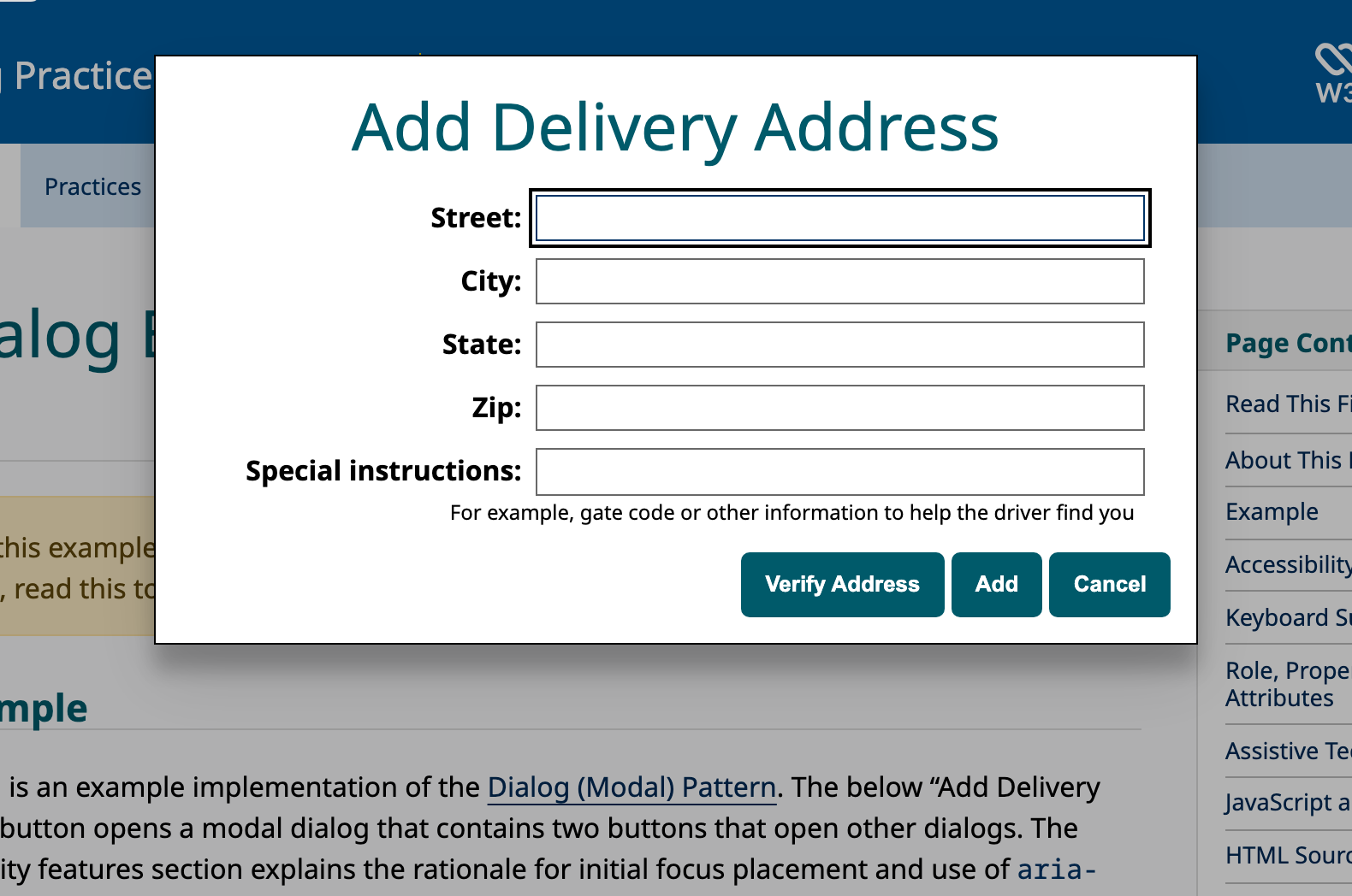
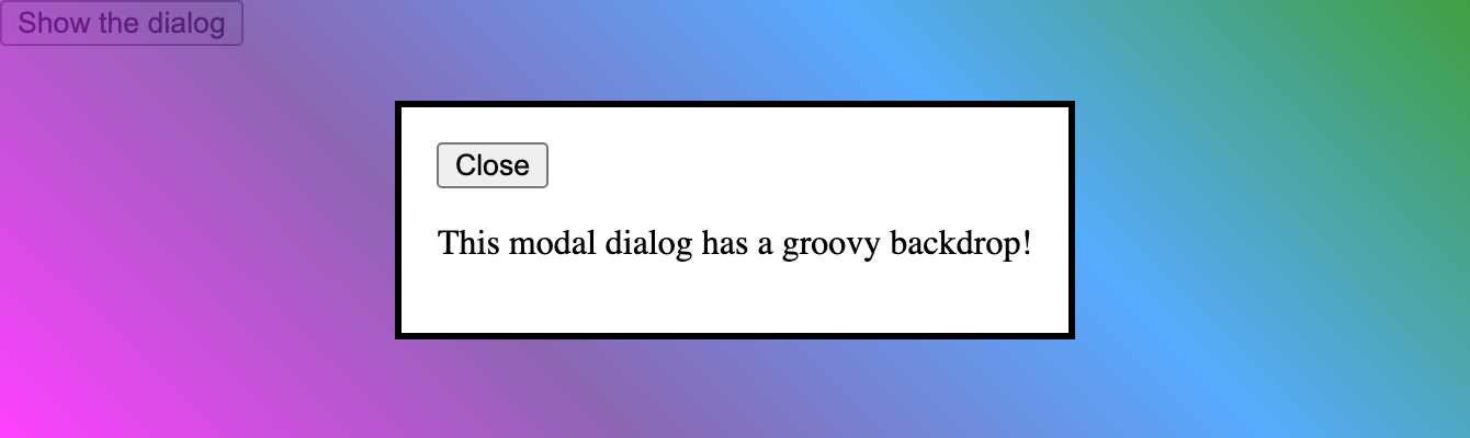
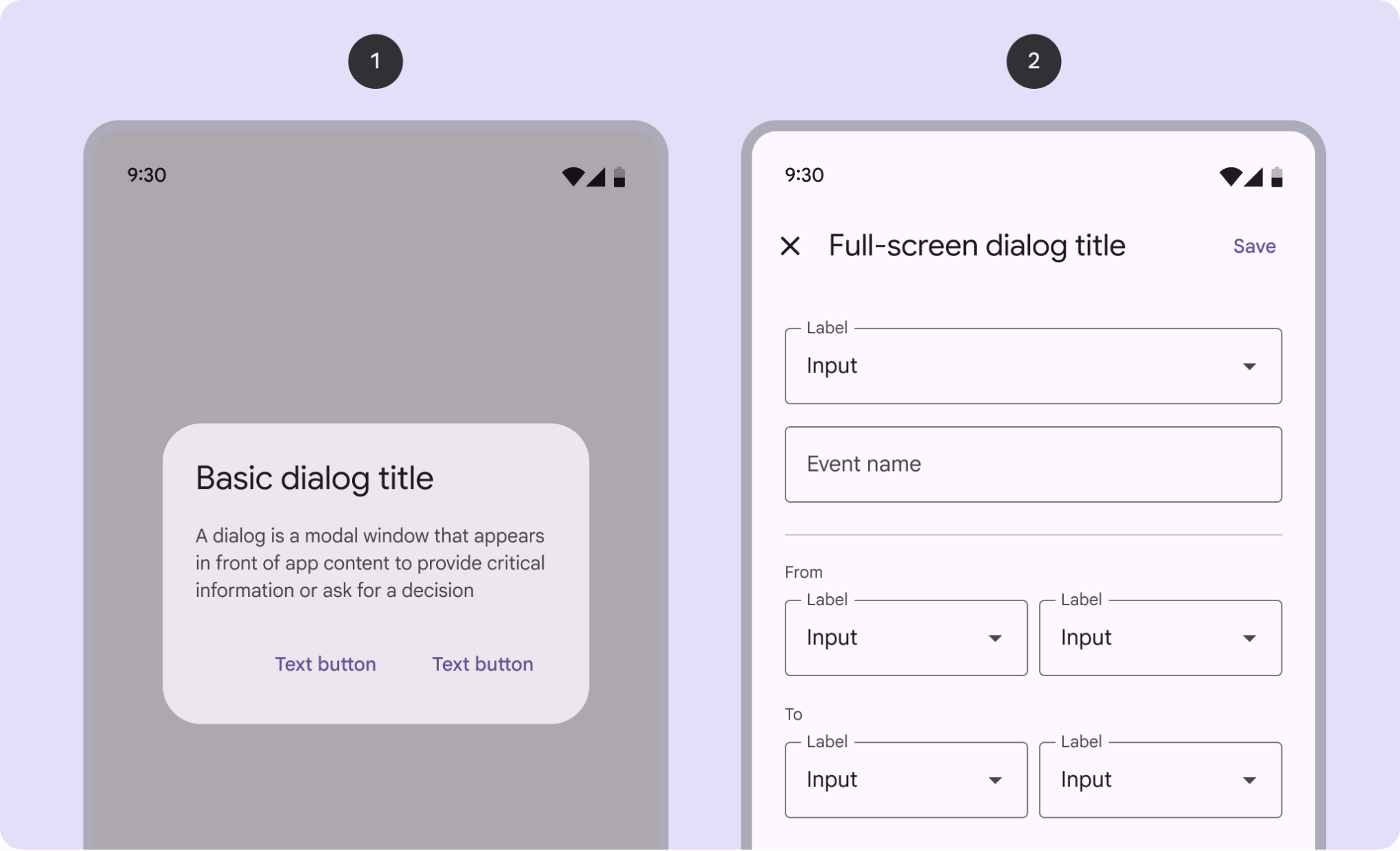
Reference screenshots
Use it
Figma
A dialog component with a scrim and surface
- Make a viewport-sized frame as the scrim, filled black at roughly 40 to 50 percent opacity.
- Inside, place the surface: a vertical Auto Layout frame at a fixed comfortable width, with padding, a corner radius, and an elevation shadow.
- Stack three sections: a header (title plus an optional close X pushed right), a body that fills the width, and a right-aligned footer row of Cancel and Confirm.
- Make it a component set with a Type variant: dialog (neutral) and alertdialog (a leading status icon and an emphasized or destructive confirm).
Keep the safe action visually dominant and place destructive actions so they are not the easy default, mirroring the focus-the-safe-option rule.
Center the surface and keep it on top
- Put the scrim frame at the top of the layer stack so it sits above page content.
- Set the scrim's constraints to Left and Right, Top and Bottom, so it stretches to any viewport.
- Center the surface using the scrim's Auto Layout alignment set to center, center.
- Keep the surface width Fixed and height Hug so it grows with content while staying centered.
Build the scrim and surface as one component so prototypes always bring the backdrop along with the dialog.
Research notes & sources
Variants
Modal dialogNon-modal dialogAlertdialogFull-screen modal / sheet
- Dialog (Modal) Pattern (ARIA Authoring Practices Guide)W3C WAI
- Dialog (Modal) Pattern ExampleW3C WAI
- <dialog>: The Dialog elementMDN Web Docs
- Modal & Nonmodal Dialogs: When & How to UseNielsen Norman Group
- DialogsMaterial Design 3 (Google)
- Modality (Human Interface Guidelines)Apple
- Having an open dialog
- Where to Put Focus When Opening a Modal Dialog