Navbar
The persistent bar of top-level navigation that anchors a site, marks where you are, and collapses gracefully when space runs out.
Tap the menu: the button toggles aria-expanded and discloses the same links.
Combo: priority links stay visible; the overflow lives behind a labeled control.
Behavior
Keyboard
- Tab / Shift+Tab
- Moves through the links in source order. A skip link, placed first and revealed on focus, lets the user jump past the navigation to the main content.
- Enter
- Activates the focused link. On the collapsed-menu disclosure button, Enter (or Space) toggles the menu open and closed.
- Space
- Toggles the disclosure menu button when it has focus. Plain links do not respond to Space; that is expected link behavior.
- Escape
- Closes the open disclosure menu and returns focus to its toggle button, the standard dismissal for a disclosed panel.
Parts
Navigation landmark
The <nav> (or role=navigation) container that groups the links. It lets screen readers find, and skip, the block of navigation as a unit. A page may carry several nav landmarks (primary, footer, in-page); when it does, each needs a unique accessible name.
Brand / logo
The site identity at the start of the bar, conventionally a link to the home page. It anchors the bar visually and gives a reliable way back to the top level.
Link list
The top-level destinations, marked up as a list of links so their number is announced and they are operable as plain links. This is the heart of the navbar; it is not a menubar and should not adopt menu roles for ordinary site navigation.
Current-page indicator
aria-current=page on the link that points at the current page, paired with a visible style (an underline, weight, or accent bar). It answers the constant wayfinding question: where am I right now?
Menu button (collapsed state)
At widths too narrow for the full list, a button labeled with text or an icon discloses the navigation. Built as a disclosure: a real <button> with aria-expanded reflecting open/closed, toggling a panel of the same links.
Skip link
A link, first in the tab order and visible on focus, that jumps past the repeated navigation straight to the main content, so keyboard and screen-reader users are not forced through every nav link on every page.
States
Responsive reflow and collapse
As the viewport narrows the link row runs out of room and must reflow: wrap, prioritize a visible subset, or collapse behind a menu button. The collapsed menu is a disclosure whose button exposes aria-expanded and whose panel holds the same links. Hiding everything is the most expensive option for discoverability, so prefer keeping key links visible.
Current-page state
The active destination is marked with aria-current=page and a visible treatment. As the user moves through the site the marker moves with them, so the bar always reflects the current location rather than a fixed selection.
Sticky versus static
A navbar may scroll away with the page or stick to the top. A sticky header keeps navigation reachable and, per NN/g, increases the discoverability of the elements it holds and the chance people use them, but it costs vertical space, so keep it compact and unobtrusive.
Keyboard order and skip link
Links are reached in source order with Tab and activated with Enter; the disclosure button toggles with Enter or Space. Because the navbar repeats on every page, a skip link as the first focusable element lets keyboard and screen-reader users bypass it straight to main content.
Multiple navigation regions
Larger sites carry more than one nav landmark, for example a primary bar and a footer nav. When several exist, each needs a unique accessible name via aria-label or aria-labelledby so screen-reader users can tell them apart in the landmarks list.
References
Use it
Figma
A responsive navbar with auto layout
- Build the bar as a horizontal Auto Layout frame: brand pinned left, link group in the center or right, global actions at the far right, with space-between distribution.
- Make the link group its own Auto Layout frame so links keep consistent spacing and the group can be hidden as a unit on small frames.
- Set the bar to fill container width and fix its height; let horizontal resizing push the spacer, not the links.
- Create a desktop and a mobile frame to show the full row and the collapsed state side by side.
Use a hug-contents spacer between brand and links so the bar stretches by growing the gap, never by distorting the link spacing.
Current-page state as a component variant
- Make a NavLink component with a State property: Default, Hover, Current.
- In the Current variant add a visible non-color cue, an underline or an accent bar beneath the label, on top of any color change.
- Expose the accent as a variable so a themed page can recolor every active link at once.
- Annotate that the Current variant maps to aria-current=page in the build, not just a style.
Pair the color change with a shape (underline or bar) so the active state survives grayscale and color-blind viewing.
The collapsed menu as a disclosure
- On the mobile frame, replace the link group with a menu button and build the open panel as a separate frame listing the same links.
- Add a prototype interaction: tapping the button opens the panel as an overlay; tapping again or pressing the close control dismisses it.
- Show both closed and open states so the disclosure relationship is explicit.
- Annotate that the button needs aria-expanded and the panel is a disclosure, not an ARIA menu, in the build.
Keep one or two top-priority links visible beside the menu button rather than hiding everything, to mirror the combo pattern that tests better.
Sticky behavior, documented for the build
- Set the navbar frame's scroll behavior to Fixed (stays on scroll) within a scrolling page frame.
- Keep the sticky bar compact; if it shrinks on scroll, show a tall initial state and a short scrolled state as two frames.
- Add a note that the bar should stay high-contrast and respect reduced-motion for any shrink animation.
- Caption the frames so a developer sees the intended resting and scrolled heights.
Design the compact scrolled height first; it is the state users see most, so it should be the one that feels right.
Accessibility
A navbar is a navigation landmark wrapping a list of links. Mark the current destination with aria-current=page, give each nav landmark a unique name when more than one exists, and build any collapsed menu as a disclosure (a button with aria-expanded), never as an ARIA menubar. Provide a skip link so the repeated navigation can be bypassed, and keep the whole bar operable by keyboard in a sensible source order.
- Provide a skip link as the first focusable element so keyboard and screen-reader users can bypass the repeated navigation.
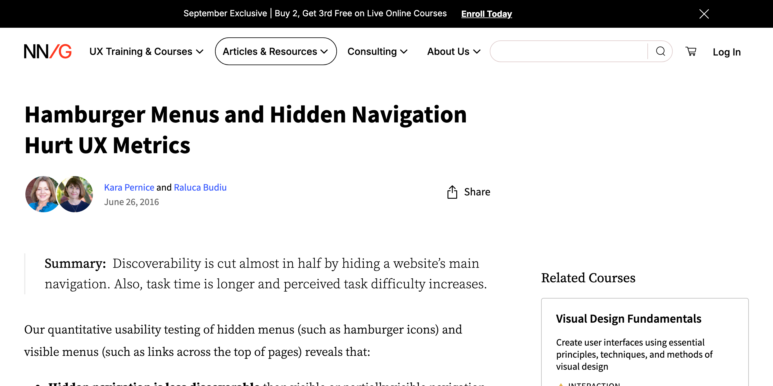
- Do not rely on hiding all navigation behind a hamburger; it lowers discoverability and slows users. Keep the most important links visible where width allows.
- Ensure the active-state styling is not color alone; pair aria-current with an underline, weight, or shape that survives a grayscale view.
- Keep a sticky navbar compact and high-contrast, and respect reduced-motion preferences for any show/hide or shrink-on-scroll animation.
- Mark up the links as an actual list so their count and boundaries are conveyed, and keep the logo a real link to home.
Research notes & sources
navigation landmark (<nav>) around a list of links; aria-current=page on the active link; a collapsed menu is a disclosure (button with aria-expanded), not an ARIA menubar
- Landmark Regions (ARIA Authoring Practices Guide)W3C WAI
- Navigation Landmark ExampleW3C WAI
- <nav>: The Navigation Section elementMDN Web Docs
- Hamburger Menus and Hidden Navigation Hurt UX MetricsNielsen Norman Group
- Sticky Headers: 5 Ways to Make Them BetterNielsen Norman Group
- Don't Use ARIA Menu Roles for Site Nav
- Link + Disclosure Widget Navigation
- Skip Navigation LinksWebAIM