Progress & Spinner
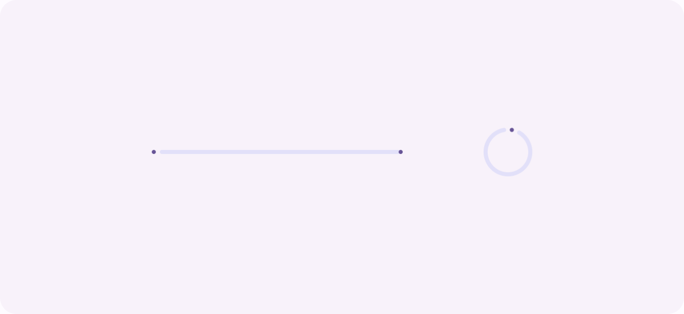
The loading family: a determinate bar when you know the percentage, an indeterminate spinner when you do not.
Determinate: a known percentage, exposed as aria-valuenow.
Indeterminate: no aria-valuenow. Respects reduced motion.
Inline: keeps its name, marked aria-busy and disabled. Click it.
Behavior
Keyboard
- (none)
- A progress indicator is non-interactive: it takes no focus and has no keyboard model of its own. If a control near it is disabled during loading (a submit button mid-request), that control follows its own focus and disabled semantics, not the indicator's.
Parts
Track
The full path the indicator travels, a line for a linear bar or a ring for a circular one. It represents the whole of the task: the gap between the filled part and the end of the track is the work remaining.
Indicator (fill or rotating element)
The active part. In a determinate bar it is the filled segment growing toward the end; in an indeterminate one it is a bar sliding along the track or a circular arc rotating. The rotation or slide is the entire signal that work is ongoing.
Label
The accessible name of the indicator, what is loading, supplied with aria-labelledby when a visible label exists and aria-label when it does not. Without it, a screen reader announces a bare progress bar with no subject.
Value / percentage text
Present only on a determinate indicator: the percent-done figure (or a count such as 3 of 10), shown visually and carried as aria-valuenow. Use aria-valuetext when the value is not a percentage, so the announcement reads in the right unit. Omitted entirely when indeterminate.
States
Indeterminate (looping)
When progress is unknown, the indicator loops: a circular arc rotates, or a bar slides and stretches along its track at constant speed, repeating. It carries no aria-valuenow, which is the signal to assistive tech that the value is indeterminate. It says work is happening; it cannot say how much is left.
Determinate (fill plus percentage)
When progress is measurable, the fill grows from 0 to 100 percent and a value updates alongside it, exposed as aria-valuenow between aria-valuemin (default 0) and aria-valuemax (default 100). Material marks the end of a determinate linear bar with a small stop indicator. Show time remaining too when you can estimate it.
Completion
At 100 percent the work is done. Hold the full state briefly so the completion reads, then dismiss the indicator and reveal the loaded content, or swap to a success state. For an inline action, return the control to its resting label. Announce the completion, do not rely on the bar silently vanishing.
Error or stall
If the operation fails or stalls, stop the animation and show an error state with helper text, not a spinner that loops forever. Carbon makes helper text optional except in the error state, where the bar must spell out the problem. A spinner with no end leaves users unsure whether the system is still working or has hung.
Reduced motion
A loading spinner is essential motion, it conveys that work is ongoing, so it stays under prefers-reduced-motion, but it should be calmed: slow or simplify the spin and drop any large or full-screen effect. Honor @media (prefers-reduced-motion: reduce) per WCAG 2.3.3 rather than ignoring the preference.
Inline versus blocking
An inline indicator sits in or beside the control that triggered the work (a spinner inside a button, a small bar under a field) and leaves the rest of the UI usable. A blocking indicator covers the whole page or region. Block only when the user truly cannot proceed; otherwise prefer inline, a skeleton, or optimistic UI.
References

Use it
Figma
A determinate bar driven by a number variable
- Build the bar as a track frame (full width, rounded) with a fill rectangle inside it, left-aligned and constrained to the left edge.
- Add a number variable, Percent (0 to 100), and bind the fill's width to it, or expose a Percent property and create variants at 0, 25, 50, 75, 100 for quick mockups.
- Place a value label (a text layer reading the percentage) above or beside the bar so the determinate value is visible, not just implied.
- Annotate that the build must expose this as role=progressbar with aria-valuenow, since Figma shows the fill but not the semantics.
Round the percentage in the label to whole numbers; a bar that reads 47.3% looks like debug output, not product.
A circular progress ring via stroke-dashoffset
- Draw an ellipse, remove its fill, and give it a thick stroke; duplicate it underneath as a faint full-circle track.
- On the top ring, set the stroke to a round cap and use Figma's arc / sweep on the ellipse (or a dashed stroke) so it draws only part of the circle, the filled fraction.
- Rotate the ring so the arc starts at the top (12 o'clock), matching how a real ring starts its sweep.
- Note for the developer that the production ring animates stroke-dashoffset on the SVG circle, with stroke-dasharray set to the circumference.
Keep the track and the fill ring the exact same radius and stroke width so the fill sits perfectly on the track, not slightly inside or outside it.
An indeterminate spinner with a Smart Animate loop
- Make a spinner frame: a ring with a single bright arc (or a faint track plus one accent segment) on a transparent background.
- Duplicate the frame onto a second one and rotate the arc 180 degrees; duplicate again for a full 360 if you want a smoother loop.
- Connect the frames with After Delay (a few milliseconds) using Smart Animate, and loop back to the first to repeat.
- Caption it as indeterminate (no value), and note the real build is a CSS rotation that must respect prefers-reduced-motion.
Rotate the arc layer, not the whole frame, so the spinner spins in place rather than orbiting its own bounding box.
A button with a loading variant
- In your Button component set, add a State property with at least Default and Loading.
- In the Loading variant, replace the label with a small spinner (reuse the spinner component) or place the spinner beside a dimmed label, and keep the frame the same width so the layout does not jump.
- Lower the variant's interactivity cue (reduced contrast or a disabled look) to show it is not clickable mid-request.
- Annotate that the real Loading button keeps its accessible name, sets aria-busy or disabled, and announces completion.
Fix the button width to its Default size so swapping to Loading does not reflow the row; a button that shrinks around a spinner looks broken.
Accessibility
A progress indicator is a read-only status, not a control: there is no keyboard interaction with the indicator itself. The work is in the ARIA. Mark it role=progressbar (or use native <progress>), label it, and on a determinate bar keep aria-valuenow current between aria-valuemin and aria-valuemax. Omit aria-valuenow entirely to signal an indeterminate state. Set aria-busy on the region being loaded, and respect reduced motion for the animation.
- Treat the indicator as read-only status; it is not operable and takes no focus.
- Announce completion and errors, do not rely on the bar visually disappearing.
- A loading spinner counts as essential motion, but still respect prefers-reduced-motion by calming it (slow or simplify), per WCAG 2.3.3.
- Give the track and indicator enough contrast against the background to be perceivable, and never encode state in color alone.
- For an inline button spinner, keep the button's accessible name, mark it busy or disabled, and ensure the spinner is announced rather than silent.
Research notes & sources
role=progressbar with aria-valuenow/valuemin/valuemax (omit aria-valuenow when indeterminate); aria-busy on the loading region
- ARIA: progressbar roleMDN Web Docs
- <progress>: The Progress Indicator elementMDN Web Docs
- Progress Indicators Make a Slow System Less InsufferableNielsen Norman Group
- Response Time Limits: Article by Jakob NielsenNielsen Norman Group
- Progress indicatorsMaterial Design 3 (Google)
- Progress indicatorsApple Human Interface Guidelines
- Progress bar: usage and accessibilityIBM Carbon Design System
- Inline loadingIBM Carbon Design System
- Loading patternIBM Carbon Design System
- Understanding SC 2.3.3: Animation from Interactions (Level AAA)W3C WAI (WCAG 2.1)