Responsive Grid
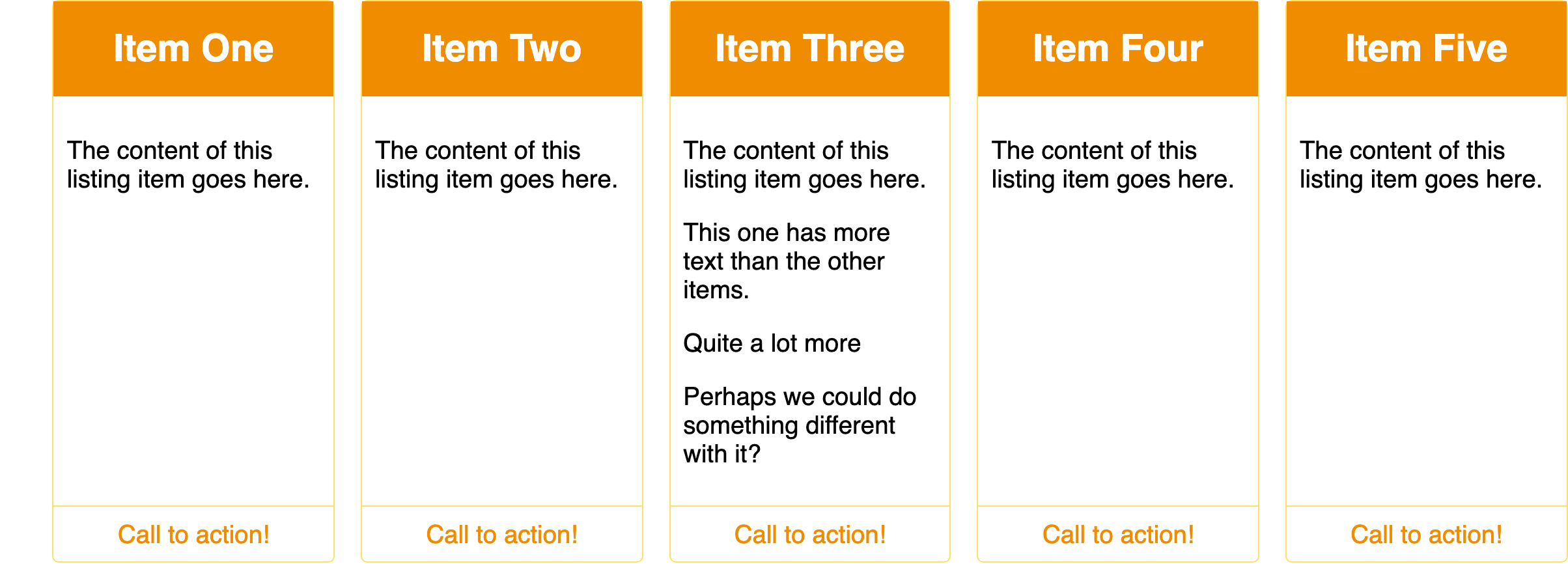
Arrange related items in equal-width columns that adapt to the available space.
A guide for your next day outside
The field library
Coastal paths
12 walks · Coast
Tide pools
8 places · Shore
Forest floor
16 notes · Woodland
Desert light
6 walks · Desert
High country
9 routes · Mountains
After the rain
11 notes · Wetlands
Behavior
Keyboard
- Tab
- Visit links and controls in source order; static cards are not tab stops.
Parts
Collection
The ordered source of items.
Tracks
Equal columns with a minimum usable width.
Gutters
Consistent space between rows and columns.
States
Reflow
Columns reduce as the container narrows; items retain their reading order.
Density
A larger minimum card width gives fewer columns and more room per item.
References
Use it
Figma
Build the responsive grid
- Create a horizontal Auto Layout with wrapping and a consistent gap.
- Give each card the same minimum width and allow its content to grow vertically.
- Test the same ordered collection in wide and narrow frames.
Accessibility
Keep visual order and source order aligned. The layout adds no keyboard interaction.
- Use a list for a collection, with headings and real links where needed.
- Do not add ARIA grid roles to a purely visual grid.
- Let long text wrap and prevent minimum column widths from overflowing the container.
Research notes & sources
Semantic list or sections; CSS Grid does not require role="grid".
- Reference image attribution and licensesSource and capture record
- Common layouts using gridsMDN Web Docs
- Content structureW3C WAI