Search
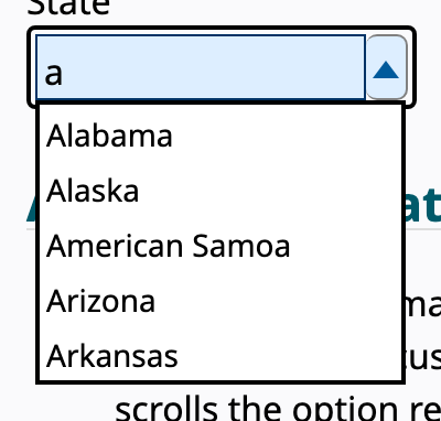
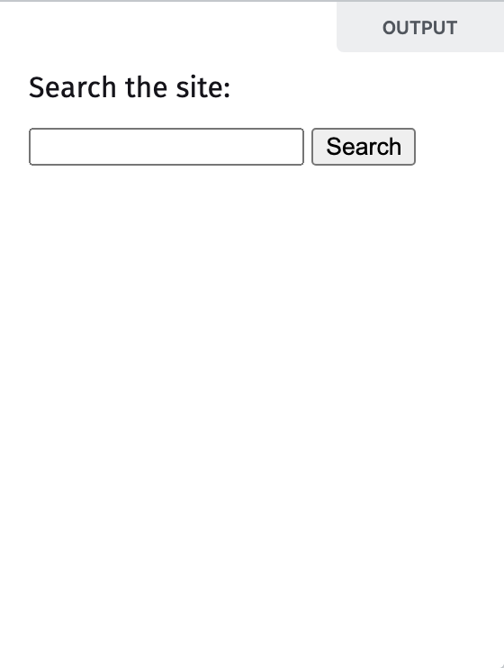
A visible, labeled query box, often with suggestions as you type, that helps people find rather than browse.
- Apple
- Apricot
- Avocado
- Banana
- Blackberry
- Cranberry
role=combobox; arrows move the highlight via aria-activedescendant, Enter selects, Esc closes.
Behavior
Keyboard
- Down / Up Arrow
- Moves the highlight through the suggestion list while keeping focus in the input (tracked with aria-activedescendant). Down from a closed field can also open the popup.
- Enter
- Submits the query, or accepts the highlighted suggestion and closes the popup when one is active.
- Escape
- Closes the suggestions popup and returns focus to the field; in some browsers Escape also clears a native search input.
- Tab
- Moves out of the search field. It does not cycle through suggestions; suggestion navigation is the arrow keys' job.
Parts
Search field
The text input itself, ideally <input type="search"> so the browser can offer a clear control and search affordances. It needs a real accessible name; a placeholder alone does not qualify and disappears once typing starts.
Search landmark
The <search> element (or role=search on the form) wrapping the field, creating a landmark region that assistive technology can announce and jump to, so search is reachable without hunting.
Magnifier icon
The widely recognized search glyph. Recognized on its own, but icon-only search is harder to find and raises interaction cost, so pair it with an open field. When it is the submit affordance, clicking it must run the query.
Clear control
A small control, often an x at the trailing edge, that empties the field in one action. Native search inputs provide one in some browsers; a custom field should add an accessible button.
Suggestions popup (combobox)
An optional listbox of completions or recent queries that appears as the user types. With it, the input is a combobox: aria-expanded reflects open state, aria-controls points at the list, and aria-activedescendant tracks the highlighted option.
States
Submit versus instant results
Search may run on submit (Enter or the magnifier) or update results as the user types. Instant search feels fast but needs debouncing and clear feedback; submit search is predictable. Whichever you choose, the magnifier, if clickable, must trigger the query because many users still click it.
Typeahead suggestions
As characters are typed, a popup of completions or recent queries appears, usually after the first letter. With list autocomplete the suggestions correspond to what is typed; selection can be manual or, when the top match is auto-highlighted, automatic.
Keyboard within the combobox
Down and Up arrows move the highlight through the suggestions while focus remains in the field, Enter accepts the highlighted suggestion and closes the popup, and Escape dismisses the popup and returns to the field. Printable keys keep editing the query.
Clearing and the empty state
The clear control empties the field and dismisses any suggestions in one step. Before a query, the field can offer recent or popular searches; after a fruitless query, a no-results state should explain what happened and offer a next step rather than a blank panel.
Expand-from-icon on small screens
Where space is tight the field may collapse to a magnifier that expands into a full input on tap. This saves room but costs discoverability, so reserve it for genuinely constrained layouts and keep an open field where it fits.
References
Use it
Figma
A search field with icon, clear, and states
- Build the field as a horizontal Auto Layout frame: leading magnifier, the input text, and a trailing clear (x) that appears only when there is a value.
- Add State variants: Empty, Focused, Filled, so the clear control and focus ring toggle with state.
- Set a minimum width that comfortably shows about 27 characters, and expose the accent and border as variables.
- Annotate that the field needs a real label and lives in a search landmark in the build.
Make the clear control its own boolean property so designers can show the filled state without detaching the component.
An autocomplete dropdown
- Place an Auto Layout list of suggestion rows directly beneath the field, matched to its width, with a highlighted row variant.
- Show two groups if relevant, recent and suggested, with quiet section labels.
- Create variants for closed, open-with-results, and open-empty (no matches) so the no-results state is designed, not improvised.
- Annotate the ARIA: combobox input, listbox popup, aria-activedescendant on the highlighted row.
Keep the highlighted-row style distinct from hover so keyboard and pointer states do not blur together in the spec.
Expandable search for tight headers
- Make two frames: a collapsed magnifier button and an expanded full field.
- Prototype the tap on the magnifier to a Smart Animate transition into the expanded field.
- Show where the expanded field pushes or overlays neighboring header items.
- Note that this trades discoverability for space, so the open field is preferred where it fits.
Use Smart Animate on a shared element name so the magnifier appears to slide into the expanded field rather than swapping abruptly.
Scoped search with a category selector
- Add a small select to the leading edge of the field inside the same Auto Layout frame, divided by a thin rule.
- Populate scopes such as All, Docs, People, and show the selected scope as the field's context.
- Build a variant per scope so the placeholder and suggestions can reflect the chosen context.
- Annotate that the scope selector and the field are separate controls that must each be labeled.
Keep the scope selector visually subordinate to the field so the box still reads primarily as search, not a filter bar.
Accessibility
Wrap search in a search landmark, give the field a real accessible name (not just a placeholder), and ensure the magnifier submit affordance is operable. When the field suggests as you type, implement the editable combobox model: role=combobox, aria-expanded, aria-controls, and aria-activedescendant moving a highlight through a listbox while focus stays in the input, with Escape to dismiss.
- Keep the field visible rather than hidden behind an icon wherever space allows; it is found and used far more.
- Announce result counts and the no-results state through a live region so screen-reader users learn what the query returned.
- Make suggestions operable by keyboard and pointer alike, and keep them dismissible with Escape.
- Ensure the field, magnifier, and clear control meet contrast and target-size requirements.
- Debounce instant search and respect reduced-motion for any suggestion animation.
Research notes & sources
a labeled search field inside a search landmark (<search> or role=search); when it suggests as you type, an editable combobox: role=combobox, aria-expanded, aria-controls, aria-activedescendant over a listbox
- Combobox Pattern (ARIA Authoring Practices Guide)W3C WAI
- <input type="search">MDN Web Docs
- Search: Visible and SimpleNielsen Norman Group
- The Magnifying-Glass Icon in Search Design: Pros and ConsNielsen Norman Group