Select / Listbox
Pick one value (or several) from a fixed set that collapses into a trigger and expands to a list, then writes the choice back as form input.
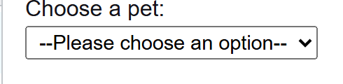
A real native select: keyboard-ready, type-ahead, grouped, and it shows the OS picker on a phone.
Select
Pick from a fixed list. No typing.
Combobox
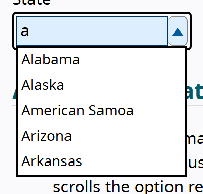
Type to filter a large set. Editable text field plus a list.
- Select / listbox · Canada, Mexico, Brazil (a value)
- Dropdown menu · Rename, Duplicate, Delete (a command)
Behavior
Keyboard
- Enter / Space
- Open the list from a closed trigger. On an open custom listbox, Space toggles selection in a multi-select; Enter confirms and closes a single-select. A native select on some platforms also opens with Down Arrow or Alt+Down.
- Up / Down Arrow
- Move the current option to the previous or next one. In a native closed select on desktop, the arrows can also change the value directly without opening the list.
- Home / End
- Move the current option to the first or last in the list (optional but expected in a full listbox).
- Character keys (typeahead)
- Type a character to move to the next option whose label starts with it; this is built into native select and must be reimplemented for a custom listbox.
- Shift + Arrow / Ctrl+A
- In a multi-select listbox, Shift+Arrow extends the selection to the adjacent option and Ctrl+A selects all (both optional in the APG model).
- Escape
- Close the open list without changing the value and return focus to the trigger.
- Tab
- Move focus off the control. Inside a custom listbox, focus stays on the widget (managed via roving tabindex or aria-activedescendant); arrows move the option, Tab leaves entirely.
Parts
Trigger / combobox button
The resting control: it shows the selected value (or a placeholder when nothing is chosen) and signals, usually with a caret, that a list will open. It carries the field's accessible name from an associated label. In a native select this is the whole <select> element; in a custom build it is a button with aria-haspopup=listbox and aria-expanded. Material's exposed dropdown renders this trigger as a text field that anchors the list.
Option list (listbox)
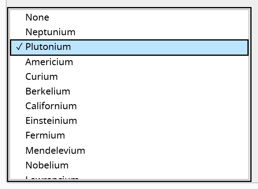
The popup that appears on open, holding the choices. Natively it is the rendered <option> set; in a custom build it is an element with role=listbox whose children carry role=option, labelled from the trigger. Only one option is current (focused) at a time.
Option
A single choice. Natively an <option> with a value attribute; in a custom listbox an element with role=option and aria-selected reflecting whether it is chosen. Its text is the label the user reads; its value is what the form submits.
Group / optgroup
An optional labelled cluster of related options. Natively the <optgroup> element with a label; in a custom listbox a role=group with aria-label or a nested labelled structure. Screen readers announce the group name before its options.
Placeholder / empty option
An optional first entry that prompts a choice ("Select a country") rather than defaulting to a real value. Natively a leading <option> with an empty value, often disabled and selected so it shows but cannot be submitted. It must not be mistaken for a valid answer.
States
Open, choose, collapse
The trigger toggles the list. On open, focus or the active option lands on the current value (or the first option when none is set); arrowing moves the current option; choosing one writes its value back, closes the list, and returns focus to the trigger. A custom build must mirror this and keep aria-expanded in sync.
Default selection and placeholder
A native single select always has one option selected; with no selected attribute it defaults to the first. Use a leading empty option as a placeholder when you want to force a deliberate choice, and validate that the placeholder is not submitted. Do not pre-select a real value the user did not pick if the answer matters.
Single versus multi-select
Single select writes one value. Multi-select (<select multiple> or aria-multiselectable=true) writes several, but it is hard to discover and operate: users may not realize they can pick more than one. NN/g recommends showing checkboxes in a multi-select list; Sarah Higley's testing found a native multiple select degrades the screen-reader experience. For more than a couple of multi-choices, a checkbox group or a dedicated multi-select listbox usually beats it.
Grouping and long lists
optgroup (or role=group) clusters related options under a label, which screen readers announce before the group's options. Very long lists are a smell: a long scroll is slow and error-prone, and once the set is large enough that typing beats scanning, the right pattern is a combobox with filtering, not a taller listbox.
Mobile and positioning
A native select hands the open list to the operating system, which on phones is a wheel or full-height sheet sized for touch. A custom listbox has to reposition to stay on screen, size for touch targets, and rebuild that mobile affordance itself, which is one more reason the native control wins on small screens.
References
Use it
Figma
A select trigger as a component with states
- Build a Select component with a State property: Default, Hover, Focus, Open, Disabled, and Error.
- Add a Value property covering at least Placeholder and Selected, so the trigger shows muted prompt text or the chosen value with the right weight and color.
- Use Auto Layout so the trigger grows with its value, with a leading label slot if needed and a trailing caret pinned to the right edge.
- Rotate the caret in the Open state and give Focus a visible ring; expose the accent as a variable so a themed page can swap it.
Keep Placeholder visually distinct (lighter, italic optional) from a real Selected value so a mock never reads an empty field as answered.
Assemble the open list with Auto Layout
- Make an Option component with State variants (Default, Hover, Focus/Active, Selected, Disabled) and a slot for a leading check or trailing checkbox.
- Build a Listbox frame with vertical Auto Layout and instance the options into it; add a Group Header component for optgroup labels.
- Set a max height with Clip content so a long list scrolls rather than covering the screen, mirroring the native behavior.
- For multi-select, switch the Option variant to show a checkbox so the multiple nature is visible at a glance.
Mark the Selected state with both a check and a subtle background, not color alone, so the chosen option survives a grayscale or low-vision check.
Document select versus menu versus combobox
- Place three labeled examples side by side: a select (value list), a dropdown menu (action list), and a combobox (text field plus filtered list).
- Caption the select as role=listbox / native <select>, choosing a value that a form submits.
- Caption the menu as role=menu of commands, and the combobox as an editable textbox plus a filtered listbox the user types into.
- Add a one-line rule: items that are data go in a select, items that are verbs go in a menu, and a field you can type to filter is a combobox.
Annotate every custom select mock with native <select> first, so handoff starts from the accessible default rather than a hand-built widget.
Accessibility
The accessible default is the native <select>, which is keyboard- and screen-reader-ready with no work. A custom control is the WAI-ARIA Listbox pattern (a button that opens role=listbox of role=option, with aria-selected and a full keyboard model) or, when the field is filterable, the Combobox pattern. Because ARIA adds semantics but no behavior, a custom build means writing the entire keyboard model, focus management, and typeahead yourself, then testing it with real screen readers. The bar to clear before doing that is high.
- Default to native: it is the most accessible, most device-appropriate option and the only one that needs no JavaScript.
- If you build a custom listbox, implement the full APG keyboard model (arrows, Home/End, typeahead, Escape) and test with real screen readers, not just a linter.
- Always give the field a visible, programmatically associated label; placeholder text inside the trigger is not a label.
- Use a true combobox (editable textbox + filtered listbox) when the user should type to narrow a large set, not a listbox stretched to fit.
- Reconsider multi-select selects: a checkbox group is usually clearer, and a native multiple select can degrade the screen-reader experience.
Research notes & sources
Native <select> by default; custom builds use the WAI-ARIA Listbox (role=listbox / role=option, aria-selected) or Combobox pattern
- Listbox Pattern (ARIA Authoring Practices Guide)W3C WAI
- Scrollable Listbox ExampleW3C WAI
- Listbox Example with Grouped OptionsW3C WAI
- Combobox Pattern (ARIA Authoring Practices Guide)W3C WAI
- Editable Combobox With List Autocomplete ExampleW3C WAI
- <select>: The HTML Select elementMDN Web Docs
- <optgroup>: The Option Group elementMDN Web Docs
- ARIA: listbox roleMDN Web Docs
- ARIA: menu roleMDN Web Docs
- Listboxes vs. Dropdown ListsNielsen Norman Group
- Dropdowns: Design GuidelinesNielsen Norman Group
- Checkboxes vs. Radio ButtonsNielsen Norman Group
- Select componentGOV.UK Design System
- <select> your poison
- The <select> element can now be customized with CSSChrome for Developers
- Material Web: SelectGoogle