Sidebar Layout
Pair a flexible main region with a narrower area of supporting content or controls.
Field journal · Northern California
A weekend on the coast
Behavior
Keyboard
- Tab
- Reach controls in document order; static regions do not receive focus.
Parts
Main region
The primary reading or working area.
Supporting region
Related facts, filters, or navigation.
Gap
Separation between the two regions.
States
Wide
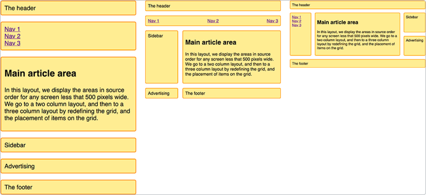
The main region takes the remaining space beside the narrower region.
Narrow
Regions stack when their contents no longer fit comfortably side by side.
References
Use it
Figma
Build the sidebar layout
- Place a main frame and supporting frame in a wrapping Auto Layout.
- Allow the main frame to fill available space; give the supporting frame a comfortable width.
- Stack in the same reading order when the main content becomes cramped.
Accessibility
A sidebar is a visual relationship, not a widget. Choose HTML landmarks by purpose.
- Keep the source order useful when the regions stack.
- Use a named aside only for complementary content.
- Avoid fixed heights that clip supporting information.
Research notes & sources
Use aside for complementary content, nav for navigation, and labelled sections otherwise.
- Reference image attribution and licensesSource and capture record
- Common layouts using gridsMDN Web Docs
- The SidebarEvery Layout · Heydon Pickering and Andy Bell
- Content structureW3C WAI
- Canonical layout examplesGoogle Material Design