Skeleton
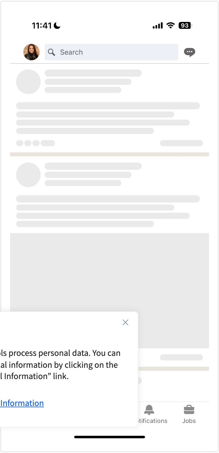
Gray placeholder blocks shaped like the content that is coming, shown while it loads and swapped in place when it arrives.
No sweep. A still placeholder still says “loading”.
Behavior
Keyboard
- (none)
- A skeleton is non-interactive and not focusable; it has no keyboard model of its own. Keyboard concerns belong to the real content that replaces it, where focus should land sensibly once it loads.
Parts
Placeholder blocks
Neutral gray bars, rectangles, and circles standing in for text lines, images, and controls. They are sized and positioned to match the real content's footprint so nothing shifts when it loads. They hold no text and convey no information on their own.
Text-line and image blocks
The two workhorses: stacked bars for headings and paragraphs (often with a shorter last line to suggest a ragged edge), and a solid rectangle or circle for an image or avatar. Matching their dimensions to the real text styles and media is what prevents layout shift.
Shimmer / pulse layer
An optional animation: a light gradient that sweeps across the blocks (shimmer/wave) or a gentle opacity pulse. It signals that work is in progress, but it is decoration, not information, and must be disabled under prefers-reduced-motion.
Loading container (aria-busy)
The wrapper around the skeleton, marked aria-busy=true while content loads and set to false when it is ready. Support is uneven across screen readers, so it backs up, rather than replaces, an explicit announcement.
Loading announcement
A visually-hidden message in a polite live region (role=status) that announces 'Loading' when the wait begins and that content has arrived when it ends. This is what a screen reader user actually hears, since the placeholder blocks are hidden from them.
States
Shimmer or pulse animation
Most skeletons animate to signal activity. The common technique is a light linear-gradient swept across the block by animating background-position (or, more cheaply, a transform on an overlay); a pulse animates opacity instead. The motion is a single subtle loop, not a light show.
Swap-in when loaded
When the data arrives, replace the placeholder blocks with the real elements in the same position, ideally with a quick fade so it does not snap. Because the skeleton already reserved the space, the real content drops into the same footprint with little or no layout shift.
Reduced motion
Under prefers-reduced-motion: reduce, drop the shimmer or pulse and show a static gray placeholder. A still skeleton conveys the loading state on its own, so disabling the animation costs nothing and protects users sensitive to motion.
Error and timeout fallback
A skeleton means 'content is coming'. If the request fails or stalls, it must not sit there forever pretending to load. Swap to an explicit error or retry state on failure and set a timeout, so the placeholder never becomes a permanent, silent lie.
Very-short-load flash avoidance
For loads under about a second, a skeleton can flash on and off faster than the eye settles, which feels worse than showing nothing. Delay it by a couple hundred milliseconds so it appears only when the wait is long enough to need it, and skip it for instant loads.
References
Use it
Figma
A Loading variant on an existing card component
- Open your card component set and add a property State with values Loaded and Loading.
- In the Loading variant, replace each real layer with a gray placeholder of the same size and position: a circle for the avatar, bars for the title and text, a rectangle for the image.
- Match block dimensions to the real text and media so the footprint is identical and switching States causes no reflow.
- Expose the placeholder fill as a variable so a themed page can adjust it, and keep the blocks neutral rather than accent-colored.
Build the skeleton by duplicating the Loaded variant and flattening each element to a rectangle in place; this guarantees the footprint matches exactly.
A shimmer sweep with a masked rectangle and Smart Animate
- Group the placeholder blocks and use them as a mask so the shimmer is clipped to their shapes.
- Inside the mask, place a wide rectangle filled with a soft light-to-transparent linear gradient (the highlight).
- Make two frames: highlight parked off the left edge, then off the right edge. Connect them with an After Delay interaction using Smart Animate, set to loop.
- Keep the sweep slow and subtle, and add a note that the build must disable it under prefers-reduced-motion.
Smart Animate tweens the highlight's position between the two frames; a 1 to 1.5s ease and a long pause reads as a calm shimmer rather than a strobe.
Toggle Loading to Loaded in a prototype
- Place an instance set to State=Loading on the frame.
- Add an After Delay interaction (e.g. 1500ms) that changes the instance to State=Loaded, with a quick Dissolve so content fades in rather than snaps.
- Because both variants share the same footprint, Smart Animate keeps everything in place and shows zero layout shift on the swap.
- Annotate that the real build must also announce 'Loading' then completion politely and move focus to the new content.
Use the same frame size for both states so reviewers see the value proposition directly: the content lands exactly where the skeleton held space.
Match skeleton dimensions to real text styles
- For each text style (heading, body, caption), note its line height and create a placeholder bar of that exact height.
- Set the bar widths to plausible content lengths, and make the last line of a paragraph shorter to suggest a ragged edge.
- Use the same vertical rhythm and spacing as the real text block so the stack occupies the identical height.
- Save these bars as small components (Skeleton/Heading, Skeleton/Body) so every skeleton reuses dimensions tied to the type scale.
Tie the bar heights to the same spacing tokens your type scale uses, so a change to the type scale updates the skeletons too.
Accessibility
A skeleton is decorative scaffolding, so the placeholder blocks are hidden from assistive technology and the loading state is conveyed separately. Mark the loading container aria-busy=true, hide the placeholder with aria-hidden, and announce 'Loading' through a polite live region (role=status); announce completion and move focus to the new content when it is ready. Disable the shimmer under prefers-reduced-motion. Screen-reader support for aria-busy alone is uneven, so the explicit announcement is what users actually rely on.
- Keep placeholder blocks out of the accessibility tree; a screen reader should never read rows of empty boxes.
- Announce 'Loading' politely at the start and completion at the end, and move focus to the new content when it lands so keyboard and screen-reader users are not stranded.
- Disable the shimmer or pulse under prefers-reduced-motion: a static placeholder still communicates loading.
- Give placeholder blocks enough contrast against the surface to be visible without shouting, and never carry meaning in the animation itself.
- On failure or timeout, replace the skeleton with an announced error or retry state; never leave it looping indefinitely.
Research notes & sources
No dedicated role. The placeholder is decorative (aria-hidden); the loading container is marked aria-busy and the state is announced via a polite live region (role=status).
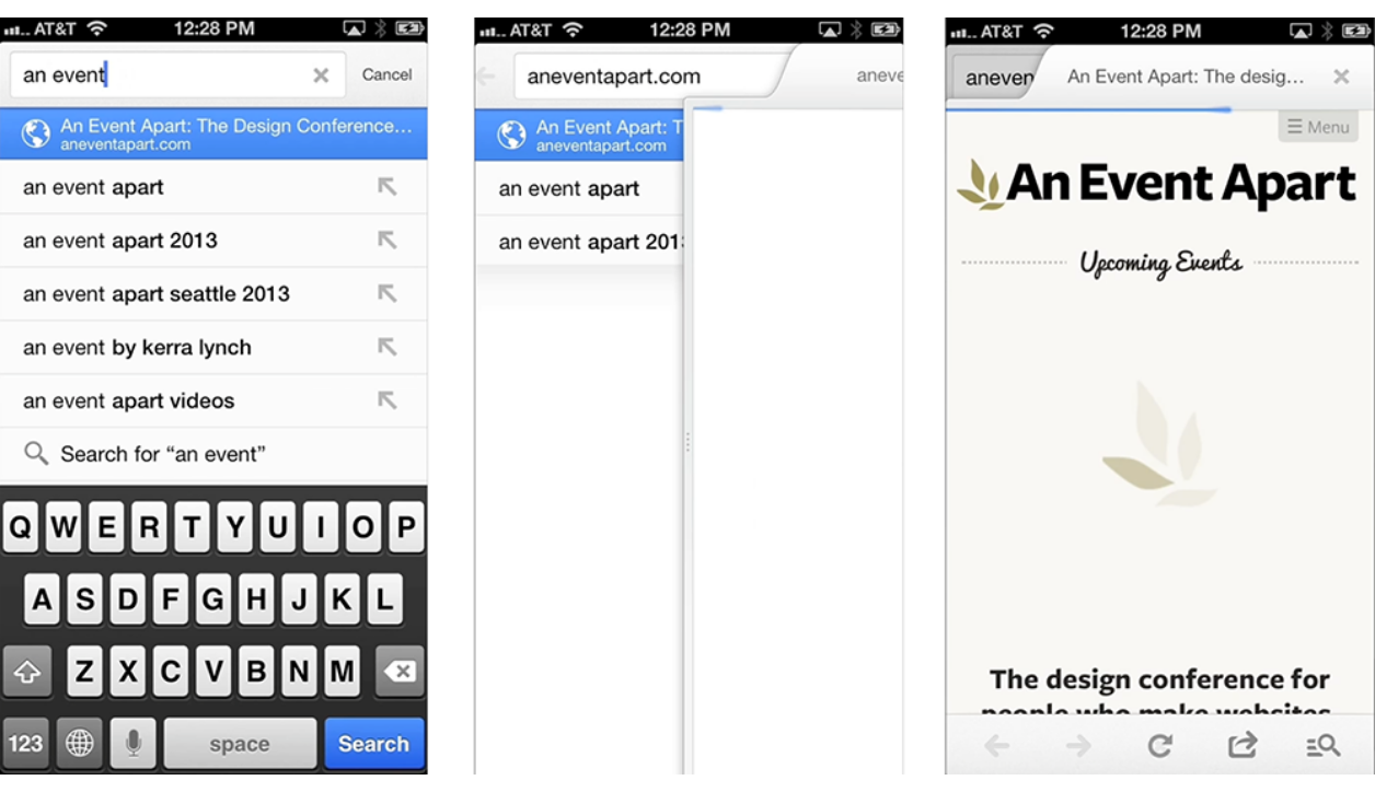
- Mobile Design Details: Avoid The Spinner
- Skeleton Screens 101Nielsen Norman Group
- A Bone to Pick with Skeleton ScreensViget
- The effect of skeleton screens: Users' perception of speed and ease of navigation (ECCE 2018)
- More Accessible Skeletons
- aria-busy (ARIA attribute)MDN Web Docs
- background-position (CSS) and animating gradientsMDN Web Docs
- Loading pattern and skeleton statesIBM Carbon Design System