Slider
Drag a thumb along a track to pick a value from a range, for settings where roughly right beats exactly typed.
Native input, fully keyboard operable. Value shown above, never below.
Discrete role=slider. Arrows step; Home/End jump. Announced as “M” via aria-valuetext.
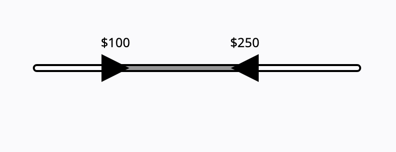
Two thumbs, each role=slider; the lower is capped by the upper, so they never cross.
Drag for a rough value; type the field when the exact number matters.
Behavior
Keyboard
- Right / Up Arrow
- Increases the value by one step.
- Left / Down Arrow
- Decreases the value by one step.
- Home / End
- Sets the slider to its minimum (Home) or maximum (End) allowed value.
- Page Up / Page Down
- Increases or decreases the value by a larger amount than the arrow keys (optional but recommended for long ranges).
Parts
Track / rail
The bar the thumb travels along, representing the full range from minimum to maximum. Its length maps the range to screen space, so a wider track gives finer control and a denser range makes precise selection harder.
Thumb / handle
The draggable control that sets the value. It is the focusable element carrying role=slider, aria-valuenow, aria-valuemin, aria-valuemax, and an accessible name, and it must be a large enough pointer target to grab reliably.
Fill / progress
The portion of the track between the minimum and the current thumb position, usually colored, that shows at a glance how far along the range the value sits.
Value readout
The current value shown beside or above the slider (never below, where a thumb obscures it). Because the slider does not surface its value on its own and is imprecise, the readout is what makes the chosen value legible.
Ticks and labels (discrete)
Optional marks and labels at allowed stops on a stepped slider, set by the step granularity. They show the permitted values and help the thumb land on one, and for non-numeric stops they pair with aria-valuetext.
Second thumb (range)
On a range slider, a second thumb sets the other end. The two thumbs cannot cross: the lower thumb's maximum is capped by the upper thumb's current value, and vice versa, while their tab order stays constant.
States
Drag, click, and step
The value changes by dragging the thumb, and often by clicking a point on the track or pressing arrow keys to step. Steering to a precise point is hard and gets harder as the range widens or densifies, which is why sliders suit approximate values and benefit from real-time feedback.
Continuous versus discrete
A continuous slider moves smoothly across the range; a discrete slider snaps to allowed stops defined by the step granularity, often drawn with ticks. Discrete steps make values easier to hit and to label, including non-numeric labels via aria-valuetext.
Range thumbs cannot cross
On a two-thumb range slider the thumbs constrain each other: the lower thumb cannot move past the upper, and the upper cannot move below the lower. The tab order between them stays constant even if their values would visually swap.
Touch and precision
On touch, users often nudge the thumb off the intended value as they lift their finger, and precise placement is daunting for users with motor difficulties or less steady hands. Generous thumb targets and a way to fine-tune (steppers or a paired input) mitigate this.
Orientation
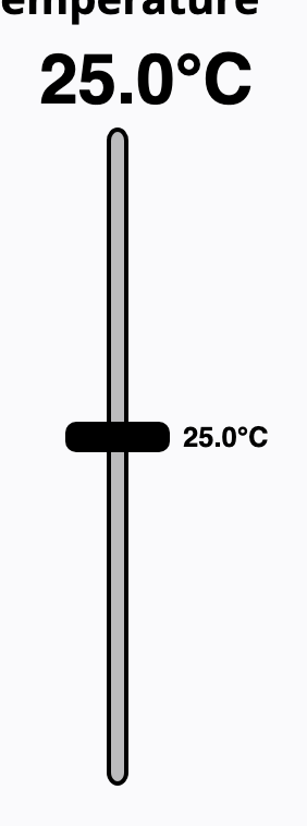
Sliders are horizontal by default but can be vertical, for example a level or volume fader. A vertical slider sets aria-orientation=vertical so its orientation is conveyed; the arrow-key directions follow accordingly.
References
Use it
Figma
A continuous slider with a live value
- Draw the track as a thin rounded rectangle; overlay a fill rectangle pinned to the left that represents the value.
- Place a circular thumb, constrained vertically centered, at the right edge of the fill.
- Add a value label above the thumb (never below) and expose the fill and thumb colors as variables for theming.
- Make a component and use a number variable or several variants to show low, middle, and high positions.
Group the fill and thumb so moving the value means dragging one element; keep the value label anchored above so a finger never hides it.
A discrete slider with ticks
- Lay tick marks along the track at even intervals using an Auto Layout row with space-between distribution.
- Label the meaningful stops (for example S, M, L) beneath or above the ticks.
- Build variants for each stop so the thumb and fill land exactly on a tick in every state.
- Annotate that each stop maps to a step value and that non-numeric labels need aria-valuetext in the build.
Distribute ticks with Auto Layout rather than placing them by hand, so they stay even if the track width changes.
A two-thumb range slider
- Start from the continuous slider and add a second thumb; make the fill the segment between the two thumbs.
- Create variants showing a narrow and a wide range so the fill clearly spans only the selected interval.
- Show both value labels, one per thumb, above the track.
- Annotate that the thumbs cannot cross and that each is its own role=slider with bounds capped by the other in the build.
Pin the fill between the two thumb positions so resizing the range updates the colored segment, not the whole track.
Slider paired with a number input
- Place a number field beside the slider in a horizontal Auto Layout frame.
- Show the same value in both, so the field reads as the precise mirror of the thumb.
- Add focus states to both controls and a note that editing either updates the other in the build.
- Caption the pair as the pattern for when exact values matter, not the slider alone.
Right-size the number field to the value's digits so it does not dominate the slider it supports.
Accessibility
Each thumb is a role=slider with aria-valuenow inside aria-valuemin and aria-valuemax, an accessible name, and a full keyboard contract: arrows step, Home and End go to the extremes, Page keys jump. Add aria-valuetext whenever the number alone would not be understandable, set aria-orientation for vertical sliders, make the thumb a large enough target, and always show the value visibly.
- Make the slider fully keyboard operable; never ship a drag-only control.
- Show the current value beside or above the slider, not below where a thumb hides it, since the value is not exposed by default.
- Where the exact value matters, pair the slider with a number input or steppers instead of relying on drag precision.
- Give the thumb a pointer target of at least 24 by 24 CSS pixels to meet WCAG 2.2 SC 2.5.8 and to be grabbable on touch.
- Do not encode the value in track color alone; the readout and labels must carry it for color-blind and low-vision users.
Research notes & sources
role=slider per thumb with aria-valuemin / aria-valuemax / aria-valuenow (and aria-valuetext when the number is not self-explanatory); arrow keys, Home, End, Page Up/Down
- Slider Pattern (ARIA Authoring Practices Guide)W3C WAI
- Slider (Multi-Thumb) Pattern (ARIA Authoring Practices Guide)W3C WAI
- <input type="range">MDN Web Docs
- Slider Design: Rules of ThumbNielsen Norman Group
- Understanding SC 2.5.8: Target Size (Minimum) (Level AA)W3C WAI (WCAG 2.2)