Tabs
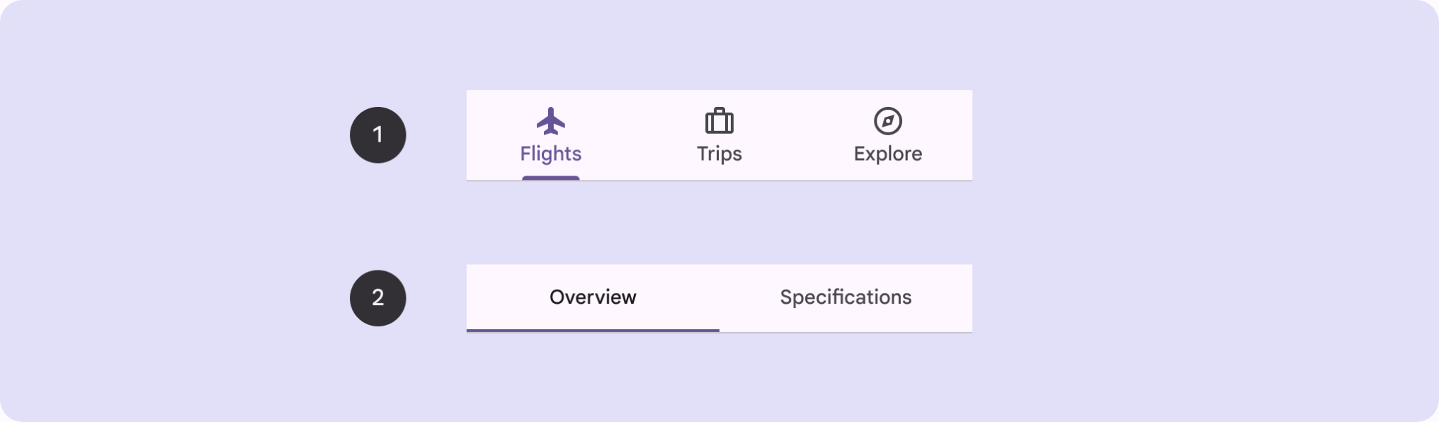
Layered sections of content shown one at a time, with a row of labels for switching between peer views in the same space.
Behavior
Keyboard
- Tab
- Moving into the tablist places focus on the active tab. With the tablist focused, Tab moves to the next element after it, typically the active panel.
- Left / Right Arrow
- Move focus to the previous / next tab, wrapping at the ends. In automatic mode this also activates the newly focused tab.
- Up / Down Arrow
- For a vertical tablist (aria-orientation=vertical), move between tabs the way Left/Right do for a horizontal one.
- Home / End
- Move focus to the first / last tab (optional).
- Enter / Space
- Activate the focused tab when it was not activated automatically on focus (manual mode).
- Delete
- For deletable tabs (optional): remove the current tab and panel, moving focus to a neighboring tab.
Parts
Tablist
The container for the set of tabs, with role=tablist. It is labelled with aria-label or aria-labelledby so assistive tech announces what the tab set is for, and it carries aria-orientation when vertical.
Tab
A label inside the tablist (role=tab, ideally a button) that activates one panel. The selected tab has aria-selected=true and points at its panel with aria-controls.
Tab panel
The content region for one tab (role=tabpanel), labelled back at its tab with aria-labelledby. Non-active panels are hidden; the active panel is made focusable when its content is not.
Active indicator
The visual state that marks the selected tab: a heavier underline, fill, or border. It must clearly distinguish the active tab from inactive ones and is the visible partner of aria-selected.
States
Selected versus unselected
The active tab carries aria-selected=true and a distinct visual treatment (active indicator, heavier weight); inactive tabs are aria-selected=false. You must clearly distinguish the active tab, not rely on a subtle color shift alone.
Automatic versus manual activation
The key behavioral choice. Automatic activation shows a panel the instant its tab is focused, and is recommended only when all panel content is already in the DOM and renders without latency. Otherwise use manual activation: the user arrows to a tab and presses Enter or Space to show it, so focusing tabs does not trigger slow loads.
Responsive overflow
When tabs exceed the available width they can scroll horizontally (fixed tabs for a small, stable set; scrollable for many or variable tabs). On narrow screens horizontal scrolling hides labels and undercuts the main advantage of seeing all options, so a vertical accordion or single column often serves better.
Focus management on switch
A roving tabindex keeps exactly one tab in the page tab order. Arrow keys move focus among tabs; Tab moves focus out of the tablist to the active panel. On switch, update aria-selected and tabindex together and set the hidden attribute on the non-active panels.
References


Use it
Figma
A tab component with a selected variant
- Build a Tab component set with a State property: Default, Selected (plus Hover and Focus).
- Make each variant an Auto Layout frame of label text plus a separate indicator line pinned to the bottom edge (constraints left, right, bottom).
- Set the indicator to transparent in Default and to the accent in Selected, and bump the label weight or color.
- Assemble the tablist as a horizontal Auto Layout row of tab instances with exactly one set to Selected; use Smart Animate so the indicator slides on switch.
Map the parts to the ARIA model as you build: the row is the tablist, each instance is a tab, the content frame is the tabpanel.
Tabs-to-accordion responsive swap
- Build two component sets that reuse the same panel-body components: a desktop Tabs set and a mobile Accordion set.
- Place each in its own breakpoint frame (for example 1280 and 375 wide).
- Keep the panel-body components identical in both so content can never drift between layouts.
- Document the rule: below the overflow threshold, horizontal labels would scroll and hide, so swap to the stacked accordion.
Name the shared panel components once and instance them into both layouts, so a copy edit updates the desktop tab and the mobile accordion together.
Accessibility
A tablist is a single composite widget, not a row of independent buttons. Only one tab is in the page tab order (a roving tabindex); Left and Right arrows move between tabs while Tab moves out to the panel. Each tab is tied to its panel with aria-controls, each panel back to its tab with aria-labelledby, and the selected tab is marked aria-selected=true.
- Activate automatically on focus only when panels render instantly; otherwise use manual activation so arrowing through tabs does not fire slow content loads.
- Do not pack so many focusable controls into the activation path that automatic activation becomes slow or disorienting; prefer manual there.
- Provide a visible focus indicator on the focused tab, and make the panel focusable so screen-reader users land on it and hear it announced as a tab panel.
- Do not conflate tabs with sequential steppers or with site navigation between pages; tabs are same-context, peer views, not page loads.
Research notes & sources
WAI-ARIA Tabs: role=tablist / tab / tabpanel, roving tabindex, aria-selected
- Tabs Pattern (ARIA Authoring Practices Guide)W3C WAI
- Example of Tabs with Automatic ActivationW3C WAI
- Example of Tabs with Manual ActivationW3C WAI
- ARIA: tab roleMDN Web Docs
- Tabs, Used RightNielsen Norman Group
- Tabbed InterfacesInclusive Components
- TabsMaterial Design 3 (Google)
- Tabs componentShopify Polaris
- Accordion UI design: when to use itLogRocket Blog