Text Field
A labeled box for one line of typed text, with the helper and error copy that tell the user what to enter and what went wrong.
We will only use this to send your receipt.
Enter an email address in the format name@example.com.
Use 12 characters or more.
82 characters left
Behavior
Keyboard
- Tab / Shift+Tab
- Moves focus into and out of the field in document order. The focused field shows a visible focus indicator.
- Click / tap on label
- Focuses the associated input, because the label is bound to it with for/id (or wraps it).
- Standard text editing keys
- Arrow keys, Home, End, Backspace, Delete, and selection chords behave as in any native text control; the browser provides them.
- Enter
- In a single-line input inside a form, submits the form. In a <textarea>, inserts a newline instead.
Parts
Visible label
A persistent text label, bound to the input with <label for> matching the input's id (or by wrapping the input). It must stay visible at all times, not vanish on focus or typing. Clicking it focuses the field and enlarges the hit target. The label, never a placeholder, is the field's accessible name.
The input (or textarea)
The editable box itself. Choose the right type (email, tel, url, number, password, search) so the browser validates and the right mobile keyboard appears, and size it to the expected content. Swap <input> for <textarea> when the answer runs to multiple lines.
Helper / hint text
Optional supporting text shown before the user types, explaining the format or where to find the value. Wire it to the input with aria-describedby so it is announced with the field. WCAG 3.3.2 calls for this kind of instruction when input requirements are not obvious.
Error message
Text shown when the entered value is invalid, identifying the field and saying how to fix it (WCAG 3.3.1 and 3.3.3). Wire it with aria-describedby and set aria-invalid="true" on the input. Pair it with an icon or border, not color alone, and place it next to the field.
Required / optional marker & affixes
A marker (commonly a red asterisk for required) showing whether the field is mandatory, plus optional prefix, suffix, or icon inside the box, such as a currency sign or a unit. Mark the rarer case across the form, and never signal required by color alone.
States
Focus and the label hit target
Clicking or tapping the label focuses the input, because the two are associated, which gives small controls a forgiving target. The focused field shows a clearly visible focus ring, distinct from the resting border, so keyboard users always know where they are.
Validation timing
The least annoying field validates lazily: it checks on blur (when the user leaves the field) or on submit, not aggressively on every keypress, which would scold someone for an email that is simply not finished yet. Once an error is shown, re-validate as the user types so the message clears the instant the value becomes valid.
Error state
On an invalid value the field sets aria-invalid="true", shows an error message wired via aria-describedby, and adds a non-color cue such as an icon or a thicker border. Material recommends swapping the helper text for the error text in the same slot so the layout does not jump, and showing an error icon as an extra sensory signal.
Mobile keyboard and autofill
On touch devices the input type and inputmode decide which on-screen keyboard appears: type=email surfaces an @ key, inputmode=numeric a number pad. autocomplete tokens let the device offer saved values and one-time passcodes. Getting these right removes real typing effort on the platform where typing costs the most.
Character limits and multi-line growth
A character counter or maxlength bounds a value such as a tweet-length message; show the count as guidance, and prefer a soft warning over silently blocking keystrokes. A <textarea> grows to multiple lines and is usually resizable; sizing its initial height to the expected answer signals how much text is wanted.
References
Use it
Figma
A text field component with label, helper, and error
- Build a Field component as a vertical Auto Layout frame: a Label text layer, the input box (an Auto Layout frame with padding and a placeholder/value text layer), and a Message text layer beneath.
- Add a State variant property: Default, Focus, Filled, Error, Disabled, swapping the border color, focus ring, and message color per state.
- Add boolean properties for Required (shows an asterisk in the label) and Has helper text (toggles the Message layer), and text properties for Label, Value, and Message so each instance is editable.
- Expose the border, focus-ring, and error colors as variables so a themed page can swap them, and keep the message slot present in every state so the layout does not jump between helper and error.
Keep the helper and error message in the same layer slot, only changing its text and color by state, so swapping to the error state never shifts the fields below it.
Bind the label to the field for real handoff
- Name the layers so the relationship is obvious: Label, Input, Helper, Error, and add a note that Label maps to <label for>, Helper and Error to aria-describedby.
- Annotate the input with the intended type and autocomplete token (for example type=email, autocomplete=email) so developers wire the keyboard and autofill.
- Document that the error state also sets aria-invalid="true" and that the error text must name the field and say how to fix it.
- Add a caption reminding the team the label is permanent and visible, never replaced by a placeholder.
Figma cannot enforce the label-to-input association, so write it into the component description; the spec is the contract the build is held to.
A textarea and a password-reveal variant
- Duplicate the Field and replace the single-line input with a taller Auto Layout box plus a resize-handle glyph in the corner for the textarea.
- For the password variant, add a show/hide toggle button inside the input frame, with both an eye and an eye-off icon swapped by a boolean property.
- Set the textarea's default height to several lines to signal the expected answer length, and keep the same Label and Message structure as the base field.
- Annotate the password toggle as an accessible button with a label (Show password / Hide password), not an icon alone.
Reuse the base Field's label and message structure for both variants so the whole family stays consistent and a token change updates them all at once.
Accessibility
A text field is accessible almost for free if you use the native elements correctly: a real <input> or <textarea> with a visible <label> bound by for/id. There is no special ARIA widget. The work is in the wiring: associate helper and error text with aria-describedby, set aria-invalid on error, mark required fields in text and not just color, and choose the type and autocomplete that match the data. Placeholders are never a substitute for a label. Most field accessibility bugs are missing labels or color-only errors, both of which native HTML plus a little ARIA solves.
- Give every field a visible, persistent label; never rely on a placeholder to name it (WCAG 3.3.2).
- Identify errors in text that names the field and says what is wrong, not by color or icon alone (WCAG 3.3.1).
- When you know the fix, suggest it in the error message, for example the expected date format (WCAG 3.3.3).
- Ensure the input border, focus ring, and error indicators meet contrast minimums, and pair color cues with text or shape.
- Match the input type, inputmode, and autocomplete to the data so the keyboard and autofill help rather than fight the user.
Research notes & sources
No dedicated ARIA pattern: a native <input> + <label for> carries it. Wire helper/error text with aria-describedby and set aria-invalid on error.
- <input>: The HTML Input elementMDN Web Docs
- <label>: The Label elementMDN Web Docs
- inputmode (global attribute)MDN Web Docs
- Labeling Controls (Forms Tutorial)W3C WAI
- Form Instructions (Forms Tutorial)W3C WAI
- User Notification (Forms Tutorial)W3C WAI
- Understanding SC 3.3.2: Labels or Instructions (Level A)W3C WAI (WCAG)
- Understanding SC 3.3.1: Error Identification (Level A)W3C WAI (WCAG)
- Placeholders in Form Fields Are HarmfulNielsen Norman Group
- Marking Required Fields in FormsNielsen Norman Group
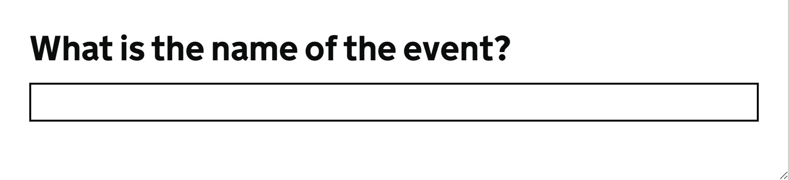
- Text inputGOV.UK Design System
- TextareaGOV.UK Design System
- Text fields (guidelines)Material Design 3 (Google)
- Form Design PatternsSmashing Magazine
- 8 Recommendations for Creating Effective Input FieldsBaymard Institute