Toast / Notification
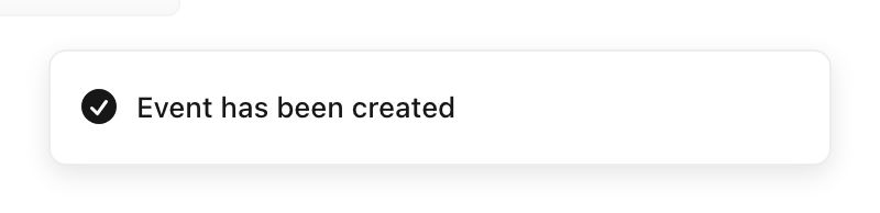
A small, self-dismissing message that reports the result of an action or a system event in a corner of the screen, without interrupting the task.
Behavior
Keyboard
- Tab
- A toast must not steal focus when it appears. If it carries a dismiss button or action, that control has to persist long enough to be reachable in the tab order, which usually means it cannot auto-dismiss.
- Esc / close
- Where a toast lingers, give a way to dismiss it (an Escape handler or a close button), so it can be cleared without waiting out the timer.
Parts
Live region container
The persistent host the toasts are injected into, carrying role=status (or role=log). It must already exist in the DOM when the page loads: converting an element to a live region only when a message arrives usually fails to announce it.
Toast surface
The small message panel that animates in and out, typically anchored to a corner. It is non-modal and never takes focus; it floats above content without blocking it.
Message (and status icon)
Concise text reporting what happened, often paired with a success, error, or info icon. Status must not rest on color alone: pair the color with an icon and the words.
Dismiss control or single action
An optional close button, swipe, or one action such as Undo. This is the hazard: an interactive control inside a surface that auto-dismisses is the source of most of the pattern's accessibility failures.
States
Enter, linger, auto-dismiss
A toast animates in, stays a few seconds (Material's snackbars persist on the order of 4 to 10 seconds), then animates out. The duration should scale with reading time, and nothing the user must act on should be on that timer.
Pause and persist on interaction
Hovering or focusing a toast (or its controls) should pause the dismiss timer so it does not vanish mid-read or mid-click. WCAG 2.2.1 expects a way to turn off, extend, or adjust such time limits.
Stacking and queueing
When several fire at once they stack in a corner or queue one behind another; Material shows a single snackbar at a time. Cap the number visible so notifications do not pile up and interrupt repeatedly.
The interactive-content trap
A toast that carries a link or button and also auto-dismisses is unreachable for keyboard, screen reader, and screen magnifier users: the control disappears before they can get to it. This is the pattern's defining failure mode.
References

Use it
Figma
A toast component with status variants
- Build a Toast component set with a Status property: Info, Success, Warning, Error.
- Make each variant an Auto Layout row: a status icon, the message text, and an optional close button, with consistent padding and a max width.
- Drive the icon and accent color from a variable per status, so the status never rests on color alone (icon plus color plus text).
- Expose the surface fill as a variable so a themed page or skin can restyle the toast without detaching it.
Keep the message to one or two lines; if it needs more, it is probably an inline alert, not a toast.
A corner toast stack with Auto Layout
- Place a vertical Auto Layout frame pinned to a corner (for example bottom-right) with a small gap between items.
- Drop several toast instances into it; the Auto Layout handles the stacking and spacing.
- Set a sensible max visible count and note what happens beyond it (queue or collapse).
- Annotate the motion and timing for the developer: slide or fade in, pause on hover, auto-dismiss after a few seconds.
Annotate that the live build must inject these into one role=status container that exists on load, since Figma cannot represent the live region.
Document the no-action, live-region rule
- Make a labeled example pairing a plain confirmation toast with a crossed-out toast that contains a link and a timer.
- Caption the plain one as the safe default: announced via role=status, no focus move, nothing essential inside.
- Caption the crossed-out one with the failure: an auto-dismissing toast with an action is unreachable for keyboard and screen reader users.
- Add the rule: if an action matters and has no other home, it is not a toast; use an inline alert, a dialog, or a notification log.
Keep this pair in the team library so the toast-versus-dialog decision is made once, not re-argued per feature.
Accessibility
A toast is a status message (WCAG 4.1.3), not a widget you focus. Announce it through a live region whose container already exists in the DOM before the toast is injected: role=status (polite) for routine confirmations, role=alert (assertive) only for genuinely urgent messages. Never move focus to a toast. The hard rule: nothing essential or interactive should live only in an auto-dismissing toast, because keyboard, screen reader, and magnifier users cannot reach it in time.
- Meet WCAG 4.1.3 Status Messages: expose the message via a role or live region so it is announced without moving focus.
- Auto-dismiss conflicts with WCAG 2.2.1 Timing Adjustable; pause on hover and focus, and give a way to dismiss or extend. Never time out anything actionable.
- Reserve assertive (role=alert) for truly urgent messages; frequent interruptions hurt users with cognitive and visual disabilities (WCAG 2.2.4).
- Keep a notification history or log for messages a user may need to revisit after the toast is gone.
- Never signal success or error by color alone; pair it with an icon and the words, and meet text contrast.
Research notes & sources
No dedicated role; a live region: role=status (polite) or role=alert (assertive), with the container present in the DOM on load
- Understanding SC 4.1.3: Status Messages (Level AA)W3C WAI (WCAG 2.1)
- Understanding SC 2.2.1: Timing Adjustable (Level A)W3C WAI (WCAG 2.1)
- Alert Pattern (ARIA Authoring Practices Guide)W3C WAI
- ARIA: status roleMDN Web Docs
- SnackbarMaterial Design 3 (Google)
- Defining "Toast" Messages
- A toast to an accessible toast
- Accessible Notifications with ARIA Live Regions (Part 1)
- Notification component usageIBM Carbon Design System
- Sonner: an opinionated toast component for React