Tooltip
A small popup of text that explains the control it points at, shown on hover or focus and never holding anything the user needs.
The hint is supplemental. The field still works without it.
Click to toggle. Works on touch; announced via a live region.
Behavior
Keyboard
- Tab
- Moving focus to the trigger displays its tooltip. The tooltip stays visible until focus leaves the trigger; focus never enters the tooltip.
- Escape
- Dismisses the tooltip while keeping focus on the trigger, so a tip that covers other content can be cleared without losing your place.
Parts
Trigger
The control the tooltip describes. It must be focusable in its own right (a button, link, or field), because a tooltip has to appear on keyboard focus as well as hover. A tooltip on a non-focusable element is invisible to keyboard users.
Tooltip bubble
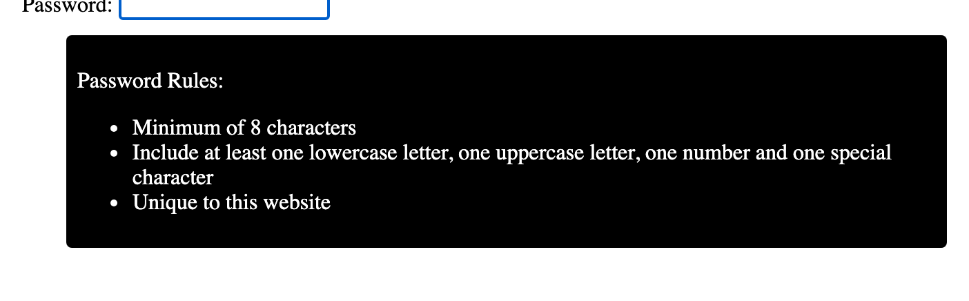
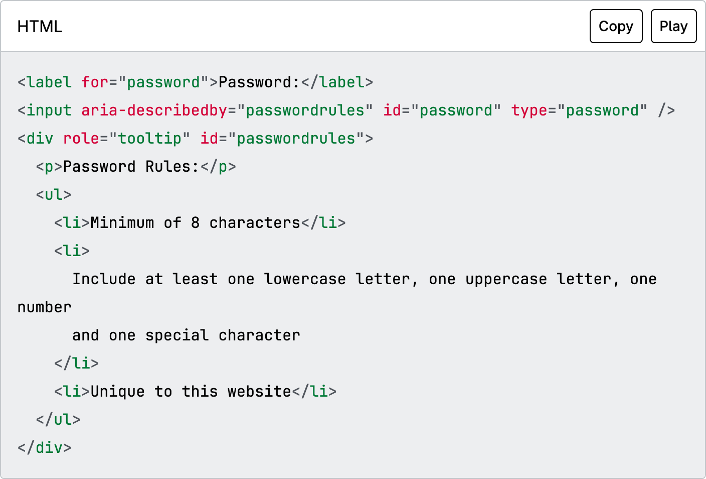
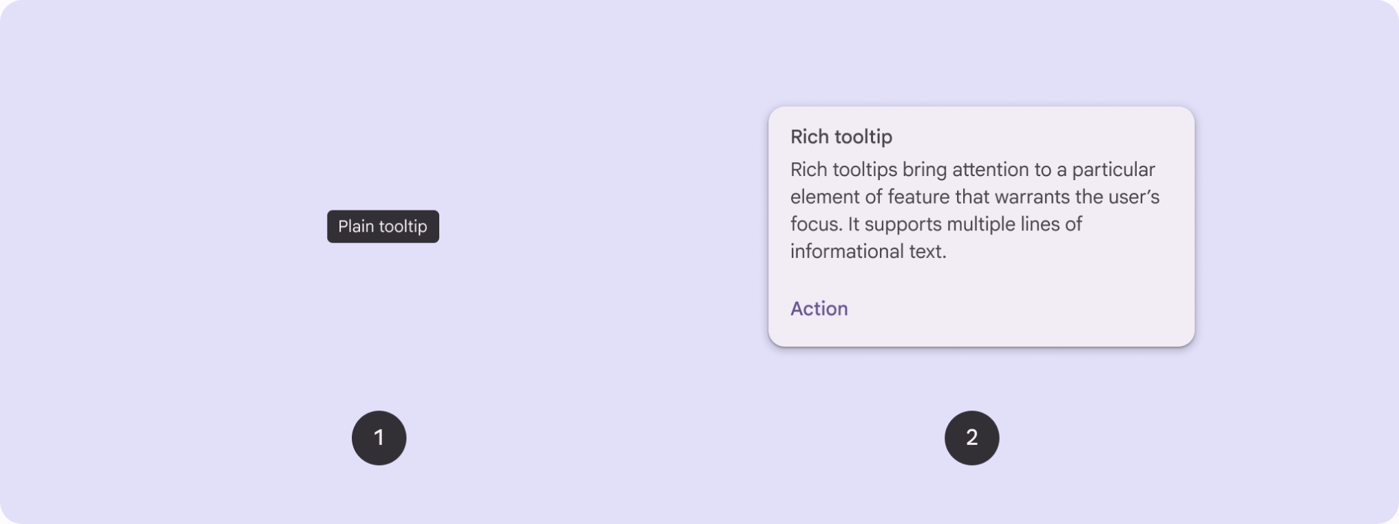
The popup container, marked role=tooltip, holding short text-only content. It is supplemental description, not the trigger's primary label, and it must never contain interactive elements such as links or buttons.
Arrow / tail
An optional pointer that connects the bubble to its trigger, useful when several controls cluster together and the tip could otherwise read as belonging to a neighbor. Purely visual; it carries no semantics.
The describedby association
The wiring that makes the tip accessible: aria-describedby on the trigger references the bubble's id, so a screen reader announces the tip as the control's description. Use aria-labelledby instead only when the tip is the control's sole accessible name.
States
Appearance delay and dismissal
A tooltip typically appears after a short delay on hover so it does not flicker as the pointer crosses the screen, and stays put until the trigger loses focus, the pointer leaves, or the user presses Escape. It should not vanish on its own timer: auto-hiding after a few seconds fails users who read slowly.
Hoverable and persistent (WCAG 1.4.13)
Success Criterion 1.4.13 requires that a hover-triggered tip stay visible when the pointer moves onto the tip itself (hoverable) and remain until dismissed or no longer valid (persistent). A bubble that disappears the moment the cursor leaves the trigger fails users on magnified or imprecise pointers.
Focus versus hover trigger
On keyboard focus the tip appears and stays until the trigger is blurred. On hover it appears and stays while the pointer is over either the trigger or the tip. The two paths must reach the same content, and Escape must dismiss the tip in both without moving focus off the trigger.
Touch has no hover
Touch devices have no hover and a tap usually activates the control, so tooltips are effectively unreachable there. There is no reliable fix. Where touch matters, surface the information as a visible label, or use a toggletip (a click-revealed disclosure announced through a live region) instead.
Positioning and collision
A tip is placed beside its trigger, commonly above, and flips to the opposite side when it would overflow the viewport. It must not obscure the content it describes, and per 1.4.13 it must be dismissible without moving the pointer, so users can clear a tip that covers something they need.
References
Use it
Figma
A tooltip component with directional variants
- Build a Tooltip component set with a Direction property: Top, Right, Bottom, Left.
- Make the bubble an Auto Layout frame of text with tight padding; add a small rotated square as the arrow, pinned to the edge that faces the trigger in each variant.
- Set a max width on the bubble so long text wraps to two or three lines rather than running off as one long strip.
- Use a dark fill with high-contrast text by default, and expose the fill as a variable so a themed page can swap it.
Keep the arrow as a separate layer pinned with constraints, so flipping the Direction variant moves only the arrow, not the text.
Show a tooltip on hover in a prototype
- Place the trigger and an instance of the tooltip on the frame, then hide the tooltip layer.
- Add a prototype interaction on the trigger: While Hovering, Open Overlay, with the tooltip as the overlay and a small Delay so it does not flash.
- Position the overlay manually next to the trigger and add a short Dissolve so it fades rather than snaps.
- Note on the frame that the real build must also show the tip on keyboard focus and dismiss it with Escape, which a Figma hover prototype cannot represent.
Figma can only model the hover path, so annotate the focus and Escape behavior for the developer rather than implying hover is the whole story.
Document tooltip versus toggletip
- Make two labeled examples side by side: a hover tooltip on an icon button, and a toggletip opened by an info button.
- Caption the tooltip as hover-or-focus, text-only, supplemental, and unavailable on touch.
- Caption the toggletip as click-to-reveal, announced via a live region, and the choice when touch or persistence matters.
- Add a one-line rule: if the content is essential or interactive, it is neither a tooltip nor a toggletip but a visible label or a dialog.
Keep this pair in the team library so the tooltip-versus-toggletip decision is made once, not re-argued per feature.
Accessibility
A tooltip is a passive description, not a widget you operate. The trigger keeps focus the whole time; the bubble (role=tooltip) is referenced from the trigger with aria-describedby and never receives focus itself. It must appear on focus as well as hover, stay visible while hovered, and dismiss on Escape without moving focus. If you find yourself wanting a focusable element inside it, you want a dialog, not a tooltip.
- Show on hover and on keyboard focus, reaching identical content by both paths.
- Meet WCAG 2.1 SC 1.4.13: the tip must be dismissible (Escape) without moving the pointer, hoverable (survives the pointer moving onto it), and persistent (no auto-timeout).
- Never place essential or actionable information in a tooltip; keep that on the screen.
- Give the bubble sufficient text-to-background contrast and respect reduced-motion preferences for any fade or slide.
- For supplemental content that must work on touch or hold interactive elements, use a toggletip or a non-modal dialog instead.
Research notes & sources
WAI-ARIA Tooltip: role=tooltip on the bubble, aria-describedby on the trigger, Escape to dismiss
- Tooltip Pattern (ARIA Authoring Practices Guide)W3C WAI
- Understanding SC 1.4.13: Content on Hover or Focus (Level AA)W3C WAI (WCAG 2.1)
- Tooltips in the time of WCAG 2.1
- Tooltips & ToggletipsInclusive Components
- Tooltip GuidelinesNielsen Norman Group
- ARIA: tooltip roleMDN Web Docs
- TooltipsMaterial Design 3 (Google)