Editorial Luxe
Restraint as a flex: a high-contrast serif on warm paper, wide-tracked small caps, and almost nothing else.
staying in.
to return to.
On familiar objects, the afternoon light, and a home that changes slowly.
Words by the editors / 08The living room08
Collected objects24
A table for two46
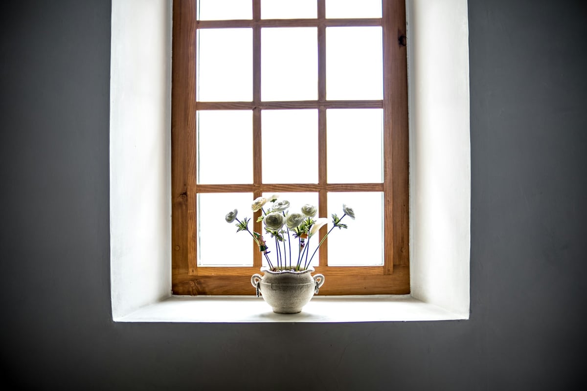
Photography: Noah Näf / Unsplash.
How it works
Color
Typography
Characteristics
High-contrast serif as the hero
A large Didone or transitional display serif carries the page, set big enough to act as the main image. The abrupt thick-to-thin contrast is the signal of refinement.
Warm paper ground, never pure white
The canvas is a warm bone, ivory, or oat, not #fff. Pure white reads as utility; warm off-white reads as expensive and printed.
Wide-tracked sans small caps for labels
Eyebrows, field labels, and navigation are set in uppercase grotesk with generous letter-spacing, roughly 0.1 to 0.2em. This detailing is as load-bearing as the serif.
Near-monochrome palette with one dark slab
Bone plus soft near-black plus one muted neutral, with a single dark block (a card, sidebar, or footer) as the anchor.
Hairline rules and generous whitespace
Regions are separated by thin 1px rules and negative space, not boxes or drop shadows.
Serif display against a quiet grotesk body
The signature pairing: an emotive high-contrast serif for display set against a calm neutral grotesk for body and UI, composed on an asymmetric editorial grid.
Use it
Figma
High-contrast serif display with grotesk body
- Add a high-contrast serif (e.g. Bodoni Moda or Playfair Display) and a neutral grotesk via Text Styles.
- Build an exaggerated scale so the serif display dwarfs the body, for example 72 / 44 / 18 / 16.
- Set generous line height and a comfortable measure for the grotesk body.
- Keep the serif for headlines and pull quotes; keep the grotesk for everything functional.
Turn on a display optical size for big serif headings so the thin strokes stay crisp, and never drop the display serif below about 28 to 32px.
Wide-tracked small-caps labels
- Create a label Text Style in the neutral grotesk at a small size, around 11 to 13px.
- Set it to uppercase and add letter-spacing of roughly 0.12 to 0.2em.
- If the face has true small caps, enable them under Type details rather than faking caps.
- Use this one style for eyebrows, field labels, and nav so the detailing stays consistent.
Track all-caps and small caps by 5 to 12 percent; untracked capitals always look too tight.
Warm bone palette with a single dark slab
- Create Color Variables for a bone ground, an alabaster surface, and a soft ink for text.
- Add one espresso slab color plus one muted neutral (stone or taupe) and at most one quiet accent.
- Use the bone, not white, as the page background everywhere.
- Apply the espresso slab to a single block (a card, sidebar, or footer) as the anchor.
Set text to a soft warm near-black like #2A241D, never #000000; pure black kills the warmth.
Editorial layout with hairline rules
- Build an asymmetric layout with wide margins using Auto Layout and a 12-column grid used off-center.
- Let one serif headline anchor the view as the hero element.
- Separate sections with 1px stroke rules in a warm hairline color instead of cards or shadows.
- Resist filling the space; leave large quiet margins around the type.
Keep the whitespace generous and deliberate; the empty space is doing as much work as the serif.
Starting points
- Ground the page in a warm bone or ivory, never pure white.
- Choose one high-contrast serif (Didone or transitional) for display and set it large.
- Pair it with a quiet neutral grotesk for body and UI text.
Research notes & sources
Late 2010s to present
Global fashion, brand & web design
Fashion editorial, branding & web
Quiet Luxury (web/UI), Editorial Minimalism, Modern Serif Minimalism, Stealth Wealth UI, New Sophisticate
Related styles
- Organic ModernThe same warm-paper-and-serif instinct, pulled toward craft instead of status: earthy clay tones, soft old-style serifs, grain and texture. Editorial Luxe is cooler, sharper, and near-monochrome.
- Swiss / International Typographic StyleShares the whitespace discipline and grid structure, but Swiss is sans-led, cool, and neutral. Editorial Luxe swaps the grotesk headline for a high-contrast serif and warms the ground.
- Didone (typography)Wikipedia
- Type in History: The DidonesSessions College
- Didone Fonts: A Designer's Guide to Fashion-Forward TypographyYouWorkForThem
- Quiet luxuryWikipedia
- Quiet luxury: all you need to know about the 2023 trendThe Drum
- Typography Trends 2026: The 5 Biggest Styles Shaping DesignDesignity
- The return of the serifCreative Review
- Luxury Brand Identity Trends 2026: Logo Design PredictionsJM Graphic Design
- LetterspacingButterick's Practical Typography
- Eyebrow Text in Web Design: What It Is and When to Use ItSocialectric
- Venture Capital Website Design: 50 Outstanding ExamplesMediaboom
- Deep Dive: Top VC Website DesignsVC Stack