Organic Modern
Natural materials, earthy color, and soft forms within a clear modern layout.
with
nature.Objects, gardens
& everyday rituals
to grow.
Kitchen herbs & seasonal planting
Saturday 09 May · 10:00—12:00
of the
outside.Notes from
the windowsill ↗
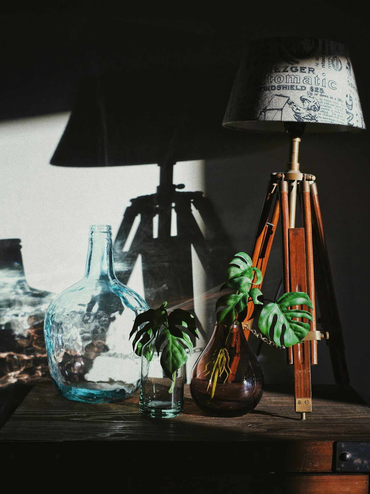
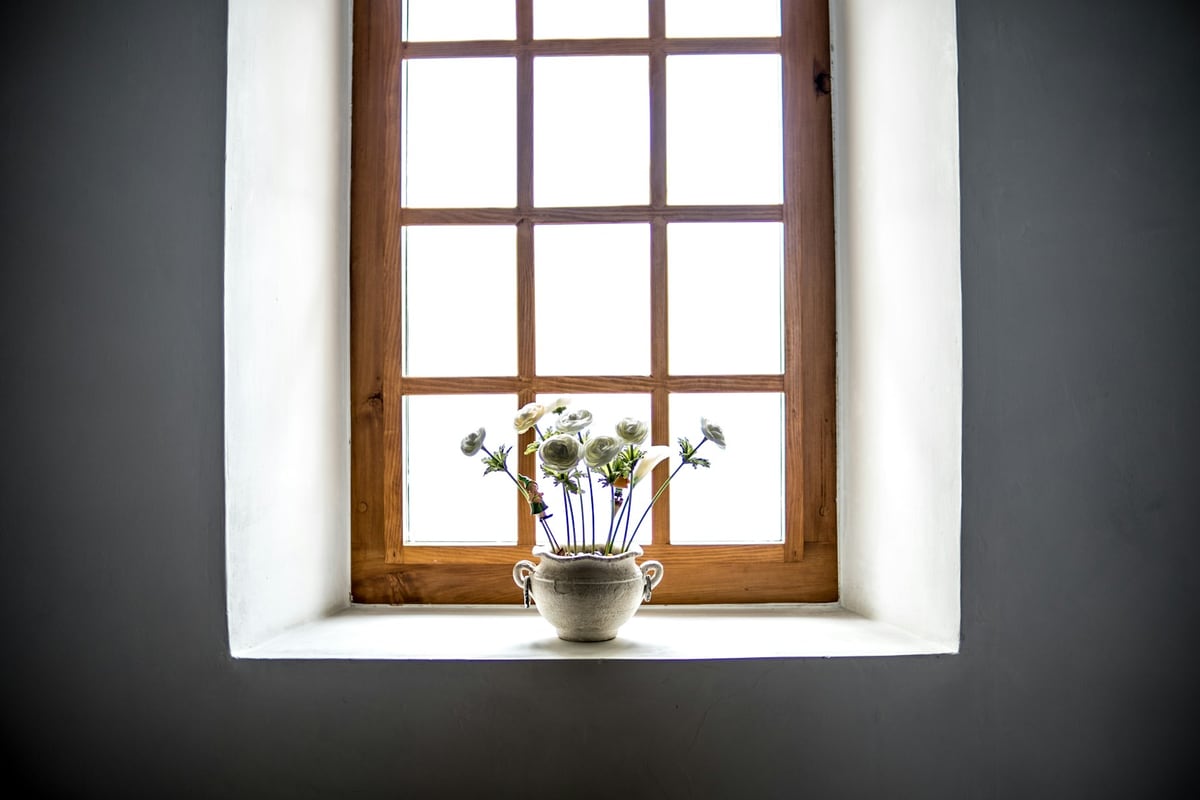
Photography: Tim Goedhart and Noah Näf / Unsplash.
How it works
Color
Typography
Characteristics
Serif display type as the hero
A large, characterful serif carries the page: high-contrast Didone or a soft, slightly wonky old-style face, set big as the main visual element rather than a neutral sans.
Warm, muted earth palette
Beige, cream, oat, and sand grounds with clay, terracotta, ochre, and sage accents. Warm undertones and restrained accents connect the palette to natural materials.
Refined serif paired with a neutral grotesk
The signature pairing: an emotive serif for display set against a quiet grotesk for body and UI, warmer and more human than geometric sans alone.
Editorial layout and generous space
Magazine-style, often asymmetric layouts with wide margins and calm whitespace, letting the type and a few images do the work.
Tactile texture and grain
A light film grain, paper, or linen texture warms the flat surfaces, adding a handmade, analog quality instead of clean digital perfection.
Craft and heritage signaling
Soft organic shapes, arches, botanical marks, and filmic photography evoke small-batch, apothecary, slow-living authenticity rather than tech polish.
Use it
Figma
Warm earth palette as Variables
- Create Color Variables for an oat ground, a sand surface, and a mocha ink for text.
- Add a clay or terracotta accent plus muted ochre and sage as secondaries.
- Use the warm neutral, not white, as the page background everywhere.
- Run text and accents through a contrast checker against the warm ground.
Try a dark brown like #3D3027 for text, and verify contrast against every background.
Serif display with grotesk body
- Add a characterful serif (e.g. Fraunces) and a neutral grotesk via Text Styles.
- Build an exaggerated scale so the serif display dwarfs the body, for example 64 / 40 / 18 / 16.
- Set generous line height and a comfortable measure for the body grotesk.
- Keep the serif for headlines and pull quotes; keep the grotesk for everything functional.
Use a display optical size for big serif headings so the thin strokes stay crisp.
Grain & paper texture overlay
- Place a noise or paper-texture PNG as a full-bleed layer above the background.
- Set the layer to Multiply or Overlay and drop opacity to roughly 6 to 12 percent.
- Lock it as a background layer so content sits cleanly on top.
- Color-grade photos warmer and more muted with an adjustment layer or fill on Soft Light.
If individual grain specks are visible at arm's length, it is too strong; keep it a whisper.
Editorial layout with organic shapes
- Build an asymmetric layout with wide margins using Auto Layout and a loose grid.
- Let one serif headline anchor the view as the hero element.
- Draw soft arches or blob shapes with the pen tool and place them behind content as quiet accents.
- Add fine botanical line marks sparingly as ornament, not everywhere.
Resist filling the space; the whitespace is doing as much work as the type and shapes.
Starting points
- Ground the page in a warm neutral (oat, cream, sand), not white.
- Choose one characterful serif for display and set it large.
- Pair it with a quiet neutral grotesk for body and UI text.
Research notes & sources
This page uses Organic Modern for a contemporary graphic direction. Warm minimalism and heritage craft are adjacent labels with overlapping features, not exact synonyms. The examples use real interior photographs, plant forms, and an earthy editorial palette. Serif type is a choice, not a requirement.
Late 2010s to present
Global brand, packaging & web design
Branding, packaging & editorial web
Organic Modern Design
Related styles
- Editorial LuxeThe cooler, sharper cousin: the same warm-paper-and-serif instinct, but high-contrast Didones and near-monochrome restraint signaling status rather than craft. Organic Modern is earthier, softer, and more textured.
- Handmade CollageThe same human, anti-sterile motive pushed the opposite way: layered, maximal, and deliberately rough where Organic Modern is clean and restrained.
- Swiss / International Typographic StyleThe cold, neutral, grid-and-grotesk discipline this style reacts against by adding warmth, serifs, and texture back in.
- Flat DesignFlat design is bright, saturated, and geometric-sans; Organic Modern is muted, warm, serif-led, and textured.
- GlassmorphismCool, digital, and translucent versus warm, tactile, and analog. Two answers to 'what comes after flat.'
- Graphic design trends 2026: 8 styles shaping visual cultureEnvato Elements
- The return of the serifCreative Review
- Heritage Craft: a contemporary treatment for traditional practicesAdobe Stock
- The 11 Biggest Web Design Trends of 2026Wix
- 'Warm Minimalism' Is the Single Biggest Trend Designers Say They're Adopting Next YearHomes & Gardens
- Pantone Color of the Year 2025: Mocha MoussePantone
- Why Mocha Mousse Is Pantone's 2025 Color of the YearTIME
- Aesop: a cosmetic brand with strong visual storytellingThe Voy Design
- Textured Grains Design Trend 2025: The Top Organic Visual StyleFollow Up Media
- 15 Best Serif Fonts for Design ProjectsTypeType
- Muted Color Palettes for Design: What Are Muted Colors & How to Use ThemCC Creative
- Back to Basics: Organic Graphic Design TrendsEnvato Elements
- Fraunces (specimen)Google Fonts