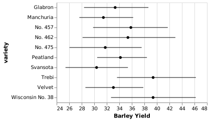
Interval plot
A point and its interval show an estimate and uncertainty.
Next month’s workshop attendance
Illustrative 80% prediction intervals, supplied with each forecast.
Illustrative dataView data4 records
| Item | People | Lower bound | Upper bound |
|---|---|---|---|
| North | 52 | 40 | 64 |
| Harbor | 68 | 50 | 86 |
| Central | 64 | 46 | 82 |
| West | 60 | 48 | 72 |
When it fits
Compare estimates while keeping their uncertainty visible.
What you need
An estimate and explicitly defined lower and upper bounds.
Watch for
Confidence intervals, prediction intervals, and observed ranges mean different things.
In practice
Sources and accessibility
The authored example uses illustrative data. Published references retain their original information and presentation.
- Claus O. Wilke · Visualizing uncertainty
- Vega-Lite contributors · Mean barley yield with confidence intervals
- W3C WAI · Accessible descriptions for complex images
Use Tab to reach controls and the data view. Native selects support arrow keys. All values are available in the data view; color and hover are never the only way to read the example.