Skip to content

Neubrutalism

Black outlines, flat bright fills, and shadows with no blur.

PrintsZinesStickersCart 0items

Riso prints for small rooms.

A two-person studio printing tide charts, zines, and sticker sheets in four inks.
Tide chart print

A3 Riso print
$24

Harbor zine no. 4

28-page zine
$12

Buoy sticker sheet

9 vinyl stickers
$8

Button states

Default
Hover
Pressed
Focus
Disabled
  • Border 2px
  • Shadow 4px 4px 0
  • Radius 4px

Launch week

7 of 12 tasks
To do2
Write the launch emailCopyAK
Price the sticker bundleShopJT
Doing1
Photograph the tide chartMediaAK
Done2
Order paper stockPrintJT
Proof the zinePrintAK
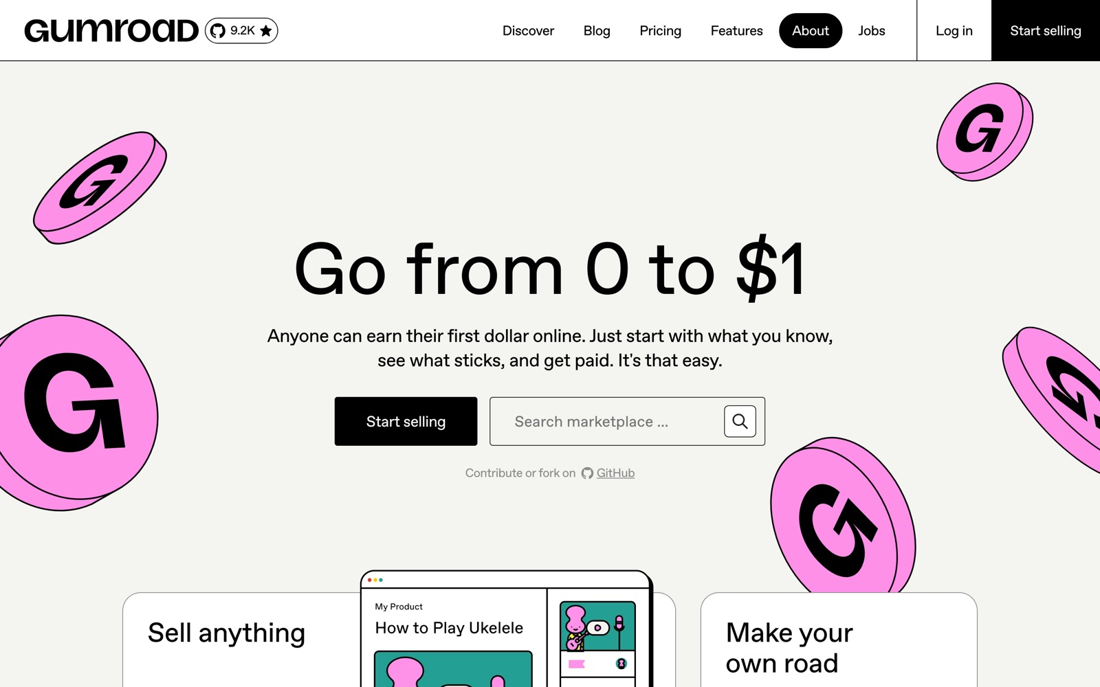
The Gumroad homepage: a large headline reading 'Go from 0 to $1' on a cream ground, a black Start selling button, an outlined search field, and pink coin illustrations with black outlines.
Gumroad homepageGumroad · 2026
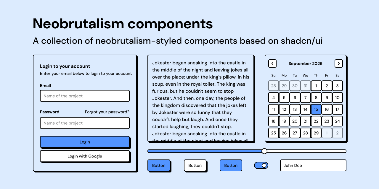
Preview of the Neobrutalism components library on a pale blue ground: a login card, a text panel, a calendar, a slider, buttons, a switch, and an input, each with a black outline and a solid black offset shadow.
Neobrutalism componentsSamuel Breznjak · 2023

How it works

Color

InkCreamPinkYellowMintPeriwinkle

Typography

Space Grotesk
Archivo Black
DM Sans
Characteristics

Ink outlines

Every card, field, and button carries a black border. Component kits use 2px; Gumroad uses 1px.

Zero-blur shadows

A solid copy of the shape sits 4px down and to the right, with no blur or spread. Featured surfaces double the offset.

Flat, saturated fills

Pink, yellow, blue, green, and orange fills sit on a pale or cream ground.

Shadow as state

Hover and press move the element against its shadow. A pressed button lands where its shadow was.

Plain, heavy sans type

Plain sans faces, bold headlines, and medium-weight body text.

One small radius

Corners are rounded by about 4 to 5px, and the same value repeats across components.

Use it

Figma
Hard shadow effect style
  1. Select a frame and add a Drop shadow in the Effects section.
  2. Set X 4, Y 4, Blur 0, Spread 0, and the ink color at 100% opacity.
  3. Save it as an effect style named Shadow/Base.
  4. Duplicate it at X 8, Y 8 as Shadow/Large for featured cards.

A parent frame with Clip content on cuts the shadow off. Turn clipping off or pad the parent by the offset.

Button with press states
  1. Draw a frame 4px wider and taller than the button face, with no fill and Auto Layout off.
  2. Inside it, build the face with Auto Layout, a flat fill, a 2px inside stroke in ink, a 4px radius, and Shadow/Base.
  3. Make it a component with a State property: Default, Hover, and Pressed.
  4. In Pressed, move the face 4px right and down and remove its shadow.
  5. On Default, add a While pressing interaction that changes to Pressed with Smart animate.

The fixed outer frame keeps neighbors from shifting when the face moves.

Palette as variables
  1. Create a color collection with Ink, Ground, and four Fill variables.
  2. Add a Dark mode and give Ink and Ground new values there.
  3. Bind every fill and stroke to a variable.
  4. Check each text and fill pair with a contrast plugin before publishing the library.

When ink text fails on a fill, lighten the fill rather than changing the text color.

Sticker badge
  1. Draw a star or circle, fill it yellow, and add a 2px ink stroke.
  2. Apply Shadow/Base.
  3. Set a short label in Archivo Black, all caps.
  4. Group, rotate 6 to 10 degrees, and overlap a panel corner.

One tilted element per view reads as a choice. Several read as disorder.

Starting points
  1. Pick a pale ground, one ink color, and three to five flat fills.
  2. Define one border weight, one shadow offset, and one radius, and apply them to every component.
  3. Design hover, pressed, and focus states against the shadow, then check contrast on every fill.
Research notes & sources

Implementation details on this page are read from shipped code: Gumroad's open-source web app and the MIT-licensed Neobrutalism components library. The style's popular history, including when Gumroad adopted the look and how Figma's marketing spread it, is widely repeated but was not verified for this page and is left out. Raw, document-first web brutalism has its own page.

2020s to present

Web product and marketing design

Component libraries and landing pages

Neo-Brutalism, Neobrutalism

Related styles

  • Brutalism, WebRaw web brutalism exposes the document; neubrutalism keeps the bluntness and makes it a polished, colorful component system.
  • Flat DesignShares flat fills and no gradients; neubrutalism adds ink outlines and hard shadows.
  • MaximalismShares loud color and type, but neubrutalism holds to one border, one shadow, and a straight grid.
  • ClaymorphismBoth use bright fills and depth; clay blurs and inflates its shadows, neubrutalism keeps them solid and flat.
  1. Neobrutalism: Definition and Best PracticesNielsen Norman Group
  2. Neobrutalism components: Introductionneobrutalism.dev
  3. neobrutalism-components (source, MIT license)GitHub
  4. Gumroad web app: tailwind.css themeAntiwork / GitHub
  5. Gumroad web app: _definitions.scssAntiwork / GitHub
  6. Gumroad web app: Button componentAntiwork / GitHub
  7. GumroadGumroad
  8. Neo-Brutalism UI LibraryGitHub
  9. Understanding Success Criterion 1.4.3: Contrast (Minimum)W3C
  10. Understanding Success Criterion 1.4.11: Non-text ContrastW3C